In 1981, a bicycle assembly company began operations in Saint-Georges, Quebec. The brand was named after the mountain range that runs from British Columbia to the southwestern United States. The brand started at West Point Cycles, a bike store remaking Nishiki road models. The company grew quickly enough. It had already expanded beyond Vancouver within three years, supplying its products to the international market. Its acquisition by the Procycle Group in 1997 allowed it to significantly expand its range of products, increasing production volumes. Today the brand makes mountain bikes and road bikes, and it offers a dozen different models for each of these groups. The company sponsors several cyclists – Wade Simmons, Thomas Vanderham, Carson Storch, and Vaea Verbeeck – and sports teams, including the world-famous Rocky Mountain Race Face Enduro Team. Continuing its development, the brand turned to professional designers to create a new look, whose task is to create visuals that meet modern requirements and effectively help them reach new heights.
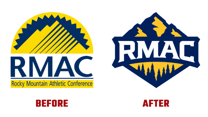
The new logo is radically different from the last version. It is based on a text reflection of the brand name in a clear, large white font, making it easy to read in any format and size. The use of dark blue corporate color as a background, in which all the negative spaces of the logo are made, marks out the inscription favorably, making it an accent element of the main sign.
The logo itself is made in the form of a regular rhombus, the upper part of which is formed by a stylized image of mountains, which are the main symbol of the region. They are made using the basic yellow colors, which are used to create the image of spruces on a yellow background in the lower part of the emblem. The brand’s name is in the center of the diamond – its abbreviation of 4 letters. As an original solution, its lower edge repeats the curve of the slat, attracting the viewer’s attention, focusing it on the name itself.
The use of modern technology in creating the logo provided a high quality of its display, clarity, and visual readability in print and digital formats. The new style and graphic design made it possible to get a new sign, which can work for a long time without revising it in the short term.


