


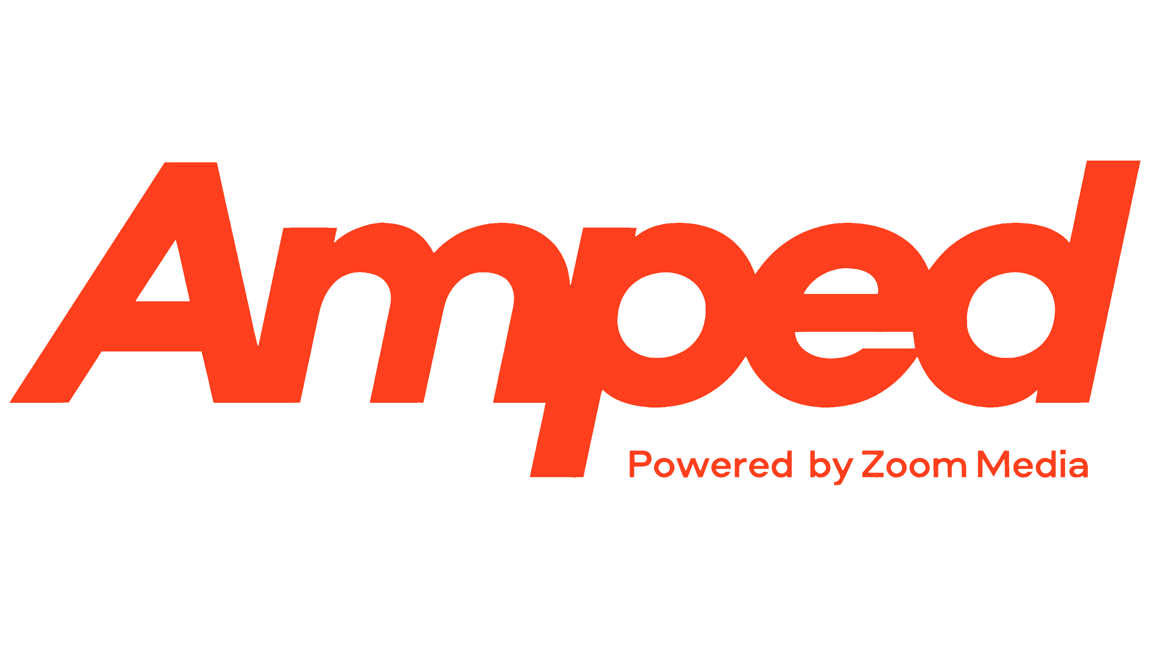
Zoom Media has introduced Amped, a dedicated brand for its digital advertising screens in gyms across the UK and continental Europe. Antwerp-based Belgian agency Celta developed the identity. The agency’s portfolio dates the project to 2025, while Zoom Media announced the launch on May 14, 2026. The logo features heavy, slanted lettering and animation that resembles a pre-workout warm-up.
The new brand changes how the network presents itself to advertisers. According to consultant Paul Evans of V2RSION, the conversation previously centered on screen counts and available advertising formats. Amped now shifts the focus to audiences, data, and campaign results. Its proposition centers on reaching gymgoers during workouts, when they are focused on exercise and personal goals.
The client’s team developed the name. Its first three letters spell AMP, short for Attention, Mindset, Performance. The formula brings together audience attention, mindset, and advertising results. Celta connects the Amped name with brand amplification. A small “Powered by Zoom Media” line beneath the end of the word identifies the parent company. Zoom Media retains its corporate name, with Amped joining its offering alongside audiovisual channels and livegood.
The logo combines an uppercase “A” with lowercase “mped.” The heavy sans-serif letters lean to the right and sit tightly together, with some strokes touching. The “A” has a triangular counter, while the interiors of the “p” and “d” are rounded. The “p” descender extends below the baseline, and the tall stem of the “d” finishes the wordmark on the right. The close connections bring the name together as a single form.
The designers associate the slant with physical exertion. In presentations and other materials, Celta uses a 78° angle to carry the logo’s geometry into supporting shapes and icons. Animation extends the fitness theme by stretching and distorting the letters. The name “warms up” translates familiar gym activities into the advertising network’s identity.
Black and orange are the primary colors. Saturated tones, overlays, and blur effects complement the imagery. Some scenes were created with AI. They show a gymgoer turning toward an advertising screen, illustrating AMP’s attention component. The website became the main platform for the new identity. The agency also developed PowerPoint presentations, animation, and an icon set.
Paul Evans handled Amped’s positioning. At Celta, Thomas Van Mol led the design, Thomas Mahieu created the animation, and Bram Van Rompay wrote the copy. Jasper Van Damme handled the project’s digital side.