The history of the Birmingham Royal Ballet is varied and somewhat confusing. Founded in its last version in 1946, it was based on the formation of 1932. Established as the Sadler’s Wells ballet theater, the group performed until 1940. Having fallen under the bombardment this year, the troupe, already incomplete, continued to tour the country. In 1946 the ballet found its new home as the Royal Opera House, Covent Garden. Continuing to acquaint everyone with classical ballet, demonstrating the highest skills, in 1990, she moved to Birmingham, where the name was changed to the current one. Today, the troupe is considered the best globally, thanks to a high level of professionalism, the ability to create artistic innovations, and adherence to artistic responsibility.
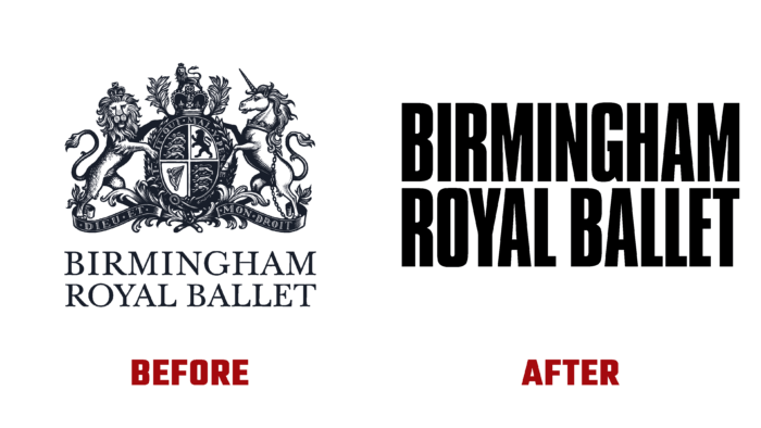
Today, the company’s premier is an outstanding dancer and choreographer – Carlos Acosta. He had a huge impact on forming a new vision of the Birmingham Royal Ballet as a classic at a world level. This expanded the scope of the troupe’s ability to win new fans, making it possible to put on new works to impact society significantly. All these important points are reflected in the new identification system, based on the use of a developed wordmark, which is placed across the entire width of the logo. In the visualization system, bright in their colors and dynamic photographs, images that work to unite the company and attract attention have been used. With their help, the brand demonstrates the ability to “reach out and turn up the volume” of their voice and skill. The update has become a multi-platform solution that allows you to take ballet to a whole new level put it in new places – in creativity, in the degree of emotional impact, in the physical sense, and digital visualization.
The word form is the basis of the logo. It was based on the distinctive architecture of several fonts, which create a single and harmonious composition with the created wordmark. This made it possible to manage all applications, ensuring the most effective impact conveniently. Full-length dancers in a favorable color frame are presented in a favorable presentation, glorifying their athleticism and sportiness. At the same time, all the classic rules for the execution of lines and plot connection are preserved. The whole identity of the brand is distinguished by the dynamics, courage, and beauty characteristic of the ballet itself.


