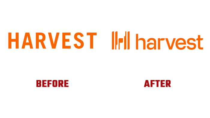
Unique software that allows you to easily and easily track your own working time, with the original name Harvest, has introduced its new identification. Founded in 2006, today, the brand has changed dramatically. Having transformed into software in demand in a variety of business areas in workflows, it required changes in its visual display, which was recently implemented. The new identity effectively demonstrated the solution to the brand’s core mission – namely, creating an environment that allows everyone to focus on complex engineering challenges where everyone can make the most of it. The software was designed to track time in the browser, desktop, and mobile device. It makes it easier to fix the time with the help of special applications. The application becomes a particularly effective tool for remote performers. The program developers took into account an important point – how teams and employees spend their time have as many differences as human individuals – in a team, among clients, entrepreneurs. These features influenced the brand’s external design structure, which became more informative, attracting more users.
The new visualization was able to reflect the company’s mission better – to help in the ability to spend time wisely. One of the most important brand elements, which everyone liked the most, was illoglyphs – a system of illustrations with vultures. This is a modular image library that has created the conditions for more flexible imagery in illustrations. At the same time, it was a way to pay tribute to the long history of depicting time and people by visualizing the negative impact of long stagnation in one place. One way to explain this linguistic approach more clearly is to combine illustrations with text that tells a story about something very important and eternal.
The graphic development of the logo and the word mark – the brand’s full name – reflects the company’s idea of time itself. Eye-catching tabs have been used to create timestamps, as can be seen in the capitalization of the name H and the features of the unique font designed specifically for this logo. Time tabs are also used in other identity elements, including timeline illustrations. The new design is somewhat overloaded with excessive design and rationalization. The use of WiseType’s Monarch Nova font in designing the eye-catching website made it more pleasant to read but somewhat distracted from the main tasks. All illustrations of the identity are clear and simple and are effective in helping you navigate the site. This is achieved through their close connection with the convention.


