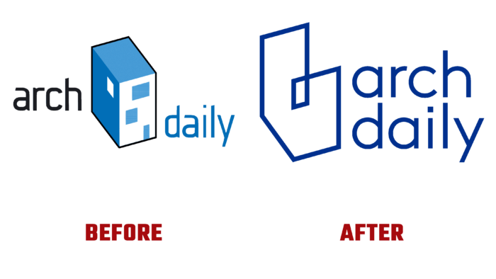
In the wake of the widespread popularity of blogs, ArchDaily was created 14 years ago for specialists and interested persons, an electronic platform related to architectural news. Over the years of its existence, it has become one of the most visited resources globally, which has led to the creation of three regional websites in three languages - Spanish, Portuguese, and Chinese. Its founders were David Basulto and David Assael, who shaped the focus and structure of the resource, ensuring that it is constantly filled with fresh information.
By the start of the launch, the founders had already formed their vision of the brand, creating its archetypal image, structured through an isometric projection of the building in blue. This element has been used for a long time, becoming a kind of emblem that has constantly adapted to the changing applications of the site. But, the new era that began in 2020 required a review of our strategy and adjustments to the appearance, more closely linking it with the upcoming changes. Expanding the basic concept of architecture beyond just buildings required taking this into account in the visualization of the brand.
The global introduction of modern technologies – 2D and 3D visualization required the reflection of their influence on the visual stage of formation of the company’s appearance. In the new logo, the traditional building has been deconstructed while maintaining the overall essence of what it includes. The object was stripped of its traditional form, becoming the owner of a continuous abstraction that only hints at the space it occupies. In this way, the modern ambiguity of the situation in which everything related to architecture and its design is today was symbolically reflected. At the same time, the willingness to accept such a changeable and hybrid, dynamic transdisciplinary future is demonstrated.
Changes have also been made to the brand’s blue color, which has taken on a new tone, bringing fresh notes to the color palette. At the same time, he became a link between the brand’s main products – Architonic, and ArchDaily, demonstrating the relationship and their common target orientation.
The implemented changes also consider the upcoming UX improvements, which should improve the acquisition of practical experience, focusing users on the most important aspects of the current changes and obtaining quality content.


