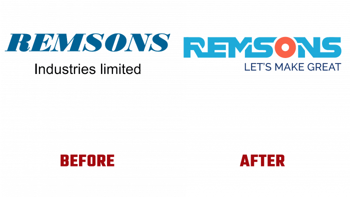
Remsons Industries, a manufacturing facility for automobile cables and gearboxes from Chakan, Pune, received a new logo and reorganized its identity. Rebranding has become an urgent need due to the active growth of the enterprise in recent years and the preparation of production for the introduction of important changes. New initiatives include creating integrated production of new units and components for brake units, control mechanics, special tools and equipment, and interior garage items. The company has implemented change management in its manufacturing processes, facilitating quick and painless restructuring. Sales of products went beyond the country’s borders, and the existing facilities underwent effective modernization. All of this needed to be communicated to consumers, partners, and employees, which best ensured the creation of a new visual identity.
The new corporate identity and brand strategy were based on the three pillars of the company – people, structures, and technologies. A particularly important element of the visual reorganization was the interface of the brand itself. Its design required full compliance with the new intentions and current ideas about the company’s future. In this matter, special assistance was provided by the Unlock design agency, which successfully coped with the task of creating the corporate identity and philosophy of the new logo, which reads: “LETS MAKE GREAT.” The new logo became the main element that “took over” the main burden of conveying the main idea of the updated brand. Special typography, in which each element results from the creativity of the company’s designers, creates the necessary atmosphere and symbolizes the brand’s solidity, firmness, and absolute commitment to the use of modern technology technologies. At the same time, it ensures the perception of the unity of each element of production and products in a general integral relationship.
The logo’s composition is a way to visually convey the harmony characteristic of Remsons Industries in combining its ideas of development and ambitions with the expectations and preferences of the company’s customers, partners, and employees. At the same time, the philosophy of the logo allows you to make a claim for more – to meet the needs of the entire society. As a result, a unique visual image format was obtained that is completely different from the usual identifiers in this area, which fully corresponds to the creation of new guidelines by the enterprise in the field of communications in the B2B sphere.
This also applies to color shades – a light, light blue in the spelling of the brand name and an accent orange, which is highlighted with the letter “O,” which is at the same time a wheel symbol, demonstrating brand ownership in the automotive industry.


