


After five years on the market, ready-to-drink cocktail brand Smash has updated its packaging to reach audiences beyond the U.S. East Coast. Minneapolis agency Rise and Shine and Partners worked with Devils Backbone on the project. The designers enlarged the name, rotated it to read from bottom to top, and surrounded it with oversized fruit slices. Orange Smash was the first to reach stores in the new cans.
The update changes how the existing logo is presented. Previously, the orange SMASH wordmark sat horizontally on a light background. The name is now white, rotated 90 degrees, and fills most of the can’s height. The ORANGE flavor label above it remains horizontal. At the same time, a small Devils Backbone Distilling Co. line appears near the top edge. Differences in scale and orientation distinguish the brand name from drink information.
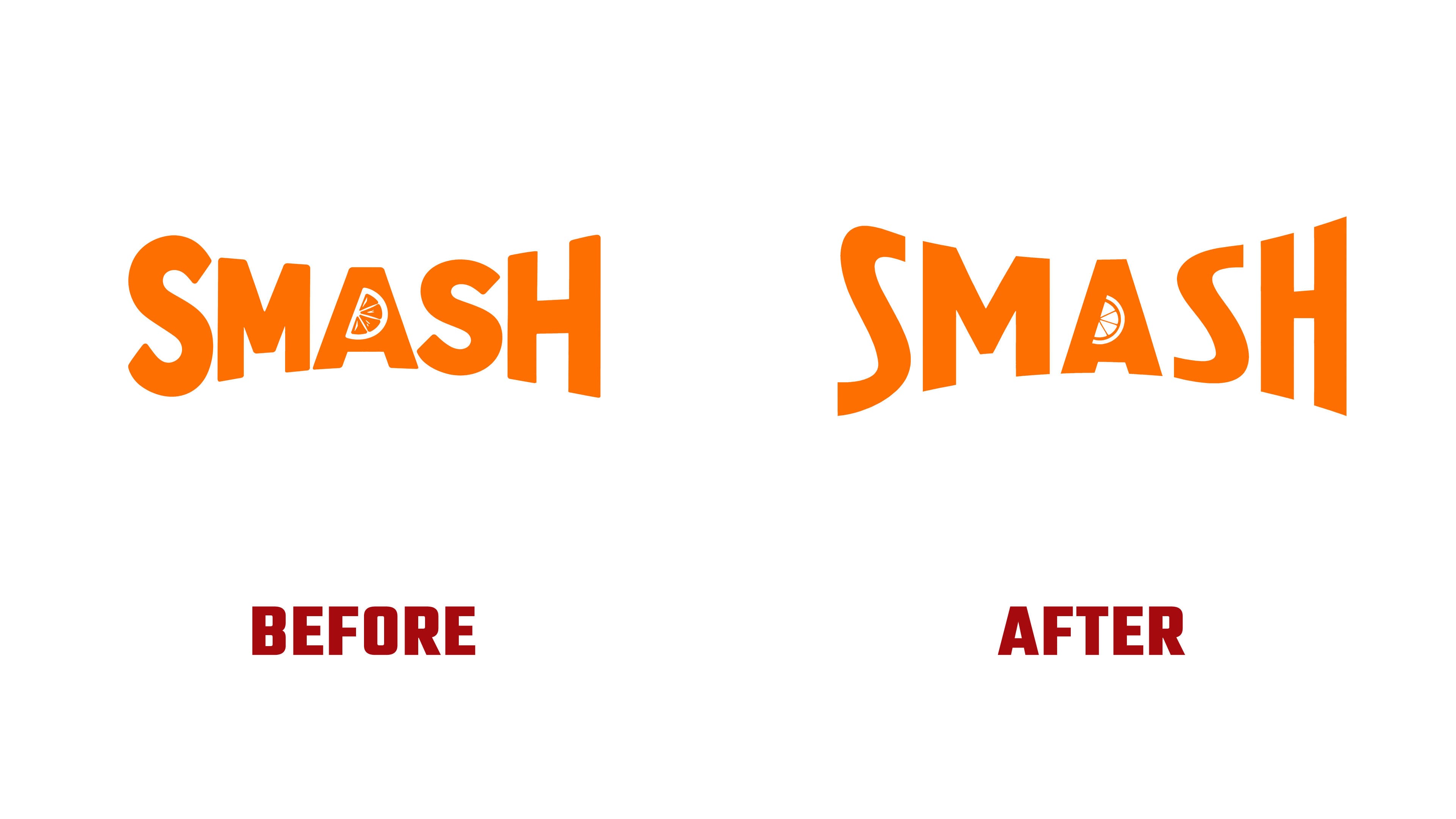
The SMASH letterforms remain unchanged. The heavy uppercase “S” and “H” at the ends are larger than the middle letters, giving the word an uneven outline. A small citrus wedge with individual segments sits inside the “A.” It also appeared on the previous packaging, connecting the logo to the cocktails’ fruit ingredients.
The new design plays on the crushing and squeezing suggested by the word “smash.” Fruit slices flank the lettering and appear to compress it. According to the designers, the treatment references the drinks’ juice. The fruit and name form a shared scene that expresses the brand’s meaning through their arrangement.
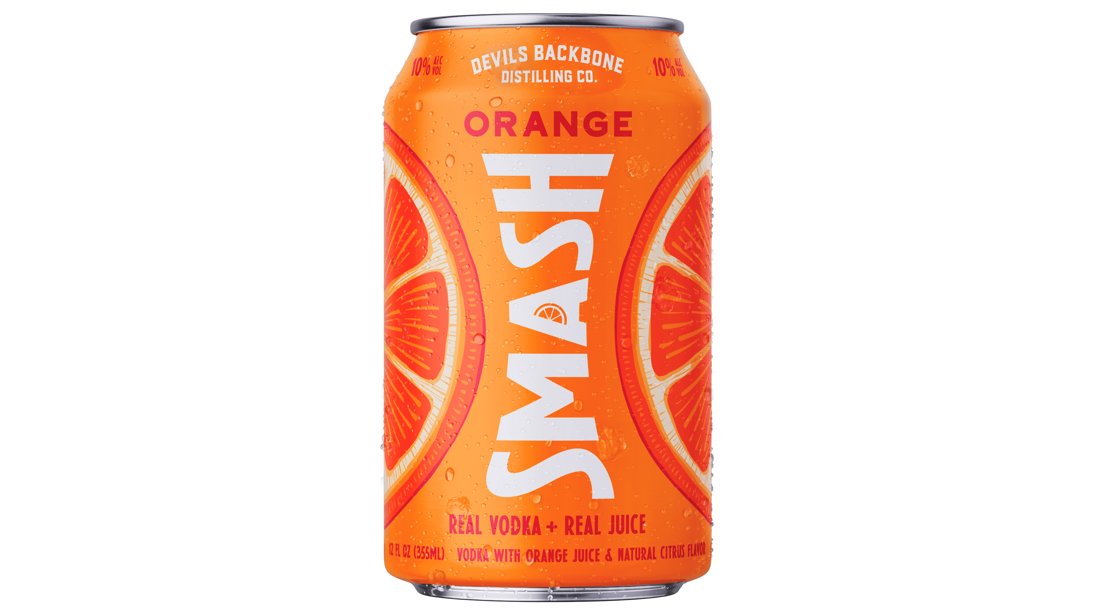
In the competitive ready-to-drink cocktail market, Smash wanted to communicate its bold fruit flavors more fully and give the name greater prominence on the packaging. The recipes and flavors remain unchanged. Orange Smash’s light background has turned orange, and large orange slices replace the small illustrated scene. Other varieties use colors associated with their respective fruits. An illustrated salt rim distinguishes the tequila-based Margaritas from the vodka cocktails.
After Orange Smash, the design rolled out across other flavors and multipacks, including Grapefruit, Grape, Lime Margarita, and Watermelon Margarita. A large vertical wordmark and ingredient imagery give the packaging a shared structure. At the same time, color and supporting details distinguish the drinks within the range.
Ed Bennett led the project’s design. Jenna Lalley handled design direction and illustration, with designer Ben Engen and production specialist Tim Hirschey working on the layouts. Lisa Anderson oversaw brand development and integration, Sam Voss managed the project, and Matt Burgess provided creative direction. The work received a Bronze Honorable Mention in the Packaging, Campaign category at The Show 2026.