


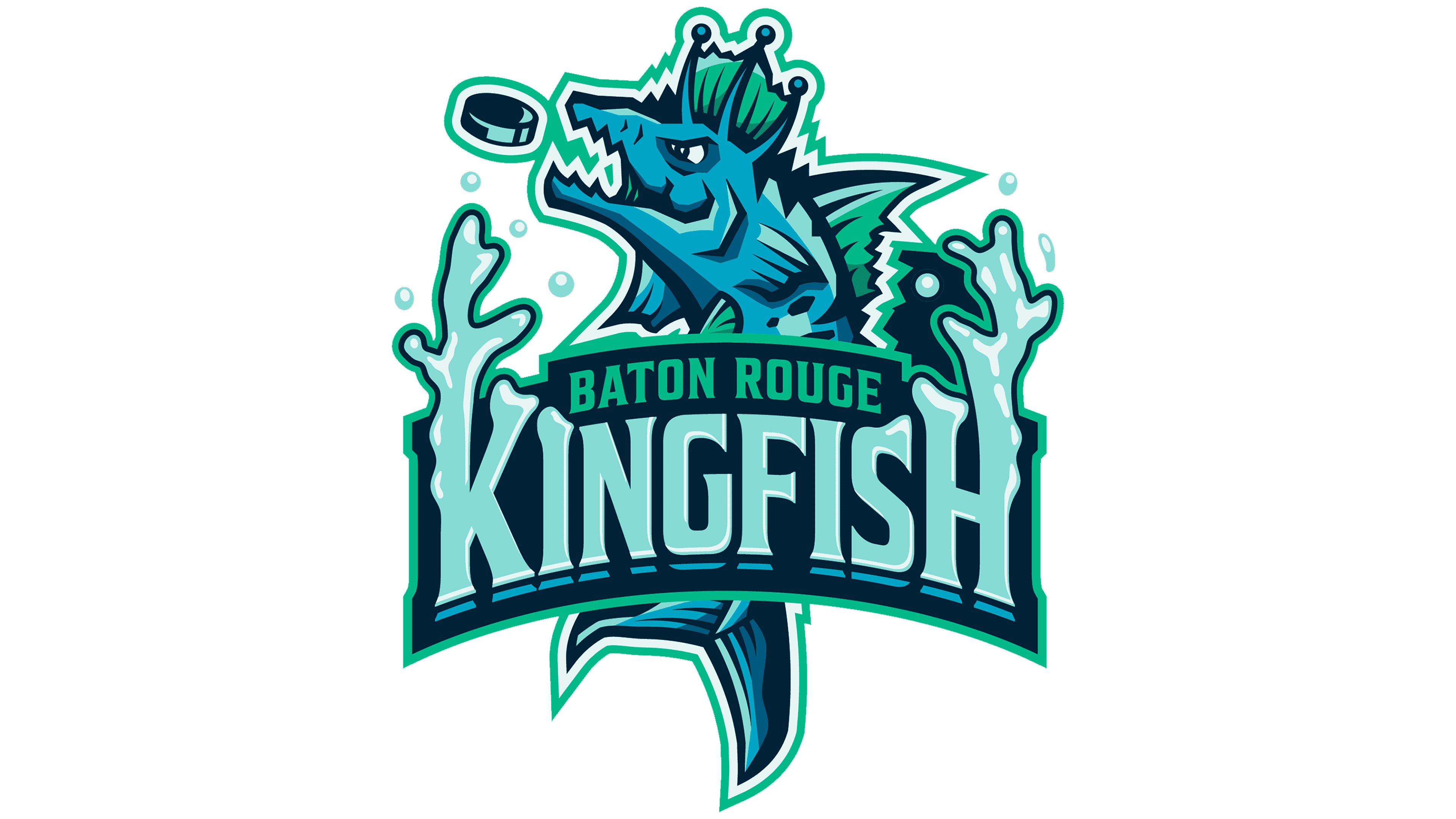
Ahead of its Federal Prospects Hockey League debut, Baton Rouge’s new club has adopted the historic Kingfish name. The name returned to the city’s professional hockey scene after 23 years. The team unveiled it on July 22, 2026, alongside an emblem by Madeleine Guillory depicting a crowned fish chasing a puck. Before the announcement, the team used the working name Baton Rouge Hockey Club.
The original Kingfish played from 1996 to 2003 and was Baton Rouge’s first professional hockey team. Local fans had suggested reviving the name even before the new organization was announced. It connects to Louisiana’s waterways and state history. The club’s press release mentions a political reference. At the same time, WBRZ identifies Kingfish as the nickname of former Governor Huey Pierce Long. The new team was preparing to take the ice after the Baton Rouge Zydeco ceased operations in spring 2026.
Guillory based the emblem on a predatory fish. The club describes its inspiration as a king mackerel leaping out of the water after prey. In the hockey version, a puck sits in front of its open mouth. The fish faces left, with its head rising above the name and its tail visible beneath the letters. A crown plays on the Kingfish name. Sharp projections along its back, teeth, and a narrowed eye complete the aggressive sports image.
The KINGFISH wordmark forms a splash beneath the fish. The outer stems of the “K” and “H” extend upward, with rounded tips resembling jets of water. Separate droplets appear nearby. The letterforms make the name part of the puck-chasing scene, extending the character illustration.
The remaining letters are tall and narrow, with pointed serifs. Thick strokes alternate with thin ones, while light interior lines add dimension. Above KINGFISH, a dark panel contains a small green BATON ROUGE inscription in uppercase letters. The emblem combines navy, light blue, green, pale mint, and white. Dark outlines separate the fish’s features from one another and from the lettering.
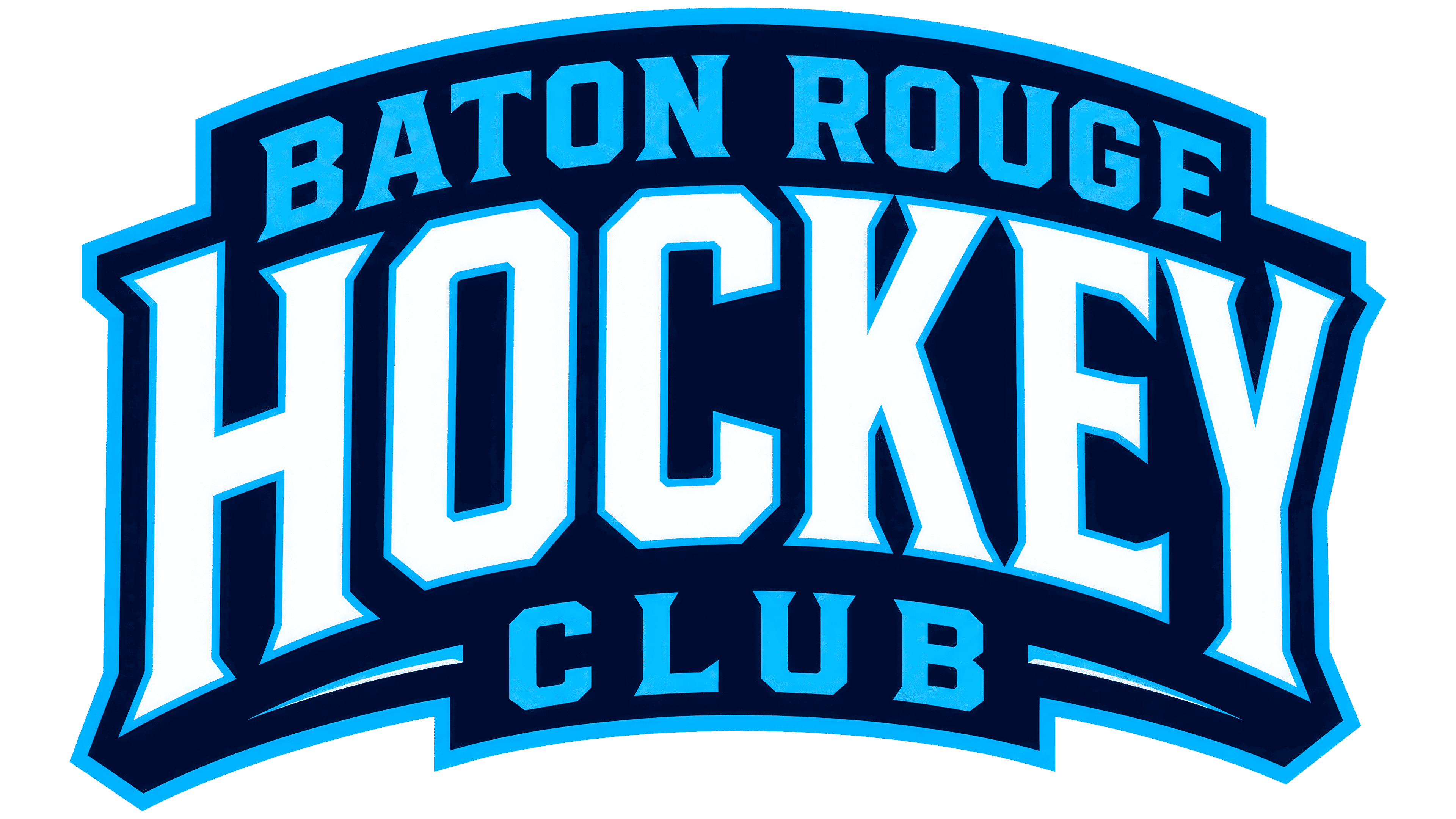
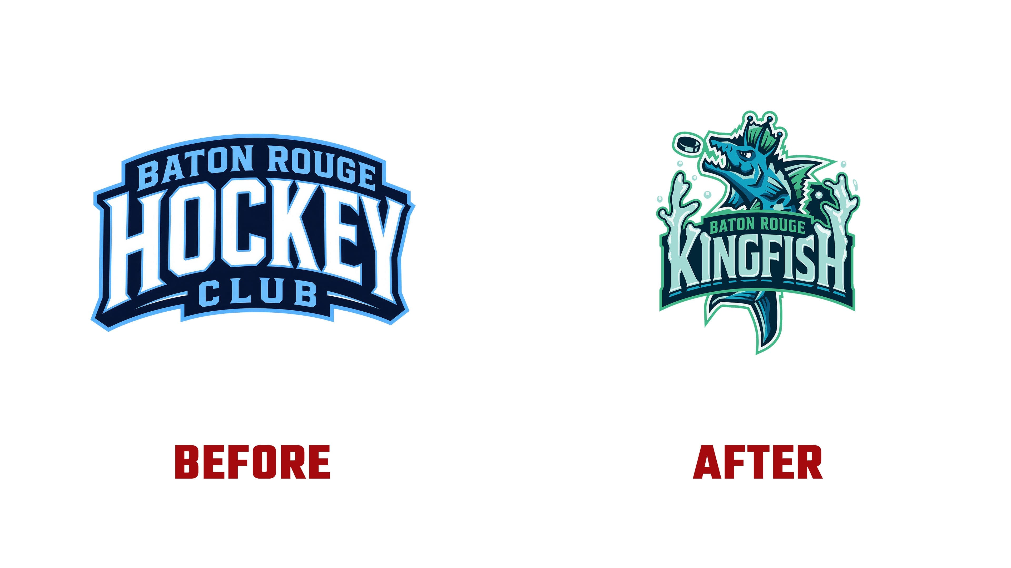
The new logo differs from the 1990s emblem, which placed a blue-and-silver fish inside a copper-colored oval. Guillory brought the character and name together in a single scene without an enclosing border. Before its introduction, the club used a text-based Baton Rouge Hockey Club emblem. A large white HOCKEY filled most of a curved panel with a light blue edge, positioned between BATON ROUGE and CLUB.
Alongside the full logo, the club introduced a standalone fish illustration, including single-color versions on contrasting backgrounds. These retain the crown, puck, fins, and tail. The character’s head appears on the website’s homepage, while team launch materials use the complete emblem with the KINGFISH wordmark.