Fundo Baobá introduced a new identity developed by the Brazilian agency Motora. The update affected the foundation’s overall image, while the main change concerned the logo. Through the mark, the organization tells its story, work, and mission more simply and more precisely.
The organization has worked since 2011. It is regarded as the first major foundation in Brazil focused on racial equity. Over the years, the foundation expanded its programs, increased its national influence, and became a hub for initiatives related to Black communities and organizations. The previous style reflected an earlier stage of the foundation. At the same time, the new system communicates its current scale and role in public life.
The update brought the foundation’s image closer to different audiences, including younger generations. The team aimed to convey a connection to Afro-Brazilian heritage through a contemporary mark rooted in memory, roots, and continuity.
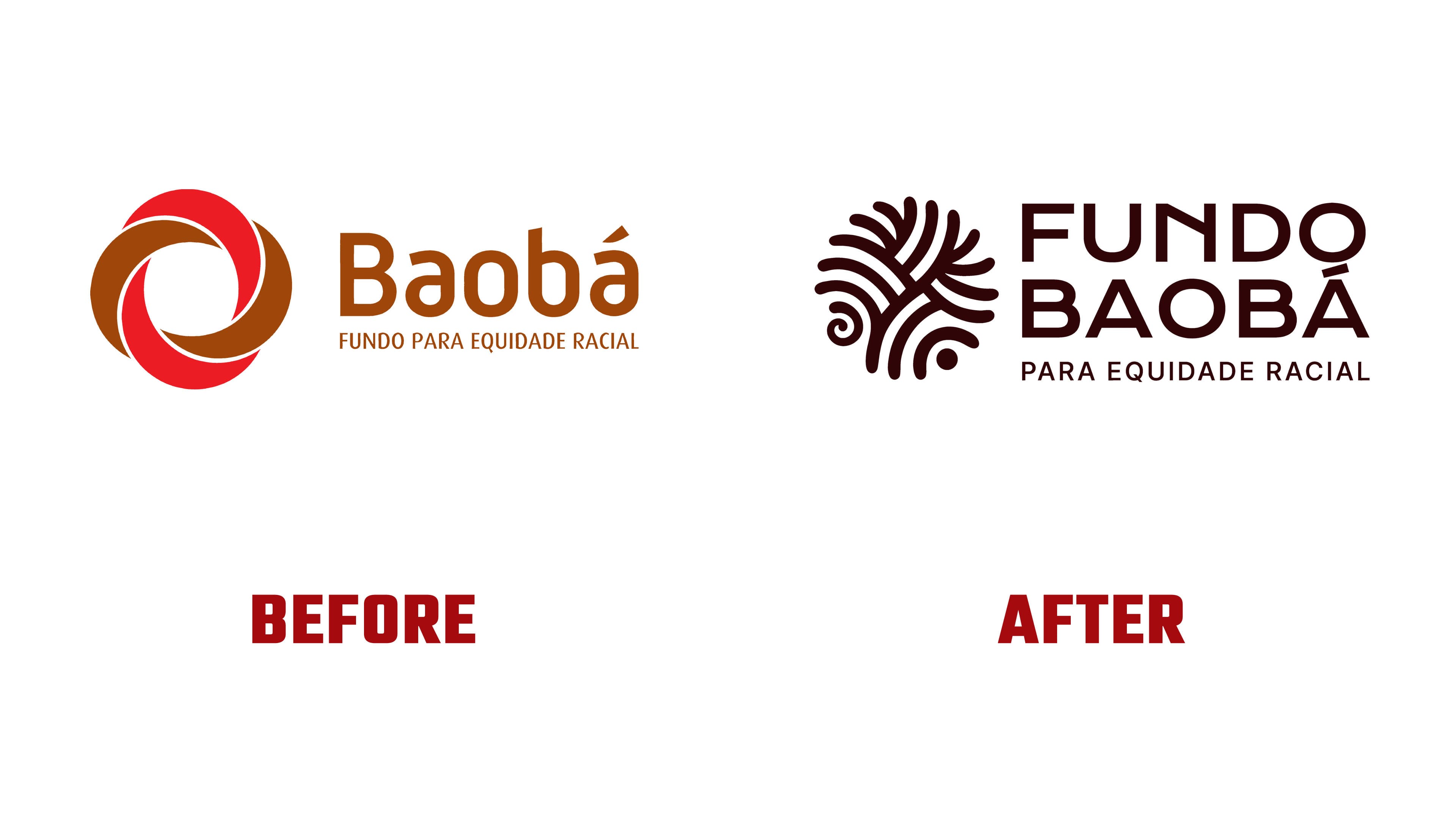
The main change involved the logo. The previous mark consisted of colored ribbons joined to form a closed shape. It recalled collaboration, unity, and public work. The new symbol has a closer connection to the foundation’s name and to the cultural foundation of its mission.
The new logo is connected with the image of the baobab tree, roots, branching connections, and continuity. It explores themes of memory, cultural heritage, and intergenerational connection. The symbol looks to the past, present, and future while keeping the main line of the updated brand.

The text portion of the mark also changed. The previous lettering looked softer and friendlier. The new FUNDO BAOBÁ version is stricter and more composed. The brand is perceived as a major public organization with an important role in the national agenda.
The updated image helps the foundation show its experience, influence, and connection with the cultural heritage of the Afro-Brazilian community. For partners, program participants, and the wider audience, the mark reflects the organization’s long-term work and its place in Brazil’s public life.
The rebrand helped Fundo Baobá align its external image with the foundation’s current scale. The new logo brought the organization’s history, public mission, and future outlook together in one symbol.