


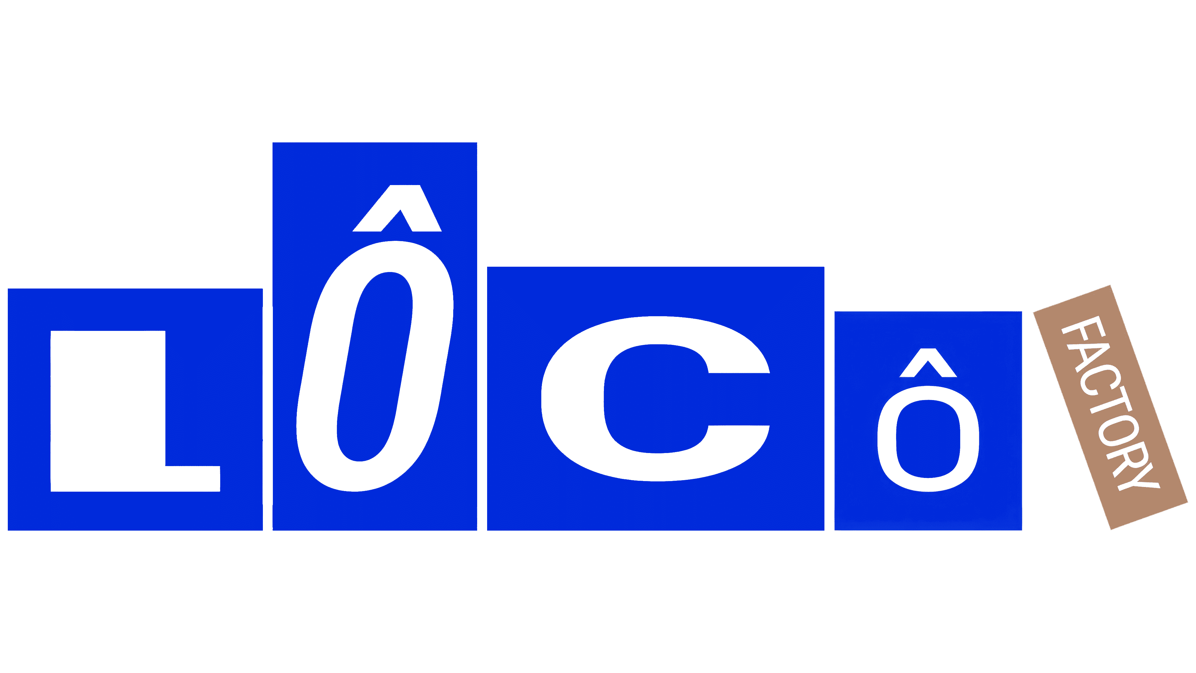
The summer edition of LÔCÔ Art Market in Ho Chi Minh City became LÔCÔ Factory, with an identity inspired by the process of making original work. For the 2026 Fun Xưởng edition, Vietnamese studio M – N Associates created a logo from letter blocks that resemble boxes ready to ship. The factory theme follows the journey of creative work from the studio to the market stall.
The event began in 2017, when publisher and bookstore inpages organized Art Market. It has operated as LÔCÔ Art Market since 2020. Held 3 times a year, in April, August, and December, the fair combines shopping with exhibitions, workshops, and live music. Participants include local brands and businesses run by expatriates living in Vietnam. Market rules require goods to be made and sold within the country, with respect for copyright and documentation of their origin.
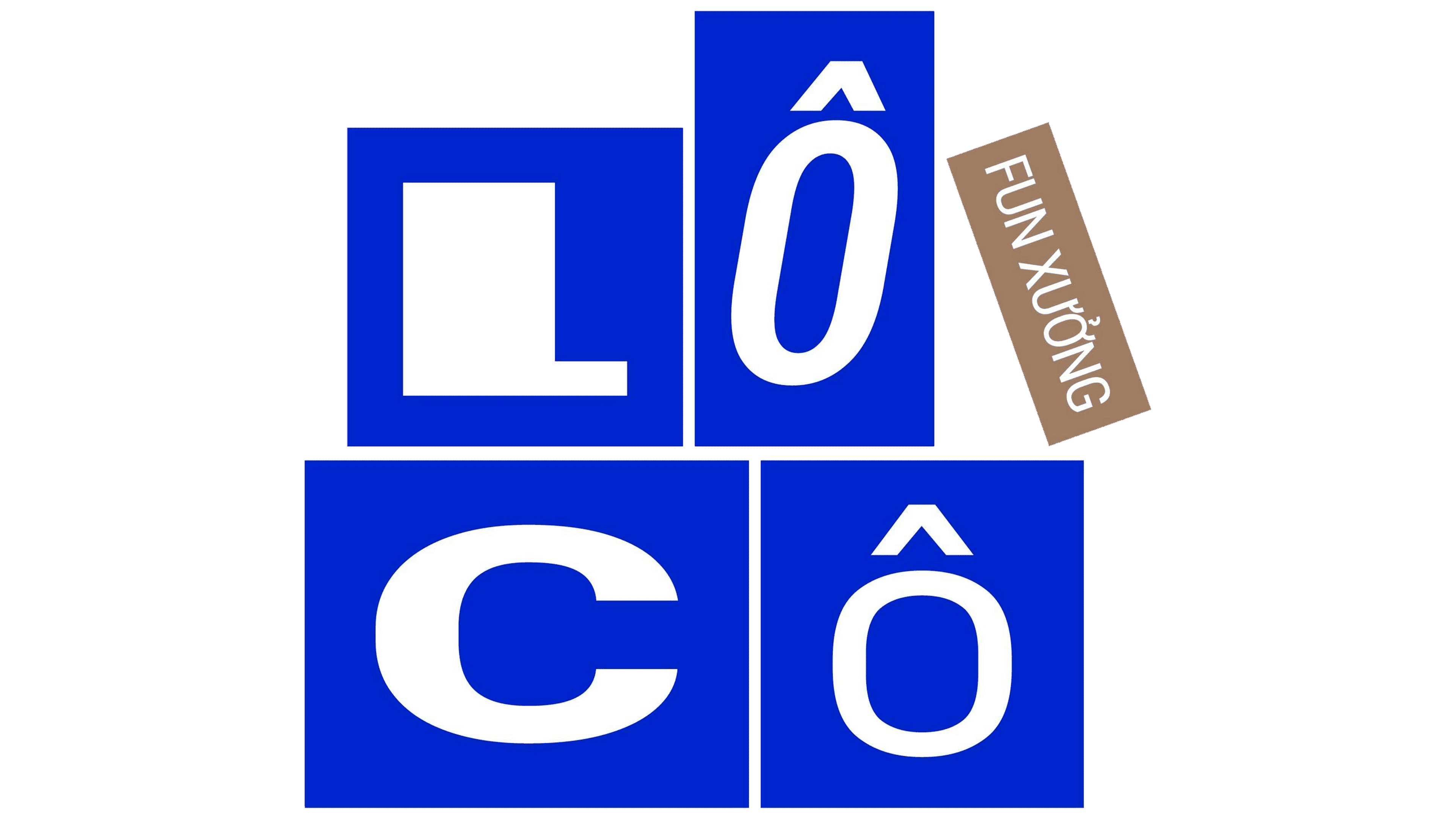
LÔCÔ’s seasonal events each have their own names and identities. In summer 2026, the organizers introduced a new format for working with creative partners, giving participants a role in shaping the market’s future. M – N Associates was tasked with bringing artists, designers, local brands, and emerging teams together around a shared theme. The factory concept connected them through the process of making their work. At the same time, the market brought the finished pieces to the public. A packed parcel represented completed work, with tape marks and stickers hinting at the hands that made it.
The LÔCÔ wordmark places its letters in 4 rectangular blocks. A nearly square box containing the “L” sits beside a tall first “Ô.” Next comes a wide, horizontal block holding the “C,” followed by a smaller upright rectangle containing the final “Ô.” An angled label in the brown of kraft cardboard sits to the right, bearing the word “FACTORY” in white. The blue blocks connect to the LÔCÔ Art Market logo.
The lettering is based on the variable typeface Roboto Flex. Its adjustable settings allowed the designers to adapt the letters’ proportions, weight, and slant to their boxes. The “L” has a heavy vertical stroke, the first “Ô” is narrow and slanted, the “C” is wide and rounded, and the final “Ô” is compact. Both “O” letters retain their circumflex accents. The varying dimensions suggest packaging for objects of different shapes. At the same time, the tilted and overlapping blocks resemble parcels stacked in a workspace.
The logo comes in several arrangements of the letter boxes. Rearranging them produces variations within the same set of forms. To develop these combinations, the studio built an internal Glyph Box Generator, introduced as Funny BoxTool. The agency and market teams use the tool to adjust block sizes and placement according to predefined rules.
Across the rest of the identity, corrugated cardboard textures, packing tape, and shipping marks extend the factory theme. Bảo Trương, Nhi Bùi, and Phương-Anh Nguyễn worked on the project under the creative direction of Duy – N.