


After IGS Energy acquired it, natural gas provider SCANA Energy introduced a new logo and identity. Unveiled on July 29, 2026, the Landor project draws on the bears featured in the company’s advertising. The designers carried their rounded shapes into the lettering, connecting the wordmark with a warm home and customer care.
SCANA Energy has operated in Georgia since 1998, when the state opened its natural gas market to competition. Based in Atlanta, the company serves residential, commercial, and industrial customers. With providers sharing infrastructure and selling the same product, differences often come down to rates. Landor’s research identified another foundation for the brand. Customers valued the way SCANA Energy employees treated them. Hence, the agency focused on helping people navigate their natural gas needs.
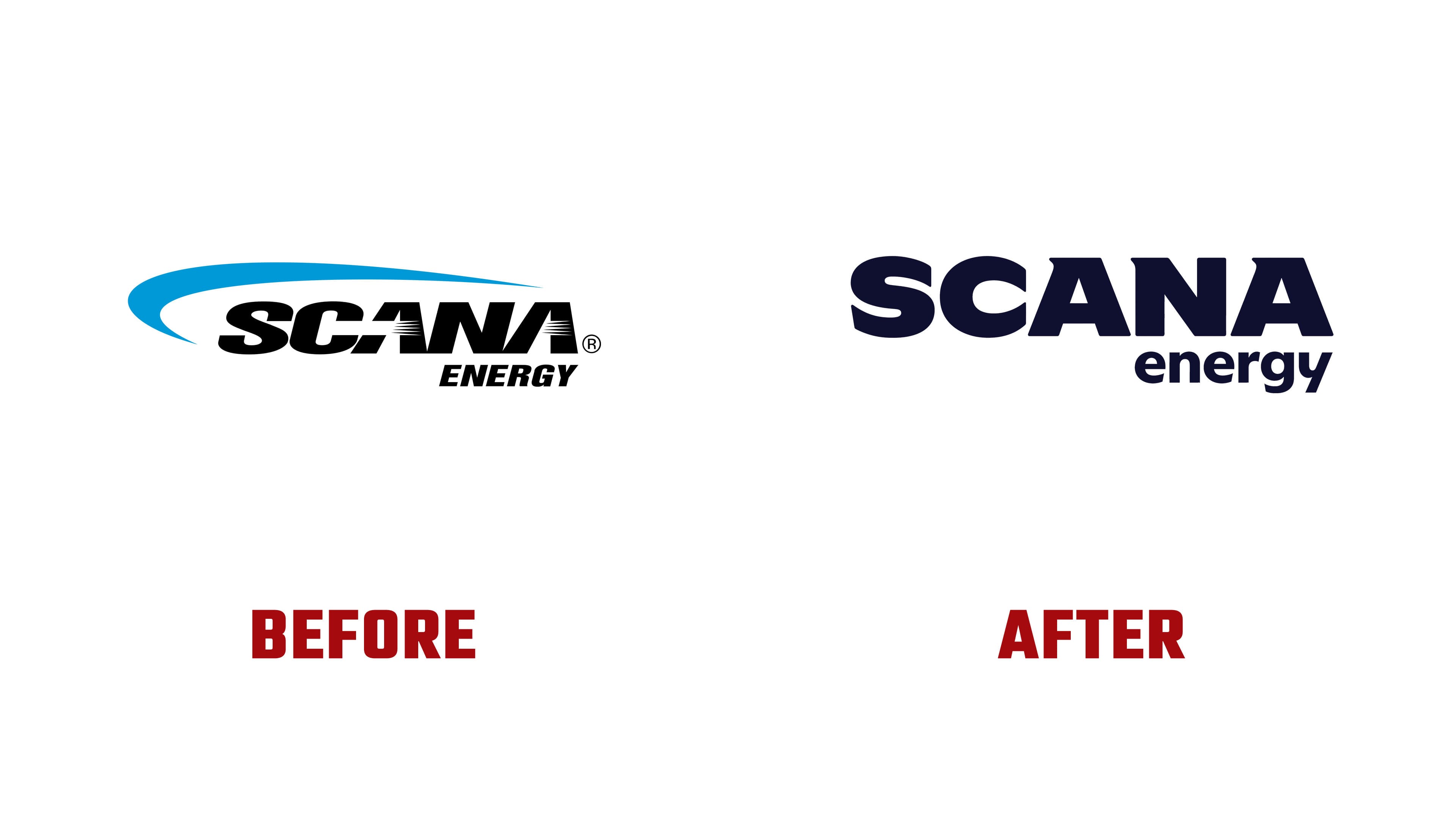
Testing also confirmed the audience’s affection for Harry, Linda, and the cubs from the company’s commercials. Landor put the family at the heart of the “Big Bear Energy” concept. Bears evoke protection and home, while their den suggests staying warm through winter. The logo expresses those associations through rounded letterforms reminiscent of the animals’ ears, paws, and silhouettes.
The previous SCANA wordmark was black and slanted. A light blue arc curved around its left and upper edges, and thin horizontal stripes crossed both “A” letters. ENERGY appeared in uppercase beneath the right side. Landor retained the two-line arrangement, removed the arc and stripes, and straightened the lettering. The upper line remains uppercase, while the lower line is now lowercase. In the primary version, both are dark blue-violet.
The new logo consists entirely of custom lettering developed for SCANA Energy. The heavy “S” and “C” have rounded curves, while straight strokes meet through soft transitions in “ANA.” Small triangular counters remain inside the “A” letters. Short projections appear at the upper-left corners of the “A” and “N.” Beneath the right side of the name, “energy” is set in small, narrow letters. The scale difference separates the company name from its business category.
Supporting materials combine shades of blue with red and pink, referencing flames and Georgia’s climate. BUCK worked with Landor to give the bear family a three-dimensional cartoon appearance. VML developed the television campaign. The new identity appears in advertising, bills, and customer communications.