The Orlando Magic team has unveiled its new logo to fans, and the response has been mixed. The NBA team decided to refresh its visual style after a long period, presenting a new emblem featuring a basketball surrounded by a constellation. While fans had been waiting for overdue changes, many admitted they expected something more expressive.
The previous logo, which featured a dynamic, energetic ball with a “magical” trajectory, was popular among fans for its distinctiveness and recognizability. The new version, however, is contained within a simple circle, with the words “ORLANDO MAGIC” arranged around it in a standard sans-serif typeface. Although the emblem includes three stars symbolizing the team’s “magic” spirit, fans felt the design lacked individuality and intensity.
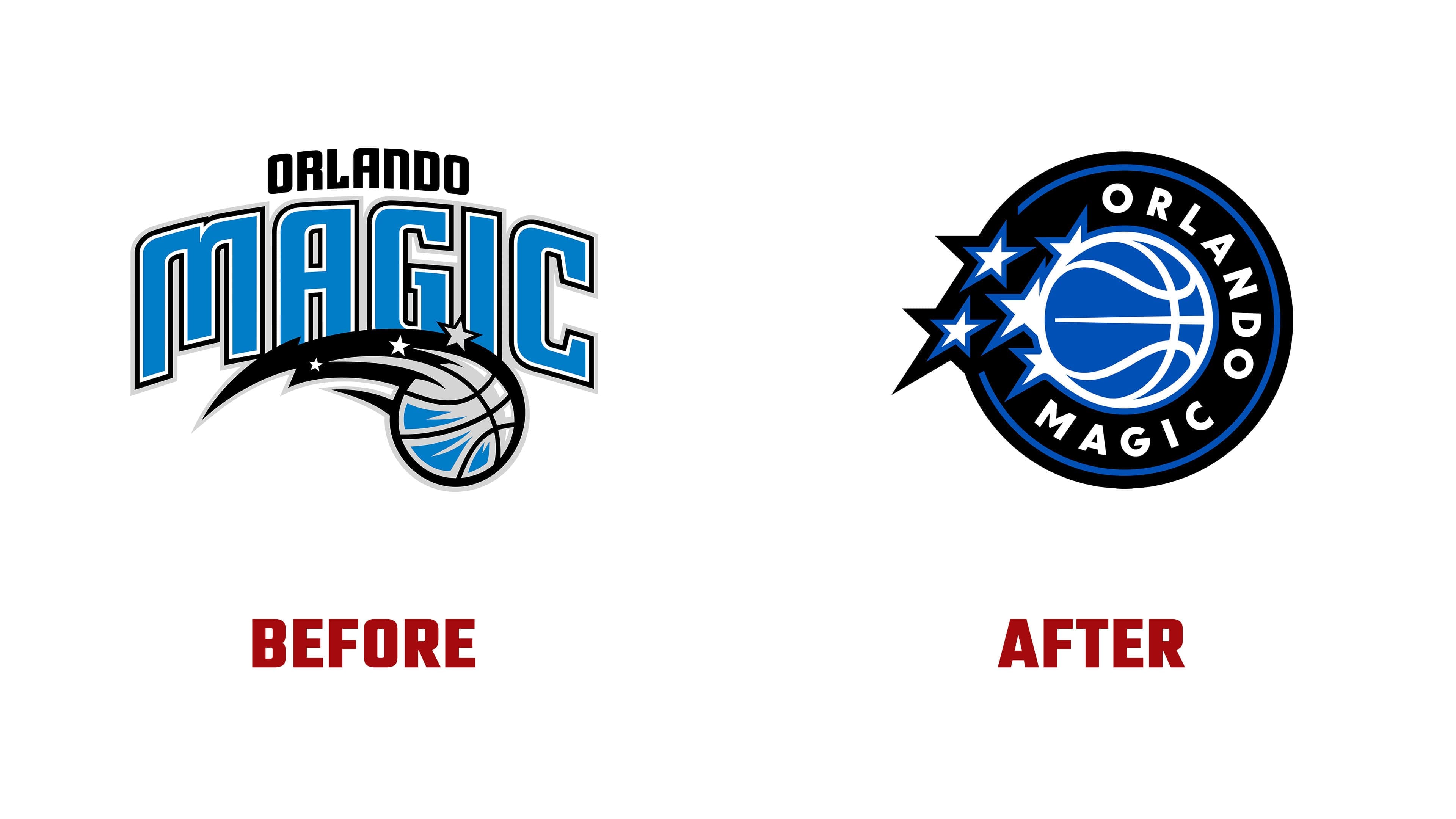
Fans who had grown accustomed to the original logo expressed disappointment. On social media, many openly criticized the update. Some pointed out that the new design is overly generic, easily adaptable to any sport rather than specifically representing basketball. Others felt that in striving to appear modern, the club had lost some of its soul.
On the other hand, the team itself emphasizes the importance of simplicity, believing that this design fits better into digital spaces and opens new branding opportunities. Additionally, the logo forms part of a broader redesign concept, including uniforms and court decorations aimed at uniting players and fans around the team’s championship ambitions.
Team logos must do more than act as symbols; they need to reflect the character, atmosphere, and traditions of their clubs. The updated Orlando Magic emblem has not yet received unanimous support from fans. Still, only time will tell whether it can become established as the symbol of a new chapter in the club’s history.