


Archival drawings, notes, and annotations have become part of Berlin’s KW Institute for Contemporary Art’s new identity. Studio Correspondence combined them with the logo’s historic lettering to create nearly 100 variations. The project was announced on September 29, 2025, alongside the fall exhibition program and presented to the public in October. Collective authorship guides the update.
The work began in the institute’s archives and with its artists. The team digitized around 1,000 drawings, notes, and shapes. The selection included marginalia, fragments of old faxes, signatures, scraps of paper, and drawings from the building’s walls. Traces of earlier work became material for the new identity. The designers see the sketch as the starting point of artistic practice, preserving its tentative lines, irregularities, and freehand quality.
The logo’s fixed foundation remains the heavy uppercase sans-serif “K” and “W” LSD Berlin created in 1999. That year, the institution adopted the name KW Institute for Contemporary Art, and the large initials appeared on invitations against changing colored backgrounds. Correspondence retained the letterforms and introduced variety through handwritten additions.
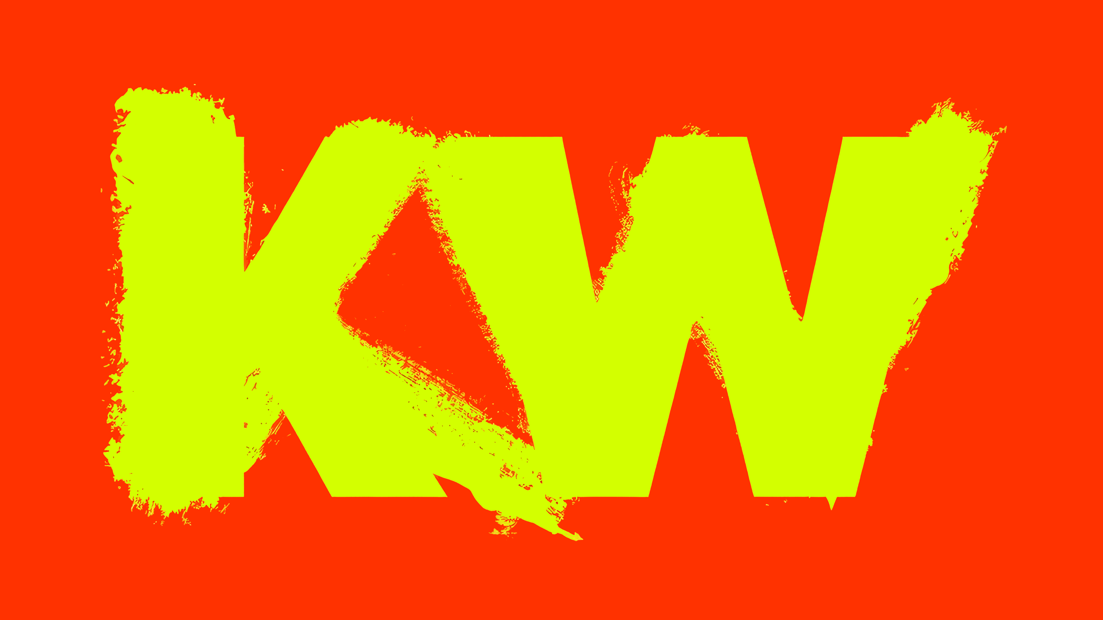
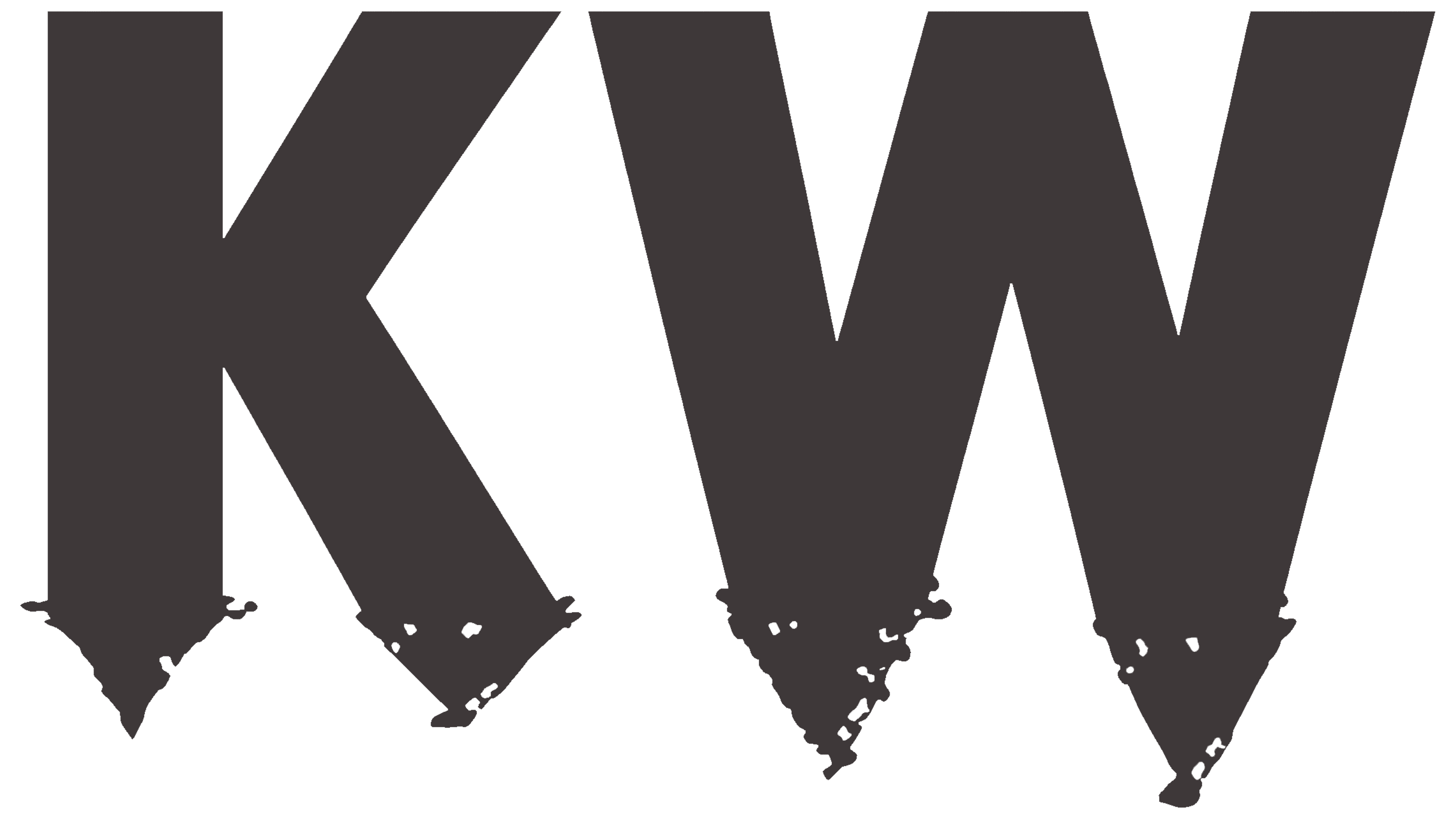
Rings, short phrases, sketches, and individual strokes now surround “KW.” In one version, several circles enclose the letters. In another, a heart appears beside them, while a third includes the handwritten word “Original.” “ThanKW” plays on the English word “thank.” In some versions, brushstrokes extend from the bottoms of the letters, pairing straight edges with thin, wavering lines.
The family of logos is designed to keep growing. For each new publication, the team aims to find a fresh pairing of the initials and a sketch. The letters connect the variations, while the additions let the identity shift from one piece to another. The designers intend the contributions of different people to express the institute’s openness to their ideas.
Work by artists, staff, past project participants, visitors, and children in educational programs continues to enter the archive. Artists presenting exhibitions are invited to leave drawings and notes on KW materials. Staff then digitize these marks and add them to the shared collection. Institute Director Emma Enderby supports collective authorship, expressed through logos that bear traces of different hands.
This interest in working sketches connects to the institution’s history. In 1991, Klaus Biesenbach and a group of young creatives transformed a former margarine factory in Berlin’s Mitte district into a space for contemporary art. Dan Graham later added a pavilion and a new exhibition hall to the complex. The name Kunst-Werke, shortened to KW, connects the German term for works of art with the idea of a place where art is produced. Rather than maintaining a permanent collection, the institute presents exhibitions, lectures, screenings, and performances addressing current social and political issues.
Correspondence, with offices in Amsterdam and Berlin, developed the update. Justus Gelberg and Lucas Engelhardt founded the studio in 2023. In its designs for the institute’s materials, the team pairs freehand fragments with an orderly presentation of information.
The eight core colors come from KW’s surroundings, its building, and artworks on the premises. The names “Tischgrün,” “Türrot,” and “Eierschalengelb” refer to a green table, a red door, and yellowish eggshells. Different color combinations are available for individual exhibitions. Within a given campaign, the same combinations appear across print and digital materials.