



A compass is the new emblem for Explorer Scouts, the UK program for young people ages 14 to 18. It replaces the Scout fleur-de-lis as part of an update to the section’s activities and identity. London agency Red Stone unveiled the project on June 25, 2026. A lowercase “e,” the first letter of Explorers, is hidden within the compass, connecting outdoor navigation with finding a path into adulthood.
The work followed research involving 2,500 teenagers ages 13 to 17, including Scouts members and young people outside the organization. The team visited local groups and discussed activities with teenagers. The previous identity felt like a holdover from another era. With the revised program spanning practical skills, creativity, leadership, and adventure, its identity needed to reflect that range and engage an audience accustomed to discovering brands online.
Explorers launched in February 2002 alongside Scout Network, replacing Venture Scouts, which served members ages 15½ to 20. Explorer units operate at the district level. Members develop skills, earn achievement badges, and work toward the highest Scouting honors, including the King’s Scout Award. Red Stone positioned the program as a place to socialize, explore interests, and try new things outside school demands. The update centers on enjoying shared activities and the freedom to seek answers.
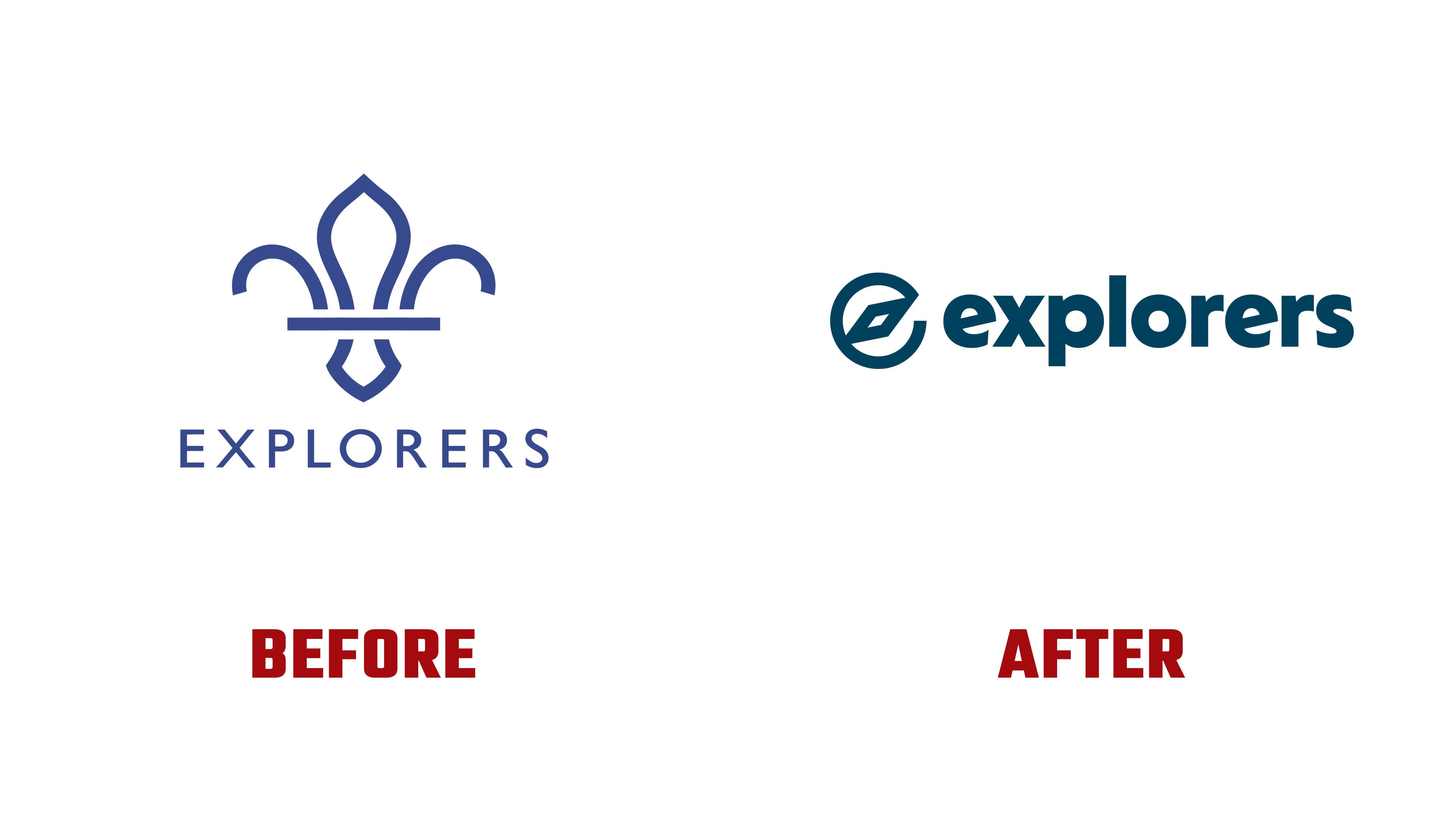
In the new emblem, the compass outline forms a ring with a gap on the right. Inside sits an elongated, diamond-shaped needle with a small opening. It points from the lower left to the upper right. Together, the ring and needle form a lowercase “e.” The designers intended the compass to represent the freedom to explore, with navigation referring to both outdoor adventures and the members’ journey toward adulthood.

The logo’s layout has also changed. Previously, a blue fleur-de-lis sat above “EXPLORERS,” set in widely spaced Gill Sans capitals. The new emblem and name sit on a single line. The compass appears on the left, followed by “explorers” in tightly spaced lowercase sans-serif letters. The teenage section now has a distinct emblem in place of the shared Scouts symbol.
The wordmark combines heavy strokes with rounded contours. The crossbars of both “e” letters follow the angle of the compass needle, while the remaining letters stand upright. This repeated diagonal connects the name to the emblem. In the launch presentation, the dark logo appears against a bright yellow-green background.
Local groups can customize the logo for free through the Scouts Brand Centre. For branded apparel, Red Stone created a series of “logo expressions,” variations that allow units to convey their individual identities. Enlarged sections of the compass form bold patterns inspired by the Scout neckerchief.
The updated program took effect with the fall 2026 school term. Launch materials included post templates, award booklet covers, and artwork for 40 badges. Local groups have until September 2027 to complete the transition.