


Public transportation helps millions of people get to work, school, doctors, stores, meetings, and home every day. World Public Transport Day was created around this idea. The international day was launched in 2026 at the initiative of the International Association of Public Transport, UITP.
For the first global campaign, Creative Concern created a unified identity. The mark was designed for different countries, different writing systems, and cities with different transportation networks.
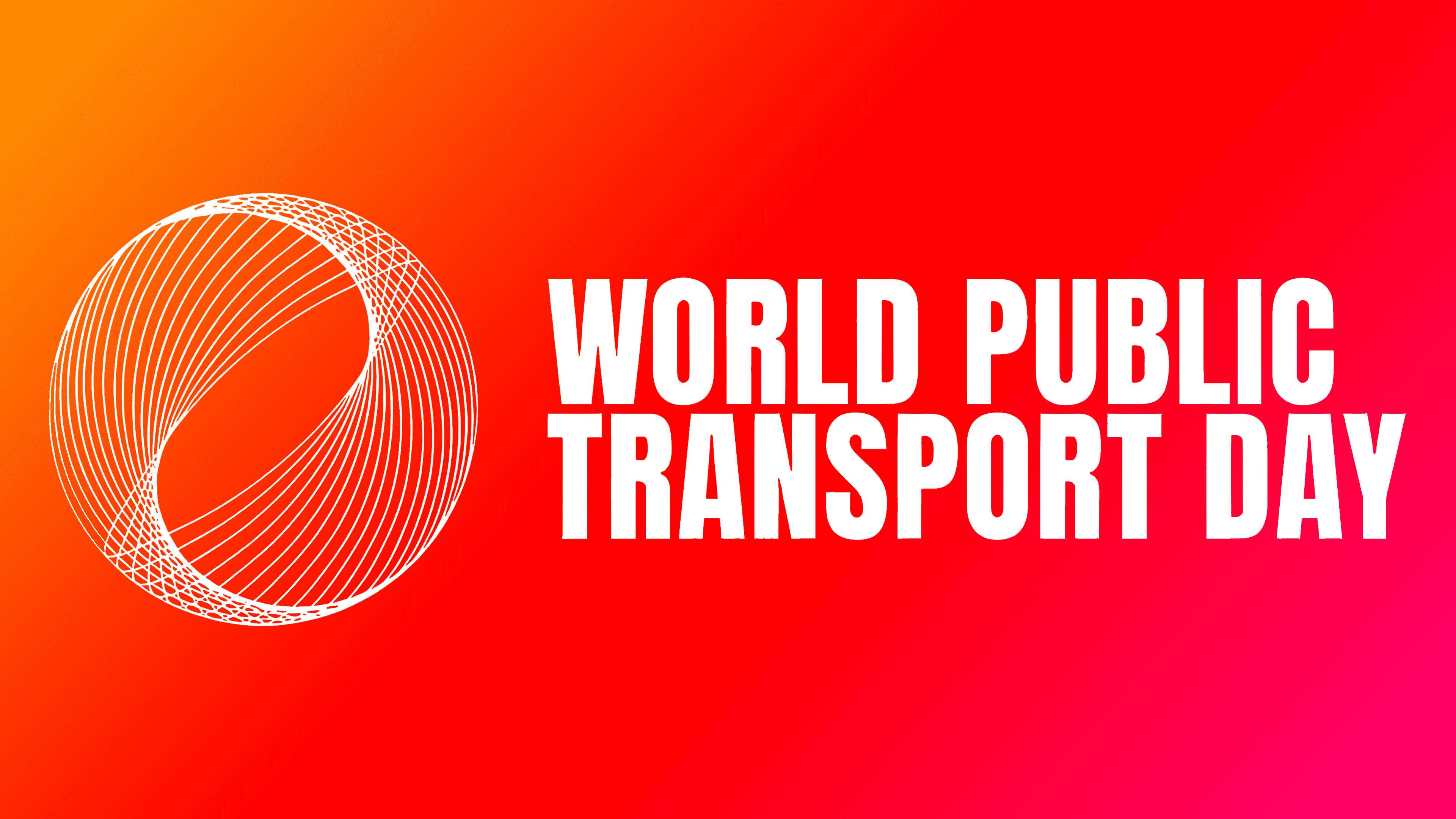
The main part of the brand is the logo. It is based on a round abstract mark made of many intersecting lines. It suggests routes, transfers, connections between neighborhoods, and trips across the city. The designers used an abstract network image instead of buses, trains, tracks, or roads. Because of its universal form, the mark is applicable across different countries and types of transportation.

The lines within the circle convey the connections among people, streets, neighborhoods, and cities. The round form recalls the international scale of the date. Public transportation is shown as a large network that supports the familiar rhythm of urban life.
The WORLD PUBLIC TRANSPORT DAY wordmark is set in a dense, narrow sans-serif with tall letters. The typeface suits the urban environment, large applications, posters, screens, and digital materials. Together with the circular mark, it creates the image of a public initiative with international reach.
While developing the brand, the team needed to give the campaign a shared visual code. It could be used by transportation companies, city governments, professional associations, passengers, and public organizations. The identity is based on the theme of connection, which brings people from different cultures closer together. The system used colors without ties to specific countries or political forces. Versions in different languages accounted for different writing systems.
The logo is connected with the campaign slogan “One Day. Millions of Journeys.” The phrase conveys the idea of one shared day filled with millions of trips, meetings, and routes. The mark, made of intersecting lines, shows the scale of daily contacts enabled by public transportation.
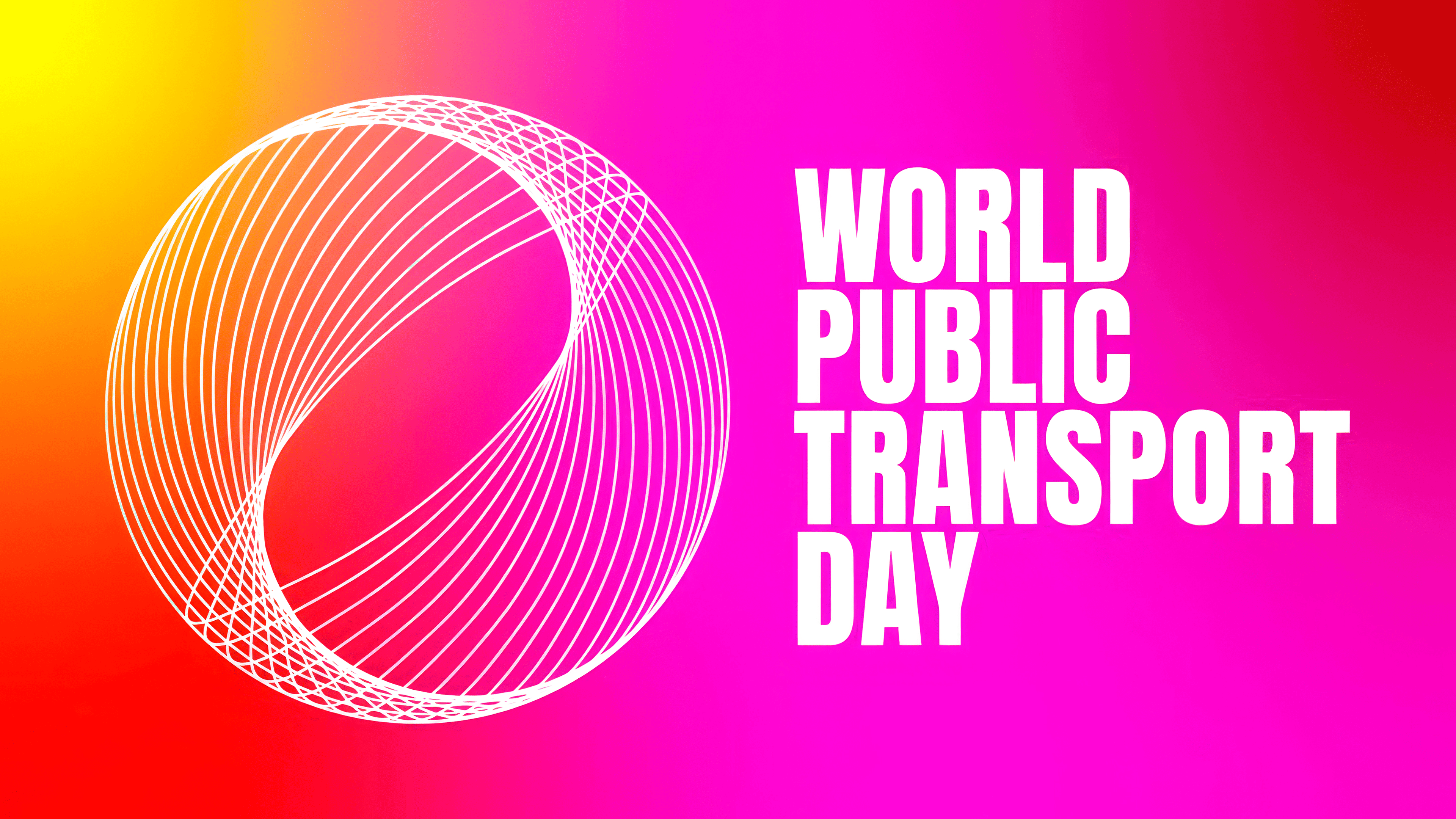
The first World Public Transport Day campaign took place on April 17, 2026. Organizers expected about 50 cities, and the initiative was joined by 148 cities from 76 countries and 186 organizations. The logo appeared on participant materials worldwide and was used at city events. Niagara Falls, the CN Tower in Toronto, and the Burj Khalifa were lit in support of the date. On the Burj Khalifa, the logo was displayed alongside the slogan in Arabic.
For World Public Transport Day, the logo became a sign of the shared idea. The image of intersecting routes shows how public transportation connects people with work, services, meetings, and opportunities, and connects cities to their everyday life.