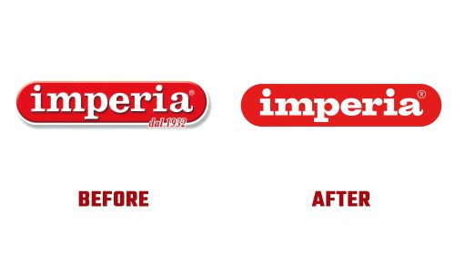
Imperia, the well-known Italian manufacturer of fresh pasta machines, has launched a new brand identity. Founded in 1932 and based in Rome, Imperia is a leading name in the culinary world, providing high-quality pasta makers and kitchen appliances globally. The company has updated its visual identity with a new logo designed by Landor’s Milan office.
The new logo is simpler and more confident, reflecting the company’s dedication to quality and craftsmanship. It uses a bold and elegant slab serif typeface. The letters are meticulously crafted, with precise lines and clean angles. The redesign of the letter “a” features a unique, slightly quirky appearance, adding distinctive character.
The logo’s pill-shaped holding form is retained but simplified, offering a modern and clean look. This shape is integrated into animations, transforming into various pasta shapes and adding a dynamic element. The wordmark animation enhances the brand’s playful and innovative image.
A custom typeface accompanies the logo, reminiscent of classic Helvetica but with unique features. The terminals have large, curvy dimples, giving the typeface a wobbly, playful feel. This design choice adds a fresh aesthetic, offering a new take on traditional typography. The ligatures resemble twirling fettuccine, adding a culinary touch to the text.
The logo uses a vibrant color palette, with flat blocks of color that stand out and grab attention. The bright colors reflect the brand’s lively nature, appealing to domestic and professional customers. The choice of colors helps to differentiate Imperia from its competitors, positioning it as a leader in the market.
The size and placement of the logo elements ensure balance and harmony. The wordmark sits comfortably within the holding shape, with ample spacing. The clean lines and precise angles contribute to a sense of order and professionalism, aligning with Imperia’s reputation for quality and reliability.
Imperia’s new brand identity showcases its commitment to innovation and excellence. The updated logo and typeface reflect the company’s heritage while embracing modern design principles. This rebranding enhances the brand’s visual appeal and reinforces its position in the culinary industry.


