Petoskey Area introduced a new style and the tourism campaign “It’s Kinda Unreal.” PETERMAYER handled the project. The update affects the region’s overall image, with the logo taking the lead role. Through the new logo, the brand communicates the place’s connection to nature, calm travel, and renewal.
The previous Petoskey Area image was built on direct explanation. The old logo showed the region through the outline of Michigan, a map marker, and the website address. The new mark moved away from the map and geographic cue toward a symbol of the area’s nature. Its form can suggest a sunset, a flower, a snowflake, and a Petoskey Stone, one of the region’s main natural symbols.
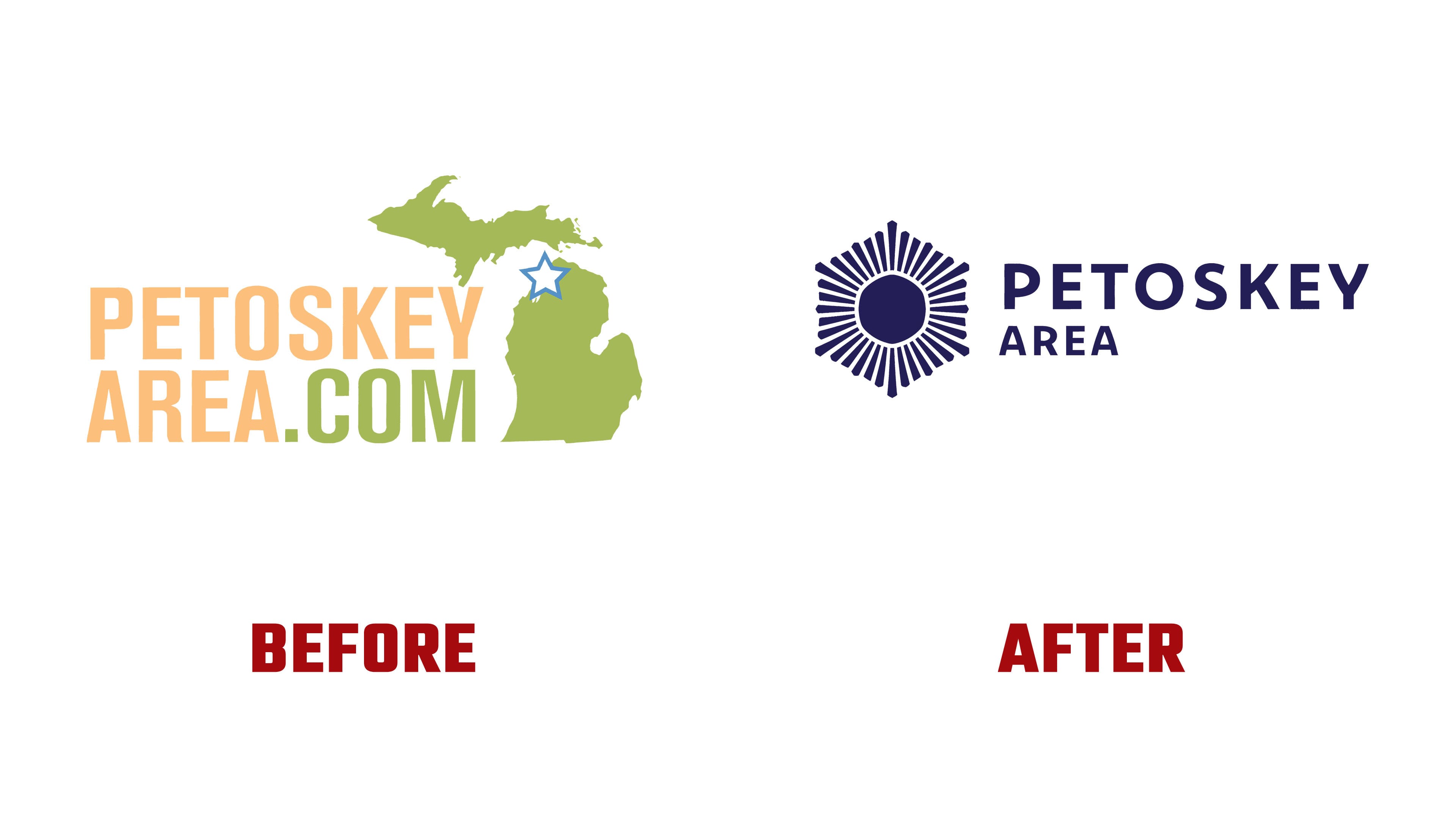
The emblem is based on the Petoskey Stone pattern, which is about 300 million years old, and local sunsets. Combining these two images created the mark that now anchors the updated identity. It replaces a dry map reference with an image tied to the personal feeling of a trip.
The new logo is aligned with the destination’s updated positioning. The region moves away from the usual presentation through lists of attractions and routes. The focus is on the state a person feels after the trip, when they rest, slow down, and feel connected to nature. The campaign uses the idea of resetting the inner compass.

Through the logo, the region is presented as a year-round destination, a place people visit for its atmosphere, rest, and the desire to return.