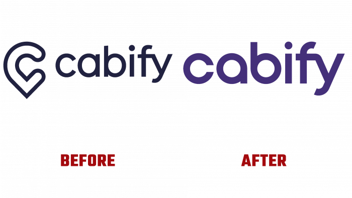
The Spanish ride-sharing company Cabify, which provides rental cars via a mobile app, entered the market in 2011. First, she started in Madrid, where she was founded, then became popular in Latin America. At the moment, she is known in Argentina, Colombia, Ecuador, and other Spanish-speaking countries.
The Cabify brand is part of Maxi Mobility. This holding united private and business users who are interested in different types of transport for their requests. A robust business system and model helps promote the company’s ethical principles, which are described as “mobility is not just a service.” The brand’s management insists that their company policies and activities are based on the principle of a green and safe future, respect for the environment, and customer focus.
Creative agency In-house was engaged in the development of the logo. Even though the company was founded in 2011, the evolution of the logo shows that, in general, the brand has always been defined by a geolocation mark and inscriptions in different fonts. These were mainly lilac and black shades and a red circle in the geolocation mark in the first logo.
The current logo stands out with a nice round and coherent font. The first three letters C, A, B, are circular, which hints at a connection with transport, or rather, wheels. The letters F and Y are combined at the end of the name but do not form any visual image.
Nevertheless, the logo looks stylish and serious. Companies often strive to simplify their identity. In this case, we see the same trend, but not to say that it lacks brand identity. The logo is simple, minimal, and the lilac color adds playfulness to the look.


