


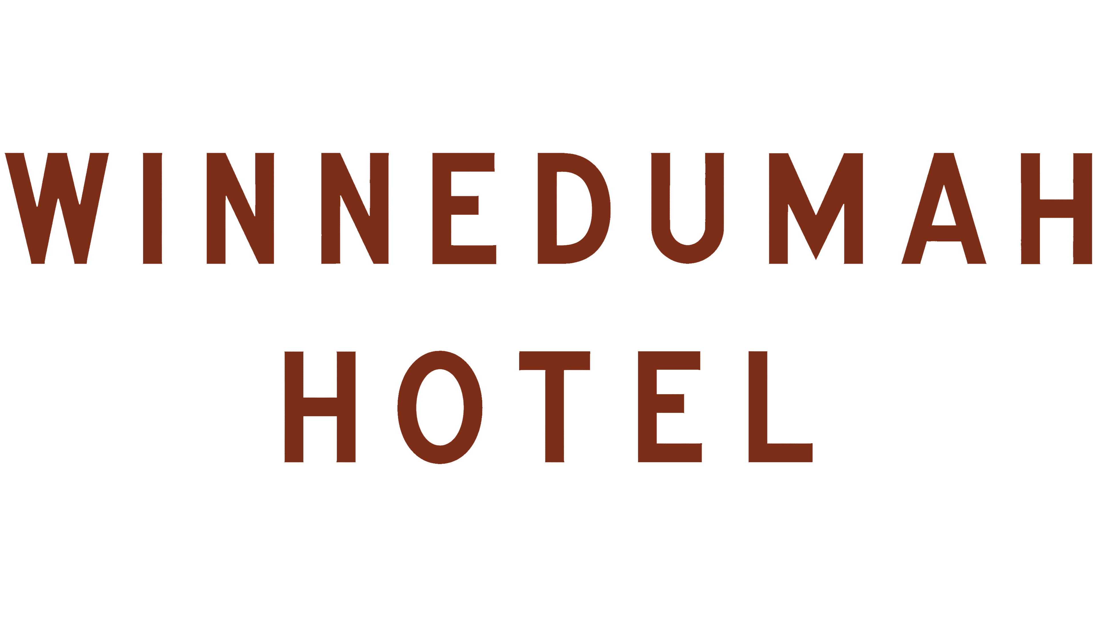
An old Winnedumah Hotel sign inspired the hotel’s new logo in Independence, California. Los Angeles studio Club recreated the lettering from the surviving sign. It incorporated it into the hotel’s identity after completing its restoration in September 2025.
Founded by Maude and Walter Dow in the 1920s, the hotel sits in the Owens Valley between the Sierra Nevada and Inyo mountain ranges, on the ancestral lands of Payahuunadü. Over the past century, it has welcomed travelers, artists, poets, photographers, and filmmakers. It reopened after restoration with 24 rooms, including 3 suites. Club began by examining historic objects and lettering that could connect the renovated hotel to its past.
The name Winnedumah comes from the Paiute Monument rock formation, visible from the front porch. The hotel associates it with a local legend about two brothers turned to stone and translates the cry “Winnedumah” as “Stay where you are.” The name preserves the hotel’s connection to the surrounding area.
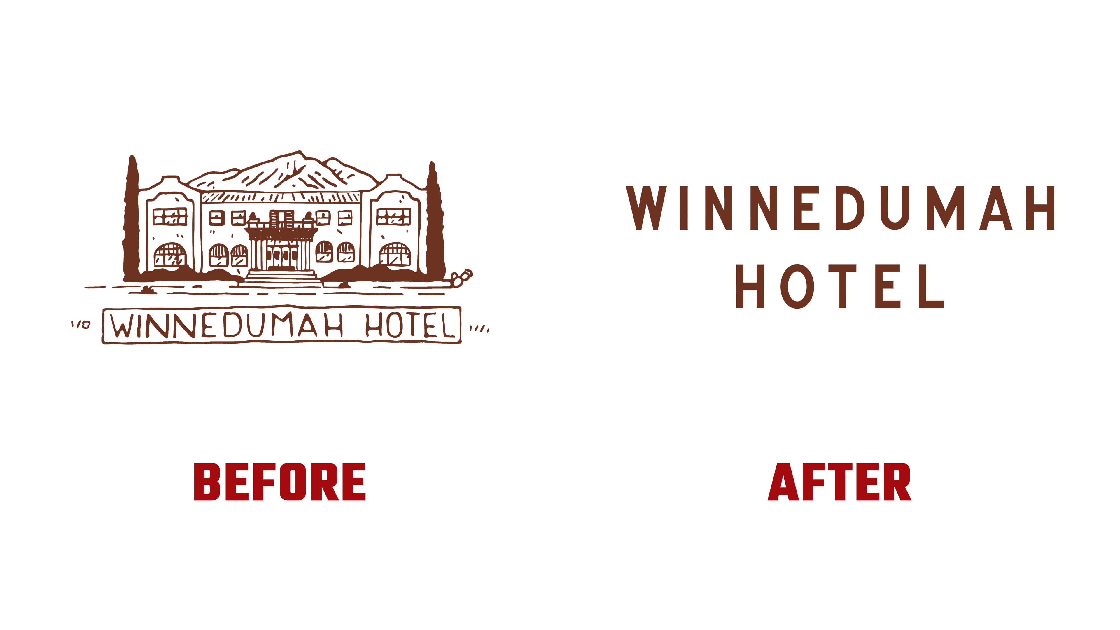
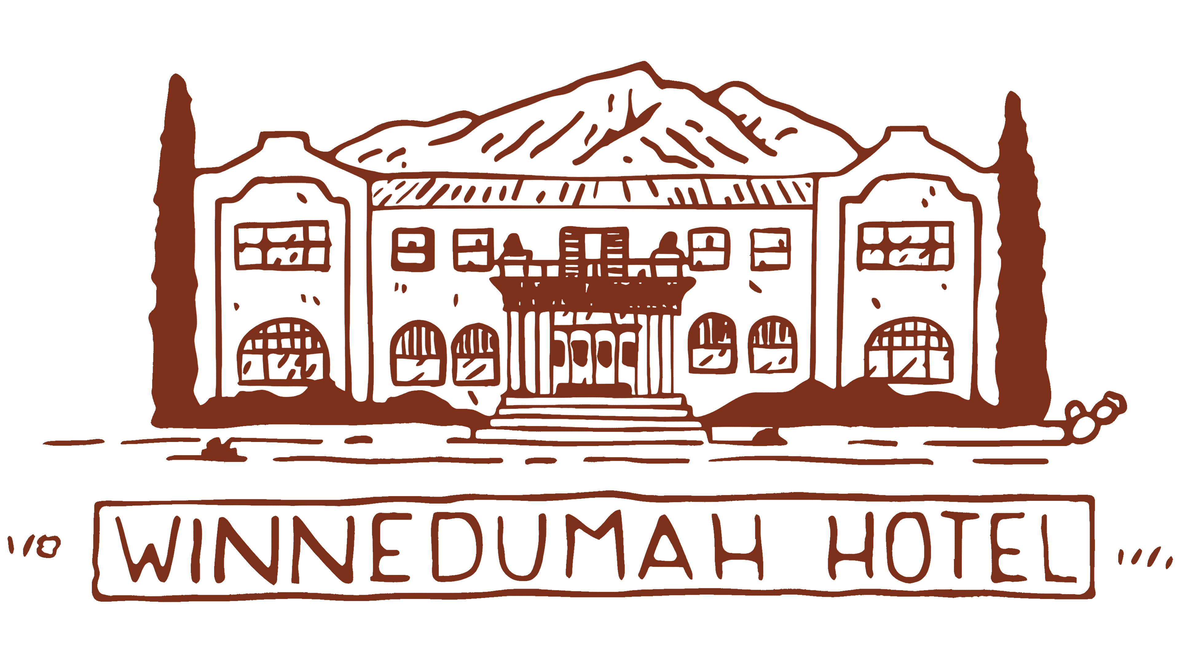
The previous emblem depicted the hotel’s facade in brown linework. It showed arched windows, a balcony above the entrance, and steps, with trees on either side and mountains rising behind the building. The name WINNEDUMAH HOTEL appeared in a frame below. The drawing resembled an illustration on an old postcard. Club replaced the detailed building illustration with a wordmark.
The team based its work on a damaged sign discovered after the property changed hands. The sign had been discarded, but its lettering survived. While studying the letters, the designers noticed tiny serifs at the ends of the strokes. They used them as a starting point for reconstructing the letterforms. They redrew the name for print, screen, and sign use.
The new logo places WINNEDUMAH on the top line, with HOTEL centered beneath it. The uppercase letters are generously spaced. Elongated forms in the “O” and “U” sit alongside the angular “W” and “M.” Small projections at the stroke endings echo details from the old sign. The primary version is brown on a light cream background. For a secondary monogram, the studio stacked a “W” above an “H.”
The exterior sign uses a separate lettering style. Club drew inspiration from hotel signs dating to the valley’s early settlement and traditional hand-lettering techniques. The identity’s colors come from old Winnedumah matchbooks and the dark shades of the Eastern Sierra’s volcanic rock. Historic printed materials and the former Independence Hotel’s branding informed additional variations within the identity.