Lithuanian basketball club Zalgiris, headquartered in Kaunas, recently took bold steps to revamp its brand. With a legacy stretching back to 1944 and an enviable collection of championships, the club’s updated branding aims to blend its rich history and forward-looking ambitions seamlessly.
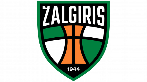
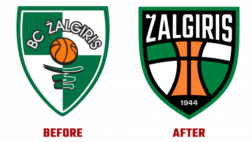
The basis of this ambitious endeavor is the newly redesigned Žalgiris logo. The prior logo had remained unchanged for a quarter of a century despite criticism for being overly intricate and not conducive to digital formats. The fresh logo retains two fundamental elements—its signature green, orange, and black colors and the iconic checkerboard pattern. However, these features have undergone a transformative update. The checkerboard melds seamlessly into a basketball motif, providing a centralized focal point for the shield-shaped design. A more strategic use of black has amplified the logo’s visual impact.
While the new Žalgiris logo has mostly received praise for its modernized typography—characterized by a flattened top and sleek bottom arch—it has not been without controversy. A point of debate has emerged concerning the discrepancy in visual weight between the characters “Ž” and “S.” Nevertheless, the revised design is being hailed as a timely upgrade that preserves the essence of the team’s heritage.
Another striking feature of the rebranding is the introduction of a bespoke typeface. Purposefully designed with an urban, gritty character, the font avoids curves, imbuing the brand with a street-smart allure. While compelling in its own right, this newly minted typeface creates a palpable tension when set against the more refined Žalgiris logo. The challenge moving forward will be to reconcile these divergent thematic tones to establish a harmonious, unified brand identity.
This revamping process points to a strategic shift, aiming to align the club with contemporary sporting trends while honoring its storied past. It’s a precarious balancing act—melding the new Žalgiris logo with the custom typeface—yet one that mirrors the club’s trajectory. As BC Žalgiris aspires to maintain its longstanding success while also breaking new ground, finding equilibrium in its branding will be a crucial part of the journey.
The club has set the stage for a new chapter that respects its enduring legacy while unflinchingly navigating the demands of modern sports branding. The path ahead may be fraught with challenges, but BC Žalgiris appears to be taking them head-on, setting the standard for tastefully modernizing a beloved sports brand.


