The Zalgiris logo is a powerful symbol that reflects the club’s enduring legacy in basketball. It serves as a visual promise of quality, commitment, and dynamism, reinforcing the brand’s reputation in the eyes of fans, players, and stakeholders. The logo symbolizes high standards of sportsmanship and team spirit.
Žalgiris: Brand overview
BC Zalgiris, a renowned basketball institution, traces its history back to 1944 in Kaunas, Lithuania. From 1945-1947, the team was called ASK, then SKIF until 1949, and in 1950 it was named Žalgiris. The team achieved significant success at the beginning, becoming the champion of the USSR Supreme Basketball League in 1947 and 1951. Along with these achievements, the team became the Lithuanian champion several times. Such well-known personalities in the basketball world as Arvydas Sabonis, Modestas Paulauskas, and Šarūnas Jasikevičius proudly represented Zalgiris, raising its status in the sport.
In the 1980s, Zalgiris reached a new level with three consecutive victories in the National League of the Soviet Union from 1985 to 1987. These victories were all the more gratifying because they were won in decisive matches against such formidable opponents as CSKA Moscow. With the declaration of Lithuanian independence in 1990, Zalgiris did not lose their momentum. They continued their dominance in the Lithuanian Basketball League (LBL), winning 24 Lithuanian league titles. Their competence was not limited to local leagues: in 1999, after winning the Euroleague, they attracted international attention.
Since the 2011-2012 season, the team’s home court has been Zalgiris Arena, which was opened right before EuroBasket 2011. Consistent achievements over the years have strengthened the position of BC Zalgiris as a beacon in Lithuanian basketball, leaving an indelible mark both domestically and internationally.
Meaning and History
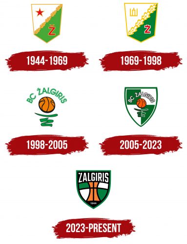
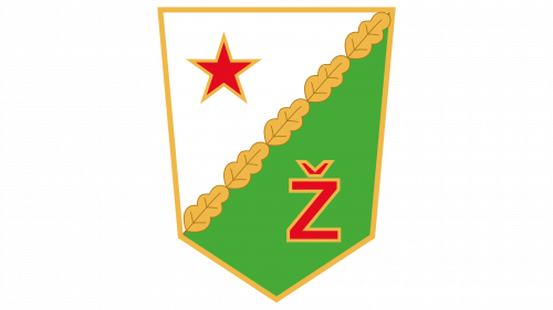
1944 – 1969
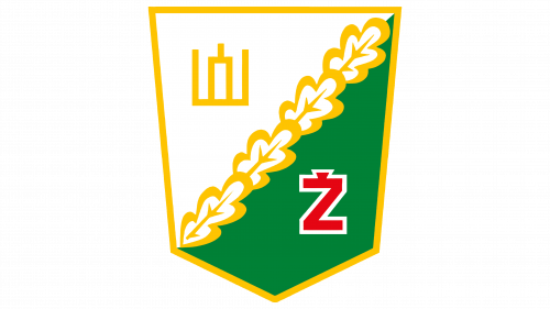
1969 – 1998
1998 – 2005
2005 – 2023
2023 – today
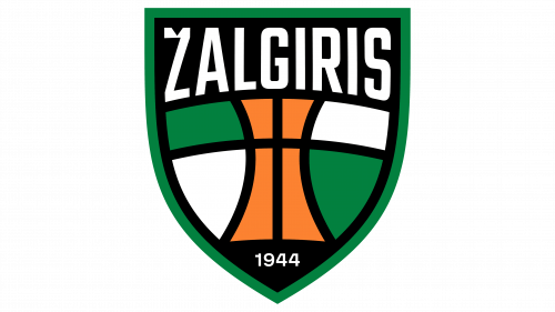
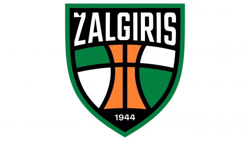
The basketball club emblem is a large shield visually divided into several zones. The arrangement of lines resembles the pattern on a basketball, so the figures are not regular geometric shapes but are closer to triangles, trapezoids, and wide arcs. The elements in the center are painted in orange and on the sides – in white and green. The year of the team’s foundation is indicated at the bottom of the narrow part of the emblem, and its name is at the top of the widest part. The text is typed in bold. Glyphs are tall, straight, and smooth. The shield is framed by a frame.
The use of the shield shape in the logo brings to mind tradition and defense – important aspects of basketball. Irregular geometric shapes reminiscent of a basketball give the logo a dynamic and sporty character. The use of orange, green, and white makes the color scheme dynamic, reflecting the team’s colors. The bold font used in the name conveys strength and stability, which is in keeping with the aggressive yet coordinated nature of basketball.
