


WTWH Media has brought more than 40 media brands and 45 industry events under the Arrowfly corporate name. The U.S. company announced the change on July 13, 2026. New York agency Tipping Gardner developed the name and logo. The publications and events retain their existing names. At the same time, the shared brand helps partners understand their connections and the business’s scale.
Founded in 2006, the company grew over 20 years from the engineering publication Design World and a collection of technical websites into a group spanning media, business events, and marketing. Its portfolio expanded into healthcare, life sciences, foodservice, retail, and hospitality. A 2022 partnership with MountainGate Capital supported further growth. As the company made acquisitions, it needed to present its industry brands as parts of a single organization.
According to Tipping Gardner, the WTWH name still suggested a traditional publisher in 2025. The abbreviation stood for “Willing To Work Harder.” For the update, the agency interviewed project stakeholders and held a working session with leadership. The new identity builds on the publications’ editorial authority and the professional communities around them.
Arrowfly combines the words “arrow” and “fly.” The designers associate the name with the company’s precision, focus, and energy. An arrow is built into the “o.” Diagonal gaps cut through its circular outline, and a triangular arrowhead projects beyond its upper-right edge. The letter resembles a compass housing with a pointer aimed up and to the right. The agency includes this compass association in its explanation of the logo, bringing name and symbol together in one wordmark.

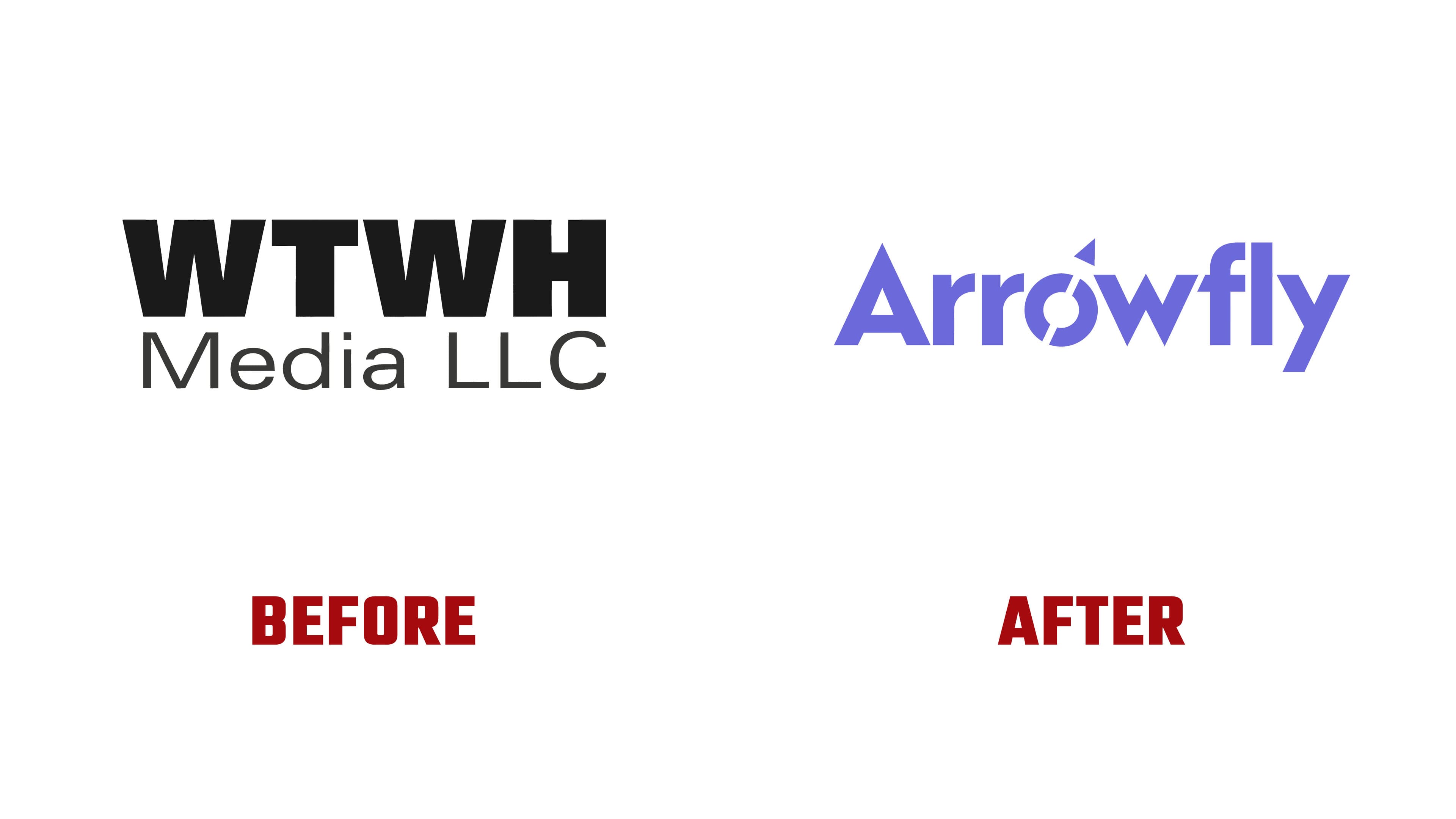
Angular forms appear throughout the other letters. The uppercase “A” has a triangular construction, the lower points of the “w” are sharp, and the “y” continues the diagonal theme. Heavy sans-serif strokes bring the name together in a continuous line. The previous logo consisted of a bold black WTWH abbreviation with a thin Media LLC descriptor beneath it. The company now uses a purple Arrowfly wordmark with an uppercase “A” followed by lowercase letters.
Purple helps distinguish Arrowfly from competitors with more subdued corporate identities. Dark blue, light blue, and light gray complement it, while backgrounds use a purple-to-indigo gradient. A 25° angle from the logo carries into slanted bands and geometric shapes throughout the identity. Versions with the descriptors Engineering and Food | Retail | Hospitality identify different business areas.
The identity is designed to work across sizes and applications, from a browser favicon to a stage backdrop at an industry event. For the July launch, Tipping Gardner prepared a brand book and identity guidelines. The agency also developed “Living the Brand” sessions to help employees use the identity and represent the company as Arrowfly.