 Europe’s largest industrial group Glamox from Norway, in the field of development and production of professional lighting solutions, has changed its identity. Founded in 1947, today it brings together some of the world’s leading brands, including Glamox, Aqua Signal, Küttel, LINKSrechts, Luxo, Luxonic, and Norselight. In its constant desire to provide the consumer with only the most effective solutions, quality products, service, and support, the brand has created its research and testing facilities, where it carries out professional testing of each of its developments. All company products are certified and meet all quality standards and environmental requirements. To achieve its goals, the group uses the latest technologies, knowledge, and experience gained over the years of its existence, which is reflected in the new visual identity presented by the brand.
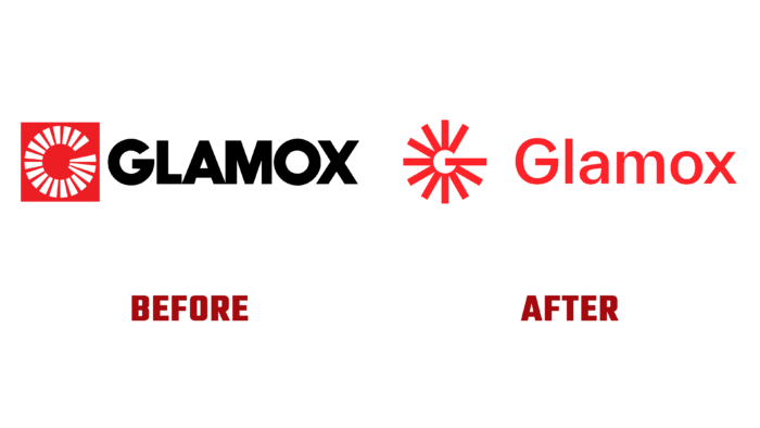
Over the past few decades, the group has not paid serious attention to its image. But the requirements of the present and the changes in the company’s strategy became the reason for the rebranding. The new logo has become more modern and concise, ensuring the simplicity and ease of its placement on any digital resources and printed media. Since the previous version performed its function very well and it was necessary to ensure maximum recognition of the updated brand, the image was built using the main elements of the previous visualization. In parallel, the formation of a pronounced individuality was ensured.
In the process of processing, the symbol “got rid” of the frame and was simplified as much as possible. The light source symbol, developed during the previous rebranding, acquired clarity and contrast, making it possible to associate it with light rays and brilliance. It is filled with positivity and a feeling of warmth and openness of space. A thin G emphasizes this effect with a slash. The graphics of the monogram in combination with the stripe also look impressive, which provides a harmonious completion of the formation of the letter. The result is a bright, shining icon that adds to the attractiveness of the created corporate look.
The graphic execution of the beams that emanate from the symbol and have dynamics provides a powerful message to the viewer watching the logo, both digitally and in analog. The new identity is modern and dynamic, making Glamox stand out from the competition.
An important role in reflecting the main concept of the brand is played by a carefully selected color palette. The combination of bright red and dark purple provided the image with a cheerful atmosphere, favorably highlighting the main graphic motif against its background – a pattern created by thin outgoing light rays.


