Bank of Toronto – CIBC – is a fairly large figure in the banking sector. The history of this bank begins in June 1961, when the merger of The Canadian Bank of Commerce (created in 1867) and the Imperial Bank of Canada (appeared in 1875) took place. This is how the new Canadian Imperial Bank of Commerce, aka CIBC, was introduced.
During this time until today, the organization has seen many transformations, reorganizations, restructuring. However, a sign of stability was not only the fact that the bank remained afloat during all the crisis periods but also the fact that the bank was not looking for its new image for quite a long period. There was no need to rebrand the visual presentation, perhaps because the bank’s administration was too conservative about such changes and did not want to prevent the bank from developing in the direction of stability.
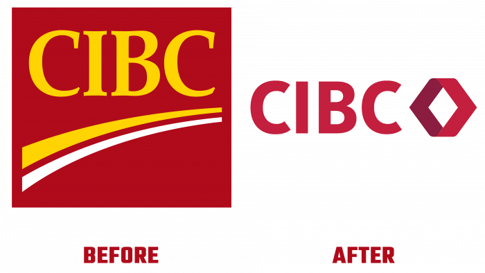
The last time the image was changed was in 2003. Then the logo was updated. Now developing a new brand and expanding its geography to the borders of North America, the bank is focused on meeting the needs of customers and their expectations “on both sides of the border.”
The bank’s new headquarters will appear soon, which indicates that the brand is being modernized at a rather serious level. It’s not just changing the logo; it’s also giving the whole organization a new life.
According to experts, the new logo is the result of a creative revelation, inspired by the image of the double chevron of 1966, which was created for the 100th anniversary of the bank.
All banking advertising products will already have a new logo to develop the advertising campaign fully.
As for the logo itself, it is made in a simple modern design technique. The design is formalism, without frills and fanciful lines. But the mystery and intrigue remain. The outer and inner sides of the main graphic element “speak” about this. Two checkmarks turned to the right, and the left had different color fill. The checkmark of the inner side looks to the left, so it is darkened and grayed out. To the right is an external checkmark, which contrasts with its white tint.
This color scheme evokes a feeling of trust, reliability, inner strength. White color, in this case, does not show naivety but evokes an association with maturity and experience. As well as cleanliness, impeccable reputation and bright prospects promising success.
The font used for the simple inscription – the bank’s name – is ordinary, thin, and official. This is not to say that it can be anything particularly different, be it depicted somewhere else with similar fonts.
The most important feature in the new logo is the element itself, which looks complete and harmonious due to the roundness of the two checkmarks.
Of course, some observant people may say that such a logo looks like the emblem of a car brand, but don’t focus on this because the logo has its source of inspiration and its special atmosphere.
As for a bank, such a logo will be a good way to promote, advertise and present to various organizations you will have to cooperate in the future.


