The CIBC logo opens the portal to the future. The emblem shows that the bank is ahead of its time and offers more and more new developments to increase clients’ income. As a result, capital, branches, and leadership positions are growing in the Canadian market.
CIBC: Brand overview
Meaning and History
Despite its creative approach to business, the Canadian Imperial Bank of Commerce has been unable to streamline its visual style for a long time. Perhaps this was due to its origin: CIBC was created based on the Canadian Bank of Commerce and Imperial Bank of Canada, which appeared in the second half of the 19th century and merged in 1961. The owner of the IBC asked about the merger because he wanted to avoid a foreign takeover.
In the beginning, the brand lacked an organized identity. Each branch looked different: somewhere, the full name of the company was written, somewhere – only an abbreviation, and in some places, the inscriptions “Bank of Commerce” and “Imperial Bank” were presented. There was no consistency in the logos either, and the first CIBC badge in the 1990s was outdated and needed a reboot. A regulated identification system appeared only in 2001 with the release of a new emblem.
What is CIBC?
CIBC is the abbreviation for Canadian Imperial Bank of Commerce, which is located in Toronto, Ontario. It was founded in 1961 after merging two institutions founded in the 19th century, the Canadian Bank of Commerce and the Imperial Bank of Canada. Now, this banking institution operates internationally and serves more than 11 million customers.
1961 – 1966
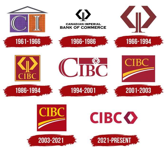
In the early 1960s, the financial institution used a logo consisting of three geometric shapes. Two quadrangles—one purple and the other orange—contained the letters “C” and “I.” Above was a gray triangle resembling a painted house’s roof. The square and rectangle looked like pages from a square notebook. They were covered in circles and lines as if the designers forgot to erase the blueprints after writing the letters.
1966 – 1986
The designers supplemented the abstract icon with the bank’s name, written in two lines at the bottom. They chose an unusual font with very short serifs and dimples at the ends of the letters. It was the only black-and-white CIBC logo.
1966 – 1994
The red and brown emblem was created in 1966 and used for 28 years. It consisted of two chevrons—inverted V-shaped signs with angle brackets pointed outward—representing a large network of branches of the Canadian Imperial Bank of Commerce—literally from coast to coast. Between the chevrons were two legs, symbolizing stability.
1986 – 1994
In 1986, the chevron symbol was repainted gold and placed inside a burgundy square. The developers had to shorten the inscription “CANADIAN IMPERIAL BANK OF COMMERCE” to an abbreviation so that it would also fit into the quadrangle. The updated typography included a sharp serif typeface. The golden square frame made the emblem complete.
1994 – 2001
The next redesign took place against the backdrop of the acquisition of 55% of the shares of TAL Investment Counsel. For the first time, the financial institution abandoned its abstract symbol and replaced it with another geometric sign – three-dimensional chevrons that formed a diamond. The 3D element was inside a small dark red rectangle, which, in turn, occupied the upper right corner next to the inscription “CIBC.”
The first “C” letter was more notable than IBC, even though the abbreviation consisted of only capital letters. A white curved line divided the semicircular side “C” in two.
2001 – 2003
At the start of the second millennium, the Canadian Imperial Bank of Commerce needed a new identity system to compete with Canada Trust, which merged with TD in 2000 and rebranded globally. The CIBC owners wanted to find something timeless that would not be outdated even after a few decades. This universal sign had two arcs (yellow and white)—a symbol of growth, progress, and moving forward. Curved lines underlined the CIBC lettering and, with it, were inside a deep red rectangle.
2003 – 2021
Two years after its debut, the logo was updated. The designers made the colors brighter and noticeably changed the shade of red. They also enlarged the abbreviation and moved it to the right. To do this, they had to expand the quad a little to become a square again.
The bank’s owners turned to Ove Brand, a design agency, to determine which associations generate a positive consumer response. Customers responded positively to everything related to progress and development. Therefore, the centerpiece of the CIBC logo is two arcs that convey the idea of growth.
The Canadian Imperial Bank of Commerce logo features a custom serif typeface similar to ParaType’s Orbi Bold. The base color is a dark shade of red (# B10316). It replaces the CIBC Claret (# 9D2235) used before the redesign. The financial institution’s name is written in yellow (tone – -gold # FFD500). This color used to be darker (# FFC724).
2021 – today
The bank’s new logo materializes a portal open to its clients’ world of desires. As CIBC’s management emphasizes, it is also the link between the banking institution’s present and past. The emblem is based on a chevron taken from the original 1966 logo. It consists of two pointers connected on the open side (wide). Typography has also changed, becoming more customer-centric.
CIBC: Interesting Facts
The Canadian Imperial Bank of Commerce, or CIBC, stands as one of Canada’s biggest banks, with a history stretching over 150 years.
- Origins: CIBC was born in 1961 from the merger of two ancient banks, the Canadian Bank of Commerce (1867) and the Imperial Bank of Canada (1875). This merger was a big deal in Canada, aiming to create a stronger bank.
- Banking Firsts: CIBC launched Canada’s first PC banking service in 1984, paving the way for digital banking.
- Worldwide Operations: CIBC is best known in Canada, but it also works in the U.S., the Caribbean, Asia, and Europe. It focuses on serving Canadians abroad, international businesses with Canadian ties, and wealthy global clients.
- Eco-Friendly Initiatives: CIBC is serious about reducing its environmental impact, investing in energy-saving technology, and supporting green projects.
- CIBC Run for the Cure: The bank sponsors Canada’s biggest one-day event for breast cancer support, showing its dedication to community and social responsibility.
- CIBC Square: CIBC’s global headquarters in Toronto is known for its eco-friendly design, including a sky park connecting its two towers.
- Mobile Banking Innovation: CIBC’s app, known for being user-friendly, was the first in Canada to let people open an account from their phone without going to a branch.
- Wood Gundy Acquisition: In 1988, CIBC expanded its wealth management by acquiring Wood Gundy, a top investment firm.
- Supporting Small Businesses: CIBC is praised for supporting small and medium businesses in Canada and offering them the resources they need to thrive.
- Digital-First Approach: Recently, CIBC has focused on digital innovation to make banking easier and more accessible, including online services, fintech collaborations, and advanced banking tools.
CIBC’s journey from a traditional bank to a modern, community-oriented, and digitally savvy institution highlights its commitment to innovation and serving the needs of its customers in today’s world.
Font and Colors
After the redesign, the inscription in the CIBC logo received a radically opposite font—simple, open, and understandable. The developers used a chopped typeface with flat uppercase letters to do this. The color palette has been transformed from red-white-yellow into two shades of red.
FAQ
What does the CIBC logo mean?
The new logo is a modern version of the original 1966 logo. It uses the iconic chevrons from the first logo, now connected to a portal, symbolizing the path to achieving goals. The linked chevrons signify guidance, support, and the path to personal and financial goals. By updating its classic logo, the brand demonstrates its relevance and forward-thinking while maintaining its history. The new logo introduces the brand as a partner in helping customers achieve their financial dreams.
What are the rules for CIBC branding?
Branding guidelines focus on consistency and visibility. When using the flat logo on a burgundy or dark background, add a white keyline around it to make it clear and recognizable. Always check the logo library for approved versions to ensure correct usage.
Use the flat logo when space is limited or file size is an issue, as it can be applied to various media.
Why is CIBC changing its logo?
CIBC is changing its logo to give it a more modern look that aligns with its evolving identity. The new design uses elements of the 1966 logo, particularly the chevron, which was updated by combining the wide sides of the two indices into a single symbol.
The logo now features a simplified, flat sans-serif font, aligning with current design trends. This makes the brand more relevant and accessible.
What is the new CIBC logo?
The new logo includes a diamond shape, symbolizing the client portal and access to the bank’s opportunities. Management sees this design as representing the brand’s desire to offer customers different options.
The diamond is located to the right of the brand name and is written in bold capital letters. This design creates a strong and modern visual identity, demonstrating the brand’s role in helping customers achieve their financial goals.
What color is CIBC?
Previously, the logo used various combinations of red, yellow, and white. In the new logo, red is now the main color. The diamond in the logo has dark and light red shades, contrasting the outside and the inside. This choice enhances the visual impact of the logo and reinforces the brand’s personality. Using the color red conveys energy, confidence, and a strong presence. The simpler color scheme matches the modern look of the brand and ensures consistency across different environments.
