Our bank helps to live and develop – conveys the logo of Lloyds Bank. The idea of movement, embedded in the elements of the emblem, indicates the leadership position of the institution and readiness to join the life team of clients and help them.
Lloyds Bank: Brand overview
In 1765, an iron merchant and a button maker joined together to start a common cause. This is how the Taylors & Lloyds organization was created, which today is known as Lloyds Bank – one of the largest financial institutions in the UK. Despite the fact that for the first hundred years, the bank successfully operated with just one branch in the town of Oldbury, it now has an extensive network of branches.
Meaning and History
The famous logo in the form of a black horse appeared at Lloyds Bank in 1884. Originally, this symbol belonged to a London jeweler who used it back in 1677. At that time, many people could not read, so there were no signs on signs. In addition, there were no numbers on the houses, so store owners had to attract the attention of customers in various non-standard ways.
In 1728, the sign of the black horse (then this position was called “keeper of monetary transactions”) received another jeweler, who was also a banker. Over time, his modest store grew to the size of a large financial firm, which in 1884 was taken over by Lloyds Bank. So, the emblem with the image of a black horse was inherited by the new owner.
It should be noted that originally, the creators of the bank chose a completely different symbol – a beehive. He was the embodiment of diligence and thrift, which best characterized the financial institution. Until the beginning of the XX century, both signs (beehive and horse) were used simultaneously, but then the design became more specific.
What is Lloyds Bank?
Lloyds Bank is the largest retail bank in the UK. It has a network of over 1,300 branches.
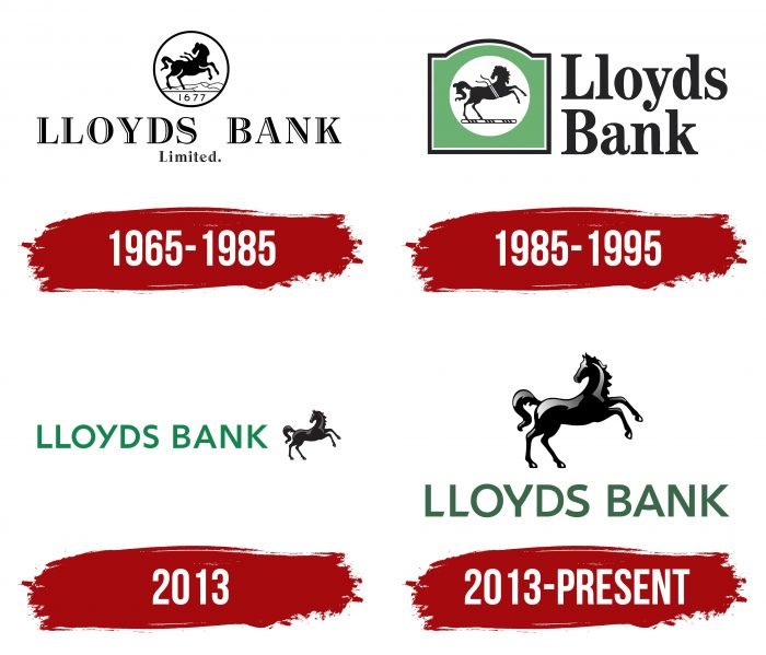
1965 – 1985
Lloyds Bank changed its logo four years after opening its first car branch. The central image, as before, was a black horse. It was in a white circle with a narrow, dark border. The ribbon fluttering over its back signified leadership. The inscription “1677” under the hooves reminded that the symbol originally appeared in 1677.
At the bottom, the designers placed the organization’s name: “LLOYDS BANK” in the first line and “Limited.” in the second. The letters consisted of single and double strokes of contrasting thickness and were decorated with serifs.
1985 – 1995
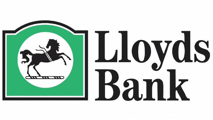
Prior to its merger with TSB Group in 1995, the bank used a tricolor logo. The horse and the lettering remained black. The outline disappeared from the white circle, but a large green frame with a dark border appeared. The word “Limited.” and the number “1677” were removed. The name of the financial organization moved to the right. At the same time, all letters, except for the first ones, became lowercase.
2013
In 2013, Lloyds Banking Group (formerly Lloyds TSB Group) split into several parts. This was the revival of the Lloyds Bank brand. Before the official split, the traditional emblem with a black horse was used online. It was complemented on the left by a green word mark. The name of the financial institution was written in sans-serif capital letters.
2013 – today
On September 23, 2013, Lloyds Bank was revived. In this regard, it needed a new logo, combining modernity and tradition. Several teams worked on the design at once. MEC News Agency teamed up with creatives Proximity London, RKRC / Y & R, and Rufus Leonard to create a refined brand vision.
They took into account the trends of the digital age, emphasizing simple shapes and minimal elements. There are only two: the horse and the name of the bank. The classic symbol was given a three-dimensional look by light spots and gradients. There are many more details – the artists made the main image expressive by working on the volumetric perception of the mane, legs, tail, torso, and head.
Lloyds Bank: Interesting Facts
Lloyds Bank, a key figure in the UK’s banking and financial services sector, boasts a history stretching over 250 years, reflecting the growth of modern banking.
- Early Days: Started by John Taylor and Sampson Lloyd II in 1765 in Birmingham, Lloyds Bank has humble beginnings in a former malt house. It has since become a banking powerhouse.
- Banking Innovations: A pioneer in banking, Lloyds introduced the UK’s first ATM in 1972, changing how people accessed their money.
- The Black Horse Emblem: Recognizable worldwide, the black horse symbol has been linked to Lloyds since 1884. It symbolizes trust and reliability. It comes from a bank acquired by Lloyds that had used the symbol since 1677.
- Growth through Mergers: Lloyds has expanded by merging with other banks, notably with the Trustee Savings Bank in 1995, significantly impacting UK banking.
- Online Banking Leader: Lloyds launched its internet banking service in 1997, offering customers the convenience of managing finances online.
- World War Support: During both World Wars, Lloyds played a crucial role in supporting the British economy, handling government accounts and war bonds, and keeping branches open under tough conditions.
- Financial Education: Lloyds is committed to improving financial literacy and launching programs to help people manage their money better.
- Eco-friendly Initiatives: Recently, Lloyds has focused on sustainability, funding green projects, and aiming to lessen its environmental impact.
- Culture and History: Lloyds values British art and heritage, maintaining an art collection and a historical archive that documents its rich history.
- International Services: While deeply rooted in Britain, Lloyds serves international customers, supporting expatriates and global businesses.
From its small-scale beginnings to becoming a major global bank, Lloyds Bank’s evolution highlights its adaptability, innovation, and dedication to customer service, securing its status as a cornerstone of British banking.
Font and Colors
The black horse, symbolizing energy and leadership, came to Lloyds Bank from Barnetts, Hoares & Co, which borrowed this symbol from a 17th-century jeweler. In modern interpretation, the horse serves as a reminder of the historical heritage of the financial institution and its role in the development of the banking sector of Great Britain.
The brand name is in legible font, as Lloyds Bank wanted to make a good impression on customers. The brand name looks business-like and very modern, which generally reflects the bank’s partnership approach to business. The font used was custom-designed by the typography company Fontsmith. It is a modification of the FS Jack sans serif font, which was inspired by forensics and was originally based on the shape of a thumb.
The authors of the logo added oblique cuts at the ends of the letter “L,” increased the curvature of the diagonal strokes “Y,” rounded the horizontal line “A,” aligned both sides of the letter “B,” and made many other changes to make the inscription “LLOYDS BANK” unique. To the same end, a dark green color (#006844), very similar to a shade of Cadmium Green, was chosen for the wordmark. The horse has remained predominantly black but has developed light gray and dark gray spots.
Lloyds Bank color codes
| Bottle Green | Hex color: | #016846 |
|---|---|---|
| RGB: | 1 104 70 | |
| CMYK: | 99 0 33 59 | |
| Pantone: | PMS 3415 C |
| Black | Hex color: | #000000 |
|---|---|---|
| RGB: | 0 0 0 | |
| CMYK: | 0 0 0 100 | |
| Pantone: | PMS Process Black C |
FAQ
Why is the Lloyds Bank logo a black horse?
The image of a black horse first appeared in 1677. It was used as a sign to draw attention to the house where the jeweler worked. Then, the emblem changed owners several times until it ended up with Lloyds Bank.
What is Lloyds Bank’s slogan?
Lloyds Bank uses the slogan “Close to you” in its advertising.
Why does Lloyds have commercial banking services?
Lloyds provides commercial banking services to expand its customer base.
Who owns Lloyds Bank?
Lloyds Banking Group owns Lloyds Bank.
