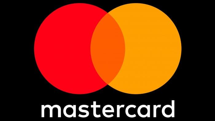
The emblem immediately makes it clear that the main task of the system is to facilitate the unification of parties. The MasterCard logo is an example of the merging of two financial structures for sending and receiving payments. The sign demonstrates globalization and full coverage of processes.
Mastercard: Brand overview
MasterCard is an international financial corporation founded in 1966. It facilitates payments between merchant banks and issuing banks or consumer credit unions. Initially, the system was called Interbank (from 1966 to 1969), then Master Charge (from 1969 to 1979), and only then did it receive its current name. It was founded by the merger of several regional banking associations – the Interbank Card Association (now Mastercard Incorporated).
Meaning and History
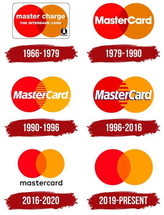
The corporation’s original logo appeared at the very beginning of its career and never radically changed, always remaining as it looks now. Changes were limited to minimal adjustments and modifications as required by time, for example, for adaptive visualization on electronic media or when changing the design of a bank card.
What is Mastercard?
This is the name of the company, formerly known as Master Charge: The Interbank Card. It provides payment processing services and recently supported cryptocurrency transactions. The financial corporation’s office is located in Harrison Township, New York. The founding year was 1966 when a group of California banks created an association to offer an alternative to BankAmericard cards.
1966 – 1979
The history of the emblem is closely linked to the evolution of the bank. It reflects all the signature concepts it adheres to. To show the areas of intersection of two sides of the same process, the administration used a Venn diagram.
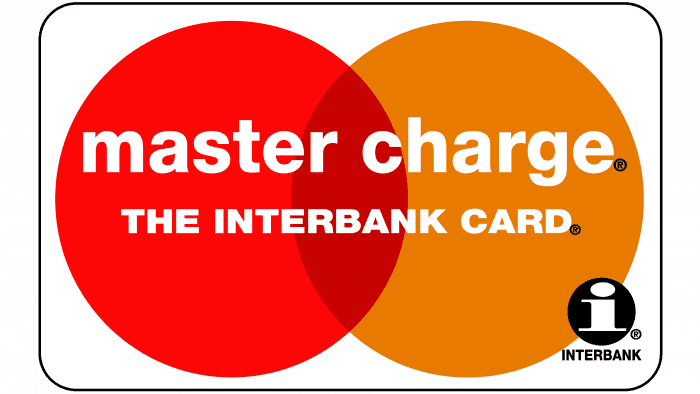
Thus, the first sign appeared, stylized as a visual confirmation of the idea that cooperation is necessary because it is mutually beneficial. Two identical circles – red and orange – were taken as the basis. They overlap each other by one quarter and demonstrate the possibility of intersecting different interests.
Above the intersecting circles, the corporation’s name was written in lowercase letters. Below, in capital letters, was written “Interbank Card.” In the lower right corner was a lowercase letter “i” – the symbol of Interbank in a black circle.
1979 – 1990
In December 1979, the company was renamed MasterCard. As a result, the financial institution’s new name appeared on the logo. They did not abandon the previous image, as it perfectly reflected the progressiveness, energy, and dynamism of banking operations.
1990 – 1996
In April 1990, the emblem was slightly modified. Instead of orange, yellow appeared, and the border of the intersecting circles was hatched with horizontal stripes. This design moved away from the Venn diagram and further emphasized the close relationships between the parties. The name in the center was written in italics with a slight tilt.
1996 – 2016
The designers emphasized the yellow circle, enhancing its color. Also, the number of intersecting stripes in the center was reduced. Thus, the logo became more minimalist and strict. Another revision concerned the word “MasterCard”: it gained thin black shadows on the right side and became more voluminous.
In the middle of the previous period, a corporate version of the emblem also appeared, which was used in parallel for ten years. It consisted of the same logo and had a third circle, slightly larger than the first two. Thanks to its transparency, it did not cover what was under it, creating a 3D effect. Below the graphic sign was the phrase “MasterCard Worldwide,” placed on two levels: in the upper row, it was printed in bold black font, and in the lower, it was in thin.
2016 – 2020
In July 2016, the financial corporation changed the spelling of its name: now, instead of a capital letter, a version with a lowercase “c” is used: “Mastercard” is considered current. Cardinal then also made changes to the logo, which occurred for the first time in 20 years. The text from the circles disappeared, and they regained their original appearance – in the form of a Venn diagram, as before 1990.
The company name is located outside the graphic symbol and is positioned at the bottom. It is written in lowercase letters. The yellow color was enhanced and became closer to orange. It can be seen in the center of the intersection of the two elements. This version is relevant for all sub-brands of the corporation. Only the inscription “Mastercard” will disappear from the logo in July 2020.
2019 – today
At the beginning of 2019, the logo of physical cards, electronic wallets, labels, stickers, and marketing materials also changed. On January 7, the word “Mastercard” was removed from it. In all other details, it corresponds to the 2016 version.
Mastercard: Interesting Facts
Mastercard is a big company that helps people pay for things without using cash.
- How It All Started: Back in 1966, some banks made Mastercard to help people shop easier. It was first called “Master Charge” and was named Mastercard in 1979.
- Going Global: Mastercard was the first to appear in China in 1987 and the Soviet Union in 1988. This was a big deal because it allowed more people worldwide to use it.
- Cool New Stuff: They were the first to add a shiny hologram on cards in 1983 to keep things safe, and they worked on making cards smarter with chips in the 1990s.
- Tap and Go: Mastercard made paying simple by allowing you to tap your card on a machine. It’s quick and easy.
- Famous Ads: Their “Priceless” ads, which started in 1997, show that some moments in life are too special to buy.
- Paying with Your Phone: You can use your phone to pay if you have Mastercard, thanks to them working with Apple Pay, Google Pay, and Samsung Pay.
- Helping Everyone: Mastercard tries to ensure that everyone, even people in faraway places, can use its services and join the digital world.
- Doing Good: The Mastercard Foundation helps with education and money matters in Africa, aiming to improve the people’s lives there.
- More Than Just Cards: Although we consider Mastercard a credit card, it is all about using technology to make paying for things easy and safe for everyone.
Mastercard has changed a lot since it started, always trying to make paying for stuff easier and safer for people everywhere.
Font and Colors
The current version has existed since 1966 – from the moment the financial association was formed – and has never changed. Any changes concerned only minor adjustments, so all this time, the emblem features two colored circles that partially overlap each other.
The emblem uses the FF Mark font family. These are minimalist and clean sans-serif Std Premium and Helios Antique Semi Bold fonts. The emblem’s color, like its shape, is also standard: it is a combination of red and yellow (previously orange). The letters have always been white.
Mastercard color codes
| Cadmium Red | Hex color: | #eb001b |
|---|---|---|
| RGB: | 235 0 27 | |
| CMYK: | 0 100 89 8 | |
| Pantone: | PMS Bright Red C |
| Orange | Hex color: | #ff5f00 |
|---|---|---|
| RGB: | 255 95 0 | |
| CMYK: | 0 63 100 0 | |
| Pantone: | PMS Orange 021 C |
| Orange Peel | Hex color: | #f79e1b |
|---|---|---|
| RGB: | 247 158 27 | |
| CMYK: | ||
| Pantone: | PMS 137 C |
FAQ
What does the Mastercard logo represent?
According to one version, the two circles in the Mastercard logo symbolize the interconnection of trade interests of Eastern and Western countries. In this context, the golden element symbolizes the rising sun of the West, opening wide opportunities, and the red circle – the Japanese flag. The emblem shows how the payment system connects the two parts of the world. The shape of the emblem resembles a Venn diagram.
What font is used in the Mastercard logo?
Since 1979, the Mastercard logo has used the ITC Avant Garde Gothic font. In 1990, it was replaced with an italic with modified glyphs. And in 2016, a new wordmark appeared, written in the geometric sans-serif FF Mark font. The letters repeated the shape of the two circles of the graphic symbol. Finally, in 2019, the brand name was removed.
What does the Mastercard logo mean?
The Mastercard logo signifies a duality that finds common ground. The two circles can be the East and West, the client and the credit card, and the common area of geometric figures symbolizes interaction. The image is based on the Venn diagram.
