The HSBC logo is designed in a modern and futuristic style. The visual mark demonstrates profitable operations that will bring profit to customers, as well as the cleanliness and transparency of foreign exchange transactions. The benefit is supported by the idea of stability and an indication of a large conglomerate.
HSBC: Brand overview
The financial company HSBC owes its emergence to a Scotsman, Thomas Sutherland, who lived in Hong Kong in the second half of the 19th century. One day, he read an article about banking and decided that this was the kind of service local businesses needed. Having secured the support of a large businessman, Thomas created his own financial institution. So, in 1864, the first branches of the Hong Kong and Shanghai Banking Corporation appeared. In 1991, the parent company HSBC Holdings plc was founded. She headed all the divisions on different continents.
Meaning and History
Today, HSBC is one of the largest banks, with an extensive network covering more than 70 countries. Its head office is located in the capital of Great Britain, and branches united under one brand serve millions of people around the world. At first, each of them had its own logo, which indicated only the location and name. More recently, all companies have been given one universal emblem featuring a red and white triangle.
What is HSBC?
HSBC is an abbreviation for Hong Kong and Shanghai Banking Corporation. This is the name of one of the largest and most influential banks in the UK.
Old logo
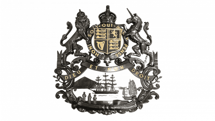
One of HSBC’s earliest graphic marks looked like the royal coat of arms of Great Britain, complete with elements of the colonial coat of arms of British Hong Kong. It contained a four-sided shield, a lion, a unicorn, and leopards. At the top – crowns (one on the shield, the other on the lion), at the bottom – two sailing ships, including a traditional Chinese junk. Not without Latin mottos: “HONI SOIT QUI MAL Y PENSE” and “DIEU ET MON DROIT”.
1983 – 2018
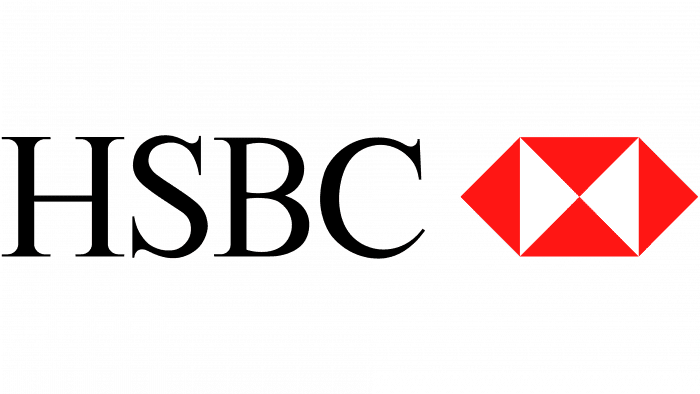
When the holding company expanded its network, it needed a single symbol for all branches. So, in 1983, the brand got its first universal emblem: a complex hexagon created by Austrian graphic designer Henry Steiner. The abstract shape is based on the bank’s flag, inspired by the symbol of St. Andrew from the Scottish flag. The black lettering “HSBC” stands for “Hong Kong and Shanghai Banking Corporation.” It was on the left side and consisted of serif letters.
2018 – today
To keep the bank recognizable, the designers kept its iconic logo. They only moved the abbreviation to the right, replaced the thin vintage font with a bold sans serif, enlarged the graphic element, and increased the brightness of the red color.
HSBC: Interesting Facts
HSBC stands as a giant in the banking and financial services sector, with roots deeply embedded in global trade history.
- Beginnings: In 1865, Sir Thomas Sutherland created HSBC in Hong Kong to support the burgeoning trade between China and Europe, focusing on commodities like silk, tea, and silver.
- Worldwide Presence: HSBC operates in 64 countries, serving over 40 million customers globally, emphasizing its role as “the world’s local bank.”
- Structure: Known for its unique structure, HSBC combines global reach with local market focus, ensuring tailored banking services worldwide.
- Symbolic Lions: The bronze lion statues, Stephen and Stitt, outside its Hong Kong headquarters symbolize HSBC’s resilience, having withstood events like WWII bombings.
- Environmental Goals: HSBC is working towards significant environmental targets, including net-zero carbon emissions from its operations by 2030 and across its financial portfolio by 2050.
- Tech Innovation: A pioneer in banking technology, HSBC was early to adopt ATMs and has continued to lead with digital banking and blockchain technology developments.
- Cultural Insight: The HSBC History Wall in its Hong Kong headquarters looks into the bank’s historical and cultural impact, featuring various artifacts and interactive exhibits.
- Economic Insight: Renowned for detailed economic research, HSBC provides valuable analyses on global economic trends and forecasts, aiding investors and policymakers.
- Sports Engagement: HSBC sponsors sports events, including golf, rugby, and cycling, to boost its brand and community engagement.
- Educational Support: Through its education program, HSBC invests in community projects focusing on education and employment opportunities for youth worldwide.
HSBC’s evolution from a regional bank to a global financial leader showcases its adaptability, innovative spirit, and significant role in financial history, highlighting the changing dynamics of the global economy.
Font and Colors
The flag from which the hexagon was drawn looked like a white rectangle divided into four parts by diagonal lines. Henry Steiner slightly changed its design and added two triangles on the sides. Now, the geometric figure resembles an open envelope with an hourglass in the center. But even with these additions, the emblem with six triangles continues to resemble the old flags of Hong Kong companies. It also resembles the national flag of Scotland, where HSBC founder Thomas Sutherland is from.
The font for the emblem of the international banking organization was created on the basis of the classic Times Roman. The font Times Eighteen (if you remove the serifs) and the inscription Univers Bold are very similar to it. All letters are uppercase and proportional.
The lettering is all black, and the hexagonal shape consists of red and white triangles. The three contrasting colors look great against a light background. If the background is dark, the text can be white or silver, as outlined in the official HSBC branding guide.
HSBC color codes
| Maximum Red | Hex color: | #db0011 |
|---|---|---|
| RGB: | 219 0 17 | |
| CMYK: | 0 100 92 14 | |
| Pantone: | PMS 485 C |
| Black | Hex color: | #000000 |
|---|---|---|
| RGB: | 0 0 0 | |
| CMYK: | 0 0 0 100 | |
| Pantone: | PMS Process Black C |
FAQ
What does the HSBC logo stand for?
The hexagonal shape made up of red and white triangles represents the bank’s flag. It is based on the cross of St. Andrew the Apostle.
When was HSBC Bank founded?
HSBC appeared in 1991 when the acquisition of Midland Bank by Hong Kong and Shanghai Banking Corporation began. This is how the financial organization HSBC Holdings plc was created.
Is HSBC a PLC or a Ltd?
HSBC stands for Public Limited Company (PLC).
