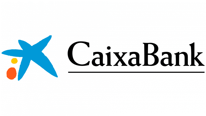
Reliability is the most important thing for a bank, which manifests itself in different ways. The CaixaBank logo demonstrates this best, as it uses images of the sea, hinting that if you trust it, you can enjoy peace of mind without worrying about financial issues.
Caixabank: Brand overview
| Founded: | 2011 |
| Founder: | Criteria CaixaHolding, FROB, Free float |
| Headquarters: | Valencia, Spain |
| Website: | caixabank.com |
Meaning and History
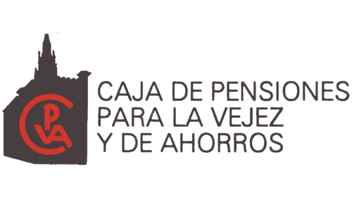
CaixaBank was founded in 2011 based on the Pension Bank of Barcelona Caja de Ahorros y Pensiones de Barcelona (La Caixa). The name CaixaBank was chosen for representative and institutional purposes and was launched on July 1st. The bankers declared their mission to contribute to the financial well-being of Catalonia residents, the region’s development, and the progress of society as a whole. The main values are quality, trust, and social responsibility.
By 2020, the bank’s assets exceeded 500 billion euros; a mobile bank operating through the ImaginBank app was created. The bank has more than 6 thousand branches, 9.5 thousand ATMs, 32 thousand employees, and the number of customers is approaching 15 million.
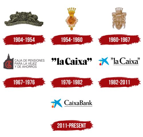
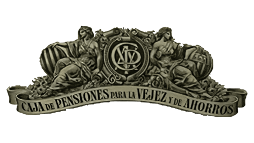
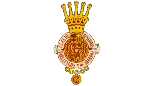
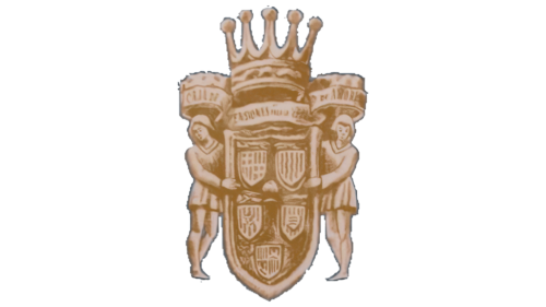
Over the existence of the institution, the logo has changed several times. In the previous history of the bank under the name La Caixa until the 70s of the last century, it did not have a specific logo; the name and seal with the word “Caixa” were used.
In 1979, the board of La Caixa decided to create a full-fledged logo, for which they engaged the design agency Landor & Associates and, with them, the famous Catalan artist Joan Miró, who was living in the Balearic Islands at the time.
It was proposed to make an eight-pointed star to avoid religious and political connotations, and the color palette was to include red and yellow, symbolizing the flags of Spain and the Balearic Islands.
Miró experimented for a long time and, in 1980, presented his version, choosing a five-pointed star but giving it the lively image of a sea star. He made a tapestry logo, which the bank owners liked so much that they immediately hung it on the wall in the main office, and all business cards were immediately reprinted with the addition of the emblem.
The logo’s basis is a saturated orange rectangle, symbolizing the Catalan lands, which have this color. On the left is a bright blue star in a thin white frame, and next to it are two circle bubbles. The name CaixaBank is written in black letters with a white outline; a stripe emphasizing its entire perimeter symbolizes stability and reliability.
In 2018, another emblem version was created and used on employee badges and mobile applications.
It represents an almost white (with a slight bluish tint) rectangle. The star with circles is located at the top, a thin black stripe emphasizes them, and below is the name CaixaBank; for applications, the inscription looks like this: “la Caixa”.
What is Caixabank?
CaixaBank is one of the largest banking holdings in Spain. It was formed in 2011 as a result of the reorganization of Criteria CaixaCorp and provides a wide range of financial services, including insurance, lending, and investment products. Its clients are large corporations, medium-sized businesses, small enterprises, and private individuals. The bank is known for its innovative solutions that improve service quality.
1904 -1954
1954 – 1960
1960 – 1967
1967 – 1976
1976 – 1982
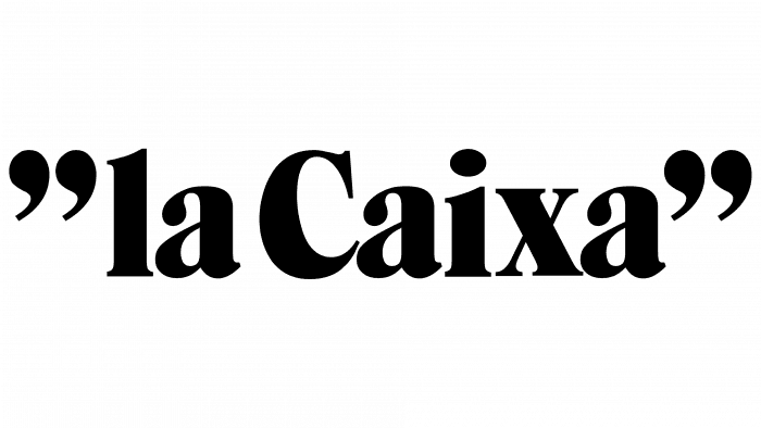
After rebranding, when the banking institution received the abbreviated name la Caixa, it got a new logo. It is maximally practical and informative, as it contains nothing but the text with the financial institution’s name. All letters are lowercase in the preposition, and in the main word – one is uppercase. The contours are rounded. The inscription is made in bold font and enclosed in quotes on both sides.
1982 – 2011
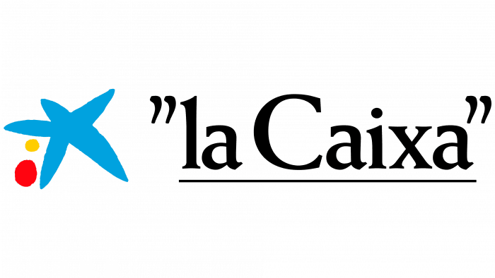
The next emblem is filled with chic and originality. To attract the attention of customers and increase its popularity, the bank changed its style. It chose the theme of relaxation, emphasizing that every customer can calmly enjoy the sea charm while the bank is open. The designers conveyed serenity in a blue star with five rays. Also, there are two multicolored spots next to it – a large red one and a small sandy one- as if these are stones heated by the tropical sun. Instead of semi-bold, a bold font is now used. The shape of the quotes has changed – they have become elongated.
2011 – today
As a result of rebranding, the bank’s name changed, so it was logical to change the logo as well. Although the inscription remained with the underline, the quotes disappeared. The word “CaixaBank” consists of two stems and is written together. To the left of it are still visible an irregular five-pointed sea star and two bright bare stones. They talk about the bank’s proximity to the sea, as the warm coast surrounds the Spanish lands.
Caixabank: Interesting Facts
CaixaBank is a big bank in Spain that’s been around since 1904. It started when a guy named Francesc Moragas created a savings bank, and over time, it grew into what CaixaBank is today, officially becoming CaixaBank in 2011.
- A Long History: It began over a hundred years ago and has changed a lot to become a major bank in Spain.
- Leading in Digital Stuff: CaixaBank was one of the first in Europe to use ATMs and has kept up with technology by offering online and mobile banking, making it easy for people to handle their money without always having to go to a bank.
- Winning Awards: The bank has won many awards for excellence, such as offering great services and caring for its customers.
- Lots of Branches: CaixaBank has many branches all over Spain, so people can find a branch nearby to get help or do their banking.
- Big in Retail Banking: They’re known for working with regular people, businesses, and big companies, offering them financial help.
- Cool New Services: They’ve devised new ways to pay for things, like using smartwatches and creating AI tools to help customers more personally.
- Investing Responsibly: CaixaBank tries to invest in a good way for the planet and people, looking at how companies affect the environment.
- Helping the Community: The bank supports various projects that benefit people and promote culture and the arts through the La Caixa Foundation.
- Going International: While it’s focused on Spain, CaixaBank also works in other countries, helping Spanish businesses worldwide and offering services to people interested in Spain.
CaixaBank isn’t just a bank; it’s a place pushing forward with new technology, helping its customers smartly, and doing a lot to help society and the environment.
Font and Colors
In the process of logo evolution, there was a sudden “glitch”: instead of a strict semi-official emblem, a friendly and optimistic sign appeared. The bright approach to identity balanced the strict style of the banking organization, brought it closer to clients, and instilled confidence. The developers also modernized the textual part: from daring, it gradually turned into elegant and restrained.
The management approved the Weiss font for the updated logo, which is lighter than before. Thanks to the thin symbols, it harmoniously combines with the icon. The inscription is solid, lowercase, with two uppercase letters – “C” and “B.”
The blue color was chosen because it stands out well on any background and signifies friendliness and trust in the client. The star is also reminded by its image of a figure of a person throwing coins into a piggy bank. This means that the money deposited in the bank will be safe.
In subsequent years, the logo changed the background color – it was black, red, and yellow, but the star and coins remain unchanged to this day.
Caixabank color codes
| Tangerine Yellow | Hex color: | #ffcc00 |
|---|---|---|
| RGB: | 255 204 0 | |
| CMYK: | 0 20 100 0 | |
| Pantone: | PMS 7549 C |
| Red | Hex color: | #e30613 |
|---|---|---|
| RGB: | 227 6 19 | |
| CMYK: | 0 97 92 11 | |
| Pantone: | PMS Bright Red C |
| Vivid Cerulean | Hex color: | #00a0df |
|---|---|---|
| RGB: | 0 160 223 | |
| CMYK: | 100 28 0 13 | |
| Pantone: | PMS 801 C |
| Black | Hex color: | #000000 |
|---|---|---|
| RGB: | 0 0 0 | |
| CMYK: | 0 0 0 100 | |
| Pantone: | PMS Process Black C |
