The style, graphics, and composition of the AXA Group logo reflect the strategic importance of the brand to the global economy. The AXA logo symbolizes stability and reliability; it emphasizes the close connection between decisions, partnership, and cooperation.
AXA: Brand overview
| Founded: | 1816 |
| Headquarters: | 25 Avenue Matignon, Paris, France |
| Website: | axa.com |
Meaning and History
The stability and high reliability of the company are evidenced by its logo, which has only changed once since its appearance. The original version was adopted in 1985 when the company was restructured, and Claude Bébéar became its leader.
What is AXA?
AXA is a group of independent investment and insurance companies from France with headquarters in Paris. It is a system-forming organization for the global economy, developing its activities in Europe and North America, the Middle East, Africa, and the Indo-Pacific region.
1978 – 1985
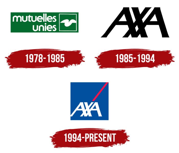
The history of AXA began in 1816, but the group of companies received its current name only in 1985. Before that, it was repeatedly renamed as it expanded by acquiring other insurance companies. In 1978, the holding absorbed Mutuelle de l’Ouest and was renamed Mutuelles Unies. This was reflected in its logo, where the corresponding white inscription appeared. The phrase was split into two lines and aligned to the right. A bold sans-serif font was used for the design.
The words “mutuelles unies” occupied two-thirds of a dark green vertical rectangle. To the right of the remaining space, there was a square white frame with a figure placed inside. The latter element had the form of a stylized tick or bird wings.
1985 – 1994
The emblem is very minimalist and consists of the intertwining of three symbols – AXA. Thus, it emphasizes the close interconnection between task execution, partnership, and cooperation. The letters are tilted to the right and have evenly cut tops. The legs of “A” connect under “X.” In the debut version, black symbols are placed on a light background.
1994 – today
After the redesign, the logo became much more modern: the developers changed the color of the letters to white and placed them on a blue square. At the top, they made a red accent symbol – a long line going into the corner from the leg of “X.” Diagonal animated graphics added dynamics and impulsiveness to it.
AXA: Interesting Facts
AXA is a big company that helps people with their insurance and money needs. It’s been around for a long time and works worldwide.
- Started in France: AXA began in 1816 in France. It grew by joining other companies, and now it’s one of the top insurance companies globally.
- Worldwide Service: It started in France but now works in more than 60 countries, helping many people.
- Name Change to AXA: In 1985, it changed to AXA because it’s easy to say no matter where you are.
- New and Helpful Services: AXA is creative, offering many insurance and money services to meet people’s changing needs.
- Caring for the Planet: AXA works hard to protect the environment. It stopped investing in coal and started supporting green projects long ago.
- Supporting Research: Since 2007, the AXA Research Fund has helped scientists study important issues to keep people and the planet safe.
- Using Technology: AXA uses new technology, such as artificial intelligence, to improve and simplify its customers’ lives.
- Working with Others: AXA teams up with other companies to offer more and better services.
- Helping Society and the Environment: AXA wants to make a positive difference in the world, so it focuses on the environment, helping society, and keeping people healthy.
- A Leading Company: Many people worldwide trust AXA for their insurance and money management needs because it’s a leading company in this field.
AXA has come a long way from being a small insurance company in France to a global leader, always trying to be innovative, care for the environment, and help society.
Font and Colors
Both logos are current and are used to this day. One version is suitable for marking business papers and documents, and the other is suitable for advertising, posters, and marking important events. Also, the administration does not make a strict attachment to the form of the emblem so that it can be both horizontal and vertical (elongated or flat).
The branding font is individual: it is more graphical than textual. The letters are uppercase, with miniature serifs at the ends. The color palette has never changed: it has always included black, white (primary), blue (background), and red (accent).
AXA color codes
| Dark Blue | Hex color: | #00008f |
|---|---|---|
| RGB: | 0 0 143 | |
| CMYK: | 100 100 0 44 | |
| Pantone: | PMS Blue 072 C |
| Cadmium Red | Hex color: | #e11721 |
|---|---|---|
| RGB: | 225 23 33 | |
| CMYK: | 0 90 85 12 | |
| Pantone: | PMS Bright Red C |
FAQ
What does the AXA logo mean?
The AXA logo stands for the bank’s name. But it is not an abbreviation; it is a complete word pronounced the same in all languages of the world. This was the condition set by the bank’s then-head Claude Bébéar to the naming consultant. He wanted the name to be short and simple but vivid, conveying vitality and responding to the group’s aspiration to be present in the international market.
What is the AXA logo?
The AXA logo is a wordmark in the form of a monogram of three large letters. All lines are straight, with a slight tilt to the right. The company name is shifted to the left, and from it upwards goes a diagonal stripe of bright red color. A cobalt square is used as the background.
What font does the AXA logo use?
The font of the AXA logo is not hand-drawn but VenturisSansADF-BoldItalic. The letters are kept intact as in the font. Only the combination of letters is changed: the designers arranged the signs in the form of a monogram, with a crossing at the bottom.
