The Deloitte logo looks stark as it demonstrates the seriousness of consulting and auditing services. But at the same time, a small, bright accent emphasizes the brand’s personality and sets it apart from its competitors. Such a double emblem is ideal for representing the “big four” audit companies.
Deloitte: Brand overview
Deloitte is a large network of companies providing services in the field of corporate finance, consulting, taxation, and audit. Its full name is Deloitte Touche Tohmatsu Limited. Each of the firms in the group is independent and subject to the laws of its country. Deloitte has been named one of the most valuable brands in 2021 and the best place to start a career in 2020.
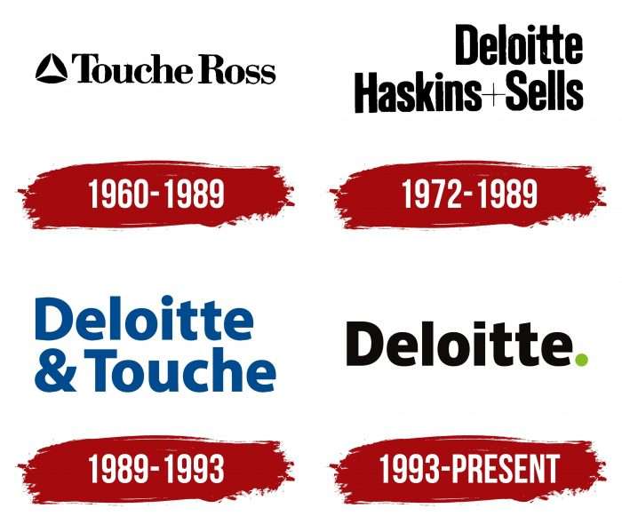
Its history is unique and revealing and begins in 1845 in London. The founder, William Welch Deloitte, expanded his firm Haskins & Sells, changing the name to Deloitte Haskins & Sell, and overseas, more specifically in the US, the company became known as Touche Ross. In 1989, there was a change again – Deloitte & Touche, and since 1993, the brand has been called simply Deloitte. Further rebrandings occurred frequently, and this only increased the client base and profits of the company. In 2012, this led to becoming a sponsor of the Olympic Games. According to current figures for 2020, a landmark year of historic economic disruption due to the coronavirus pandemic, the company earned a record $47.6 million from auditing, consulting, financial transactions, taxation, fines, and legal services. This made the business giant one of the top three large companies owned by a single individual in the United States.
Meaning and History
Corporate identity plays a crucial role in the development of business. Today, it is impossible to imagine a successful buying company that would not resort to the services of specialists in the development of corporate design, outdoor advertising, and public relations. All this forms a complete image of the brand in the market of services and goods, makes it recognizable, and increases consumer demand if it becomes closer to the potential client.
Depending on the tasks set for the company’s management, the original name and logo can be strongly transformed under the influence of such factors as the difficulty of selling products on the market under the wrong brand name, the lack of associations with the proposed product and its scope of application, the inability to convey the idea, mission, and values of the brand through the created logo.
What is Deloitte?
Deloitte is a representative of the “big four” consulting and auditing companies. Its full name is Deloitte Touche Tohmatsu Limited.
1960 – 1989
At this time, the logo was an elongated triangle formed by three black ovals. Along the right side was the inscription in large capital letters Touche Ross. In Serif font, all parts of the logo were shown in black. Presentable, solid, without unnecessary cumbersome combination of colors and shapes.
1972 – 1989
A characteristic feature of the logo was the shift of graphic accents to the right. Thus, Deloitte became the “upper floor” under which Haskins + Sells was located. A part of the lower line protruded; obviously, the inscriptions visually looked like steps, and the lower one was larger than the upper one. The font had also changed: it was thinner, more geometric, sans serif, again in black. It can be assumed that with this logo, the authors wanted to achieve an association with the rise of the company.
1989 – 1993
The modified logo does not appear for long, only four years. Particularly striking is the blue color of the new font and the arrangement of the words one below the other: Deloitte at the top and & Touche at the bottom. Beautiful accents and a successful composition played their part in the brand’s history.
1993 – today
Due to the change of the name, or rather the abbreviation of the word Deloitte, there was a need for a bright accent. It became a black dot at the end of the word with a bright green spot, contrasting with the smooth black font of the logo.
There is also a shortened version of the logo – the letter D and a green dot. It appeared because the full version of the logo has become familiar to the target audience, and now it is enough to see two graphic symbols, and there is a strong association with the brand in mind.
Deloitte: Interesting Facts
Deloitte is a big name in professional services, known worldwide for its audit, tax, consulting, financial advice, and risk management work.
- Start: Deloitte began in London in 1845 and was founded by William Welch Deloitte. He was the first to audit a public company, the Great Western Railway.
- Accounting Innovations: William Welch Deloitte introduced important accounting methods, like distinguishing between financial and non-financial assets, which are key to today’s accounting.
- Global Reach: Deloitte has grown significantly over the years. Now, it is in over 150 countries with hundreds of thousands of employees, making it one of the biggest professional service networks.
- Names and Mergers: The name “Deloitte” has changed over time due to mergers. It used to be known as Deloitte Haskins & Sells and Deloitte & Touche, but now it’s just Deloitte.
- Services: Deloitte started with accounting but now offers consulting, financial advice, risk management, tax, and legal help to tackle various business issues.
- Big Projects: Deloitte has worked on big deals, like auditing some of the world’s largest companies and advising major sports events like the Olympics.
- Diversity and Inclusion: The company is known for supporting diversity, promoting gender equality, and supporting LGBTQ+ employees.
- Tech and Innovation: Deloitte spends a lot on tech and innovation, runs Deloitte University for learning, and leads in using AI, blockchain, and more.
- Cultural Impact: Deloitte greatly influences global business practices and accounting standards. Its research helps shape business and policy debates worldwide.
Deloitte’s rich history and dedication to excellence and innovation have made it a key player in the professional services sector, influencing how global businesses operate.
Font and Colors
The font used is similar to Mediator Narrow Extra Bold. It is quite modern and formal, which looks good in an advertising campaign because it does not convey contradictory feelings – it is quite graceful, not hard, not soft, balanced. The authors of this group of fonts are Manvel Shmavonyan and Alexander Lyubovenko.
In this case, the main colors are light green, black, and white. The bold green accent certainly indicates the prosperity of the company and makes it clear that the clients will be just as happy and successful. In color psychology, green symbolizes growth and youth, as well as reliability, help, and support.
Deloitte color codes
| Kelly Green | Hex color: | #67bd00 |
|---|---|---|
| RGB: | 103 189 0 | |
| CMYK: | 46 100 26 | |
| Pantone: | PMS 802 C |
| Black | Hex color: | #080303 |
|---|---|---|
| RGB: | 8 3 3 | |
| CMYK: | 0 63 63 97 | |
| Pantone: | PMS Black 6 C |
FAQ
What does the Deloitte logo stand for?
The word logo that reads Deloitte represents the unity of the international network. The green dot at the end denotes the initiative of the organization and its non-standard approach to problem-solving.
What is the slogan of Deloitte?
Deloitte’s slogan reflects the core principles of the audit firm: “To be the benchmark of excellence” and “Always one step ahead.”
Is Deloitte an LLP or an LLC?
Deloitte is a UK limited liability partnership (LLP).
Why does Deloitte have a green dot?
An advertising agency suggested placing a dot on the Deloitte logo because the usual wordmark looked too boring. The design team tried several colors, but green looked best.
