Bank of America’s logo is rife with patriotic motifs. The organization is proud of its country and does everything for its prosperity and glory. The symbols of the emblem read reliability and confidence in the future, which the sign conveys to customers.
Bank of America: Brand overview
Bank of America is a North Carolina-based financial services company that provides a full range of investment and banking services to individuals, entrepreneurs, and multinational corporations. It was created in 1998 through the merger of NationsBank with BankAmerica.
Meaning and History
The bank’s early logos featured its corporate symbol, a monogram of the letters “B” and “A.” But we are not talking about Bank of America itself, but about its eponymous predecessor. The operating company has a completely different graphic sign: it shows a stylized U.S. flag of six stripes of different lengths.
What is Bank of America?
This is one of the largest representatives of the U.S. banking industry. It is a holding company headquartered in Charlotte, North Carolina, and is the second-largest Big Four bank in the country. BofA originated in 1998 in San Francisco and acquired its current status after acquiring the Nations Bank of Charlotte. The bank’s services are related to commercial banking, investment banking, and wealth management.
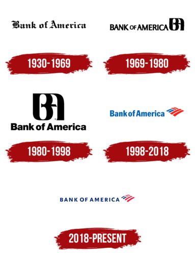
1930 – 1969
From 1930 to 1969, one of the largest banks in the United States used an emblem with black lettering in Gothic script. It depicted the name Bank of America, which looked presentable thanks to the letters, made in the style of medieval Latin. After all, it was believed that the fraction, as opposed to Antiqua, embodies depth, seriousness, and solidity. It was created by ancient scribes, who tore off the pen from the paper, as a result of which the words of the handwritten text became discontinuous. To reproduce the logo, you can use a close modern analog of the font – Archive Black TitleFont Family from Archive Type.
1969 – 1980
In 1969, the logo designed by Walter Landor appeared. The graphic designer insisted and managed to convince the board of directors. He proposed many variations until the General Counsel said that it did not matter what the logo looked like as long as it had the letters “B” and “A.” Thus came the monogram, which was intended to mimic a name stamp. On the left was the inscription “BANK of AMERICA.”
1980 – 1998
Over time, the name began to be written at the bottom of the monogram. The letters “B” and “A” were capitalized, and the rest of the letters were lowercase. The Helvetica Black font gave them a modern look.
1998 – 2018
After the merger of NationsBank and BankAmerica, the current Bank of America emerged with $525 billion in assets. Some of these funds went into the development of a new logo: a red and blue abstract figure reminiscent of the US flag. An attentive observer will notice the letters “B” and “A” in the six colored stripes. The name of the financial institution has been moved to the left and repainted in blue.
2018 – today
In 2018, Lippincott made thin lines, changed the colors, changed the case of the lettering, and increased the letter spacing.
Bank of America: Interesting Facts
Bank of America became one of the biggest banks in the world after merging with NationsBank in 1998.
- Big Merger: In 1998, two big banks, NationsBank from North Carolina and BankAmerica, combined. This made Bank of America a huge bank serving customers across the U.S.
- Headquarters: The new company established its main office in Charlotte, North Carolina, where NationsBank was from. This choice showed the importance of NationsBank’s leadership in making the merger happen.
- More than Just Banking: Since joining together, Bank of America has grown to offer many more services, including investment help, wealth management, and financial advice, in addition to basic banking.
- Buying Merrill Lynch: In 2008, during a tough financial time, Bank of America bought Merrill Lynch, making it the top wealth management business in the world and a big name in investment banking.
- Leading Digital Banking: Bank of America was one of the first big banks to start online banking in the 1990s. It leads with new tech like mobile banking, AI financial helpers, and strong online security.
- Huge Customer Base: The bank works with millions of people, small and medium businesses, and big companies in all 50 U.S. states and over 35 countries, making it a major global bank.
- Going Green: Bank of America is working to be more environmentally friendly. It spends billions on things like renewable energy projects and building in a better way for the planet.
- Legal Issues: After merging, the bank had to deal with legal problems, especially the 2008 financial crisis. It paid a lot to settle issues related to its mortgage practices.
- Embracing New Tech: The bank invests in new tech, such as blockchain and AI, to make banking better, safer, and easier for its customers.
- Supporting Arts and Culture: Bank of America helps the arts thrive. It lets cardholders visit museums for free in several places and supports art organizations nationwide.
Since merging in 1998, Bank of America has grown into a leading global financial institution, focusing on innovation, customer service, and doing business responsibly.
Font and Colors
Designers turned Bank of America’s sense of self into a graphic sign that is on every credit card and in every branch. The stylized flag is coded with “B” as two blue stripes and “A” as four red stripes.
The newest logo uses a new sans-serif font: the name is now displayed in capital letters. The colors are darker than before 2018, although the palette remains the same: blue and red elements on a white background.
Bank of America color codes
| Royal Blue | Hex color: | #012169 |
|---|---|---|
| RGB: | 1 33 105 | |
| CMYK: | 99 69 0 59 | |
| Pantone: | PMS 662 C |
| Alizarin Crimson | Hex color: | #e31837 |
|---|---|---|
| RGB: | 227 24 55 | |
| CMYK: | 0 89 76 11 | |
| Pantone: | PMS 185 C |
FAQ
What does the Bank of America logo represent?
The modern Bank of America logo is an attempt to demonstrate the simplicity, ease, and accessibility of the financial institution it represents. The emblem depicts a flag that is identical in color to the U.S. national flag. It is placed sideways and has the shape of a regular rhombus. In front of it is the name of the bank, typed in the upper case in a chopped font.
Why did Bank of America change its logo?
Bank of America changed its logo for three reasons: 1. It wanted to be on trend and in line with current trends in corporate identity design. 2. The bank set a goal to get a logo that would match its status as a confident representative of the banking system internationally. 3. BofA wanted to emphasize patriotism and evoke emotional attachment from customers.
Does Bank of America have a new logo?
Yes, Bank of America has a new logo. It was adopted in 2018 and is an improved version of the previous logo. The three blocks of stripes on the makeshift flag are spaced slightly wider than before. The red and blue colors are as close to the palette of the American flag as possible. The lettering is in simple letters with wide spacing to show the bank’s modernity and accessibility.
