


![]() JPMorgan Chase Logo PNG
JPMorgan Chase Logo PNG
The logo of JPMorgan Chase demonstrates gracefulness, nobility, and fulfillment of its obligations. The emblem epitomizes clarity and transparency. It reflects the venerable age of the financial institution, dating back to the days of ladies and gentlemen.
JPMorgan Chase traces its roots to the Bank of the Manhattan Company, founded in 1799. Another major predecessor, the New York Chemical Manufacturing Company, appeared in 1824 and later became Chemical Bank.
J. Pierpont Morgan built the investment-banking side of the lineage. In the 1850s, he expanded his banking operations and, in 1871, joined Anthony Drexel to form Drexel, Morgan & Co., the foundation of his financial empire. By the 1890s, Morgan’s firm had become a major force in railroads, industry, and government finance. In 1895, he organized a gold loan to help the US government during a financial crisis. In 1907, he personally helped stop a wider banking panic.
After the Great Depression, new rules split commercial and investment banking. In 1959, Morgan’s firm merged with Guaranty Trust Company, forming Morgan Guaranty Trust Company. The retail-banking side underwent major mergers. In 1991, Chemical Banking Corporation merged with Manufacturers Hanover Corporation, creating one of the largest US banks of the period.
The modern company was formed in 2000, when JPMorgan merged with Chase Manhattan Bank to become JPMorgan Chase & Co. The deal joined Morgan’s Wall Street heritage with Chase’s commercial and retail banking base. In 2004, JPMorgan Chase bought Bank One Corporation, expanding its branch network and consumer banking business. During the 2008 financial crisis, it acquired Bear Stearns and Washington Mutual.
From 2010 to 2015, the bank focused on consolidation and international growth. From 2016 to 2020, digital banking and technology became larger priorities. By 2023, JPMorgan Chase ranked among the world’s largest financial institutions.
Meaning and History
![]()
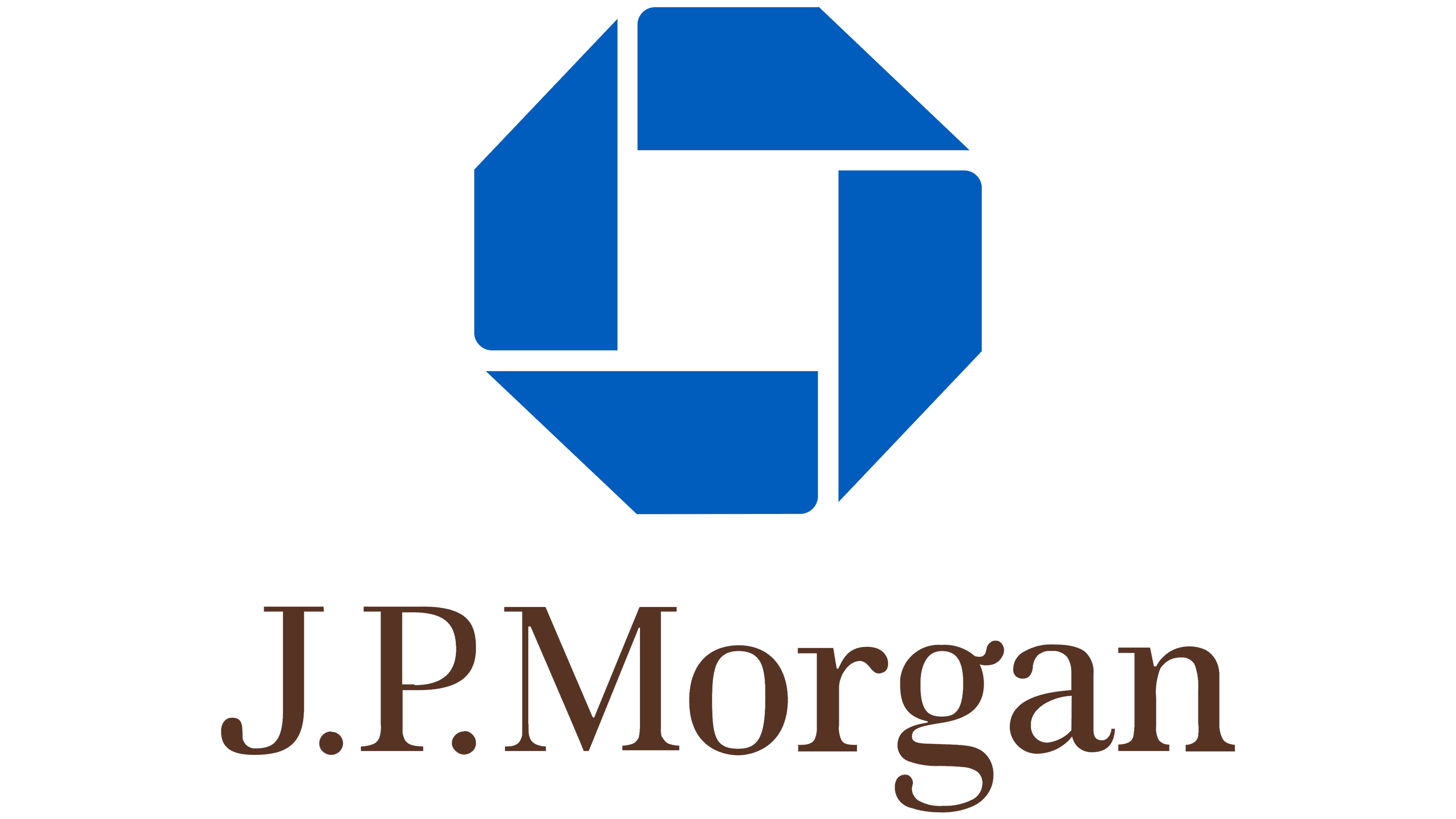
Looking back, the recognizable octagonal shape of the Chase logo dates to 1961, when Chase Manhattan Bank was formed through the merger of two companies. This resulted from the design firm Chermayeff & Geismar Associates offering eight different symbols. Management approved an octagon made up of four parts. They were originally multicolored but eventually became blue. After JPMorgan Chase appeared, the geometric figure complemented the name, then disappeared altogether, leaving only the inscription in the current logo.
What is JPMorgan Chase?
This is the name of the financial holding company from the state of Delaware, USA. In 2021, it was recognized as the largest bank in the United States. It was founded by several organizations, the oldest of which was the Bank of Manhattan Company. Their merger took place in 1996, but the true year of JPMorgan Chase’s creation is considered to be 2000, as this is when J.P. Morgan & Co. Incorporated and The Chase Manhattan Corporation.
2000 – 2008
![]()
The JPMorgan Chase logo, created following the merger of two financial industry giants, JPMorgan & Co. Incorporated and The Chase Manhattan Corporation, symbolizes unity and progress. It incorporates key elements that reflect the company’s strength, reliability, and growth.
At the core of the design is an octagon, a shape associated with movement, stability, and forward direction. In the center of the octagon lies a white square, symbolizing a secure bank vault. This visual element underscores that the safety of clients and their assets remains the company’s top priority.
The octagon represents progress, emphasizing renewal and transformation within the financial industry. Strict geometric forms give the emblem a sharp and modern appearance.
The typeface is a grotesque style, with bold black letters that appear substantial and formal, reflecting the company’s strength and authority. The absence of spaces between words highlights the cohesion and unity of the organization’s structure, which is vital for a financial institution of this scale. The black color of the letters enhances the sense of seriousness and professionalism.
The logo symbolizes a new era for JPMorgan Chase, showcasing the company’s readiness to embrace challenges and innovative solutions. Its visual elements effectively convey the message of uniting experience and innovation to drive the organization forward.
2008 – 2024
![]()
The redesign brought noticeable changes, especially in the graphic part. The octagonal geometric figure disappeared; there was no place for it, even in the upper right corner. At the same time, the logo developers updated the inscription, adding missing spaces and converting all letters to uppercase. However, the first letter “JPM” in the word “JPMORGAN” and the letter “C” in the word “CHASE” are still above the other characters.
2024 – today
![]()
The updated JPMorgan Chase logo reflects the company’s transformation and its commitment to a more cohesive, modern representation. This step demonstrates the brand’s evolution and a rethinking of its visual identity. The logo has become concise, formal, and precise, conveying the company’s key qualities: stability, professionalism, and innovation.
The main change in the new emblem is the unification of the company name into a single word: JPMorganChase. This decision emphasizes the brand’s unity and integrity by removing unnecessary elements, such as spaces and “& Co.” The condensed text appears more contemporary, reflecting the company’s drive to stay relevant.
The font has been bolded but retains its elegance. Rounded elements in the letters add a touch of softness to the logo, making it approachable while maintaining its formal and professional tone. The spacing between the letters has been reduced, creating a compact and visually balanced design.
A distinctive feature of the rebranding is the introduction of brown into the color palette. This choice was inspired by the company’s new headquarters at 270 Park Avenue in New York City. Brown symbolizes reliability, while its combination with blue adds depth and sophistication.
The logo’s compact design reflects a commitment to unity within the company and simplicity in client communication. The bold font underscores JPMorgan Chase’s authority and influence, while the rounded edges highlight its focus on modernity and client-oriented values.
Font and Colors
jpm logo
From an artistic point of view, the current emblem is much simpler than the previous one. It does not have a multi-part octagon composed of small quadrilaterals, and its semantic load does not imply symbolism. Designers have abandoned the hand-drawn elements, moving away from the old Chase concept. Now, the badge can be associated only with seriousness, strictness, responsibility, and stability. This is exactly what the bank’s employees, who opposed abstractions back in 1961, wanted. After 47 years, they still won.

The font of the new logo is the complete opposite of the previous version. If before it was chopped and bold, now the phrase “JPMORGAN CHASE & CO,” is written in an antique font. The letters are very similar to the lettering of the neoclassical ITC Century Book font designed by typographer Tony Stan.
The color scheme is as simple as possible, as the emblem consists of only black letters on a blank white background. The monochrome is perfect for a bank holding company and emphasizes its laconic image.
![]()
The new JPMorgan Chase emblem is designed in a single-serif font. The most likely candidate is a typeface inspired by classic fonts such as Baskerville or Times New Roman, though it may have been specifically adapted for the company’s logo.
Font features:
- Clear serifs lend the text sophistication and elegance while maintaining a sense of formality.
- The letterforms have moderately thin lines with slight contrast between main strokes and connecting elements, achieving a balance between modernity and tradition.
This style is perfectly suited to the financial sector, conveying trust, stability, and long-term values.
All elements of the logo are designed with uniform proportions:
- The capital letters in “JPMorgan” and “Chase” have consistent heights.
- The width and height of the lowercase letters are also standardized, creating visual unity in the text.
There is no contrast between “JPMorgan” and “Chase”; the logo is designed in a single style, with both words equally legible as part of a single brand.
The logo’s kerning (spacing between letters) follows a standard format for serif fonts. The letter spacing is balanced to ensure readability at all scales, from small images to large banners.
- The spacing between letters is consistent throughout the logo.
- The text’s composition gives an impression of cohesiveness and precision, with no emphasis on any specific part.
The company’s black-and-white logo reflects professionalism and formality. Black symbolizes reliability, strength, and authority, perfectly aligning with the brand’s mission and values.
The emblem is designed to be as simple and restrained as possible:
- To avoid excess, the text is arranged in a single line without decorative elements.
- The composition is symmetrical and clean, making the logo concise and versatile.
![]()
FAQ
What does the JPMorgan Chase emblem mean?
In the previous logo, the banking organization’s name was complemented by a symbol representing progress, security, and development. In 2008, the designers removed this element, leaving only a strict black inscription on a white background to underscore the seriousness of the financial holding company.
What is JP Morgan Chase’s logo?
Since 2008, the banking conglomerate has used a text logo that spells out only its name: “JPMorgan Chase & Co.” in uppercase. Although all letters are capitalized, the “J,” “P,” “M,” and both “C’s” are enlarged nearly one and a half times.
What is the JPMorgan Chase logo font?
The JPMorgan Chase logo font has much in common with ITC Century Book, which Tony Stan designed. It also features high-contrast lettering and thin serifs. At the same time, there are differences, which are especially noticeable in the capital “C.” The last word mark is in a font close to Tagir Safaev’s FreeSet Demi Bold.