The American financial and payment system from 1956 – VISA, whose logo is known to everyone today, got its name in 1976. The identity symbolizes the multinational significance of the brand, its purpose, and its close connection with the history of its creation.
Visa: Brand overview
Visa is an American company providing payment services. It emerged in 1958 when the financial conglomerate Bank of America started issuing BankAmericard cards and created the BankAmericard Service Corporation. The system was later renamed to the more universal name Visa.
Meaning and History
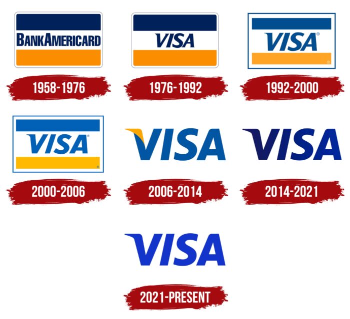
The visual corporate style has hardly changed over the past 40 years. The first logo with the “Visa” inscription appeared in the mid-1970s and underwent several minor redesigns. Before this, a similar name was used but with the phrase “BankAmericard.”
What is Visa?
Visa is the name of an international payment system and the American financial corporation that owns it. It is used for transferring money worldwide. Experts consider it one of the most valuable companies today. It was launched in 1958 as the Bank of America credit card project, gradually transforming into an independent representative of the banking market.
1958 – 1976
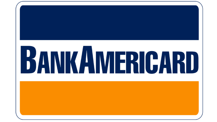
The first logo looked like a rectangular plastic card with rounded corners. Its top part was dark blue, the middle was white, and the bottom was orange. In the center, there was an inscription “BankAmericard” in bold sans-serif font. All letters were uppercase, but “B” and “A” were taller than the rest.
1976 – 1992
To make the brand transnational, the owners renamed the financial system. Thus, Visa, one of the most successful brands in the world, was born. The name change allowed for an increase in target audience reach as the geographical association with America disappeared. Moreover, this became the reason for the logo update.
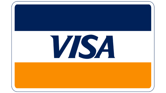
Designers followed a familiar scheme: they replaced BankAmericard with Visa, preserving the old proportions and colors. The word is written in italics, with an emphasis on the slanted letter “V.” The letters have serifs.
1992 – 2000
In 1992, the palette became brighter. The rounded corners of the outer frame became straight, and the contour became wide and blue. This version of the logo can still be seen in some commercials.
2000 – 2006
At the end of the 20th century, developers increased the space between the letters and slightly reduced the slant of the letter “V.” Moreover, the blue color was replaced with light blue, and the orange with yellow.
2006 – 2014
Despite global success, company leaders decided to revitalize the brand. It seemed illogical that the company provided a vast number of financial services, but its logo depicted only a credit card. In November 2003, specialists began developing a new trademark. It hardly differs from previous versions: essentially, it’s the same “Visa” inscription but without rectangular elements and an outer frame.
The font remains italic, though its slant has decreased. The protruding angle of the letter “V” is colored yellow to emphasize the clarity and conciseness of the image.
2014 – 2021
In 2014, the company abandoned its classic palette for the first time. They removed the gold color, which was identified with the hills of California, and kept only blue, symbolizing the blue sky. To diversify the logo, designers used a gradient.
Rumors suggest that the brand got rid of the yellow color to become closer to people. For many, this color is associated with gold, signifying unattainable luxury and prestige. Visa, in turn, tried to make credit universally accessible.
2021 – today
In 2021, the financial company Visa introduced its new style through the agency Wieden+Kennedy. To convey the new concept to customers, they used a commercial filmed by director Malik Hassan Said. The result of the rebranding was an updated version of the wordmark. The international studio Mucho took on its creation.
The shape, which has become traditional, remained unchanged. Designers focused only on the color: they removed the gradient and made the entire inscription bright blue, preferring a dynamic, saturated shade (#2639c3). Despite the lack of radical updates, the logo was perceived differently. The simplification of the color scheme improved the display of the word “VISA” in the digital space. Moreover, the palette looks optimistic, which also positively affects the branding of the payment company.
Visa: Interesting Facts
- Start and Name: Visa began in 1958 in California. In 1976, it got the name “Visa” because it’s easy to say and understand everywhere.
- Electronic Payments: In 1973, Visa made it possible to approve payments electronically, which was a big deal. It helped make buying and selling easier and faster.
- Olympics Support: Visa has sponsored the Olympic Games since 1986, connecting people worldwide.
- Online Shopping: Visa helped make shopping online safe in the 1990s, so people could buy things online without worrying as much.
- Chip Cards: Visa introduced cards with chips to make them safer and harder for bad people to copy.
- VisaNet: Visa has a large computer network that can quickly handle a large amount of payment information, ensuring that people’s purchases are safe and fast.
- Becoming Public: In 2008, Visa sold its stock to the public in a big sale that showed its importance in money.
- New Ideas: Visa keeps looking for new ways to pay, like tapping your card or paying with your phone, to make buying things easier and safer.
- Worldwide Use: Visa is accepted in over 200 countries, making it easy to buy things when traveling or shopping from far away.
- Caring for the Planet: Visa wants to help the environment by using clean energy and allowing people without bank accounts to access the financial system.
Visa is important because it helps people buy and sell things worldwide, making life a little easier and safer.
Font and Colors
The main emphasis of the bank logo is on the text, so there are no graphic elements. The only hand-drawn detail is the elongated wedge-shaped serif on the left side of the letter “V,” which makes the font universally recognizable. From 2005 to 2014, it was highlighted in yellow.
From the beginning, Visa used a slanted font resembling italics. The debut emblem had a serif font, while the others had a block font from the Sans Serif category. The palette of the official logo is blue and yellow, but in 2000, they were replaced with blue and orange. After the redesign in 2014, the financial company completely abandoned the gold color, which symbolized the California hills, leaving only dark blue. This is explained by the system’s striving to become closer to potential clients, while the yellow color is associated with unattainable gold for many.
Visa color codes
| Persian Blue | Hex color: | #1434cb |
|---|---|---|
| RGB: | 20 52 203 | |
| CMYK: | 90 74 0 20 | |
| Pantone: | PMS 2736 C |
FAQ
What does the Visa logo represent?
The Visa logo is a bold wordmark set in uppercase letters without serifs. The only design element is the wedge-shaped extension of the letter V on the left side. In the modern version, the symbols have a smooth, streamlined shape without serifs, although they were previously present in the emblem.
Why did Visa change its logo?
Visa has changed its logo several times. The first adjustment occurred in 1976 with the transition of the financial structure to a new name. Another change is related to the disappearance of the yellow color. The management abandoned it in 2014 to show the system’s general accessibility to the entire world’s population, as the yellow color was associated with gold. Designers kept only blue – the color of the sky, common to all people.
