


 Bitcoin Logo PNG
Bitcoin operates as an open payment network with decentralized currency issuance and transaction processing. The Bitcoin logo therefore represents a different kind of financial relationship from those associated with bank logos. Network users transfer funds directly to one another, with optional bank involvement.
Bitcoin emerged in 2008 during the financial crisis, introduced by Satoshi Nakamoto through a nine-page paper published on metzdowd.com on October 31. It described a bankless, peer-to-peer payment system based on blockchain. Nakamoto’s identity remains unknown.
On January 3, 2009, the genesis block was mined, embedding a headline from The Times about bank bailouts. The first client followed on January 9, and on January 12, Nakamoto sent 10 BTC to Hal Finney. Bitcoin had no market price then.
In 2009, user NewLibertyStandard set an early rate at 1309 BTC per dollar. Trading began in 2010 with Bitcoin Market and later Mt. Gox. That year, Laszlo Hanyecz paid 10,000 BTC for two pizzas.
By 2011, Bitcoin reached dollar parity and peaked at $32. Time coverage drew attention, while its use on Silk Road shaped its reputation. Nakamoto left the project in 2011.
In 2013, Bitcoin exceeded $1,000 amid the Cyprus banking crisis. Ethereum emerged as a technological counterpart. In 2014, Mt. Gox collapsed after losing about 850,000 BTC, triggering a market drop.
The price surged again in 2017, reaching $19,483, as ICOs and Litecoin grew. After an 80% decline in 2018, institutional interest rose in 2020–2021, with Tesla and MicroStrategy adding Bitcoin to reserves.
In 2021, Bitcoin hit $63,600, and El Salvador adopted it as legal tender. In 2024, the US Securities and Exchange Commission approved ETFs from BlackRock and Fidelity. By October 2025, the price had surpassed $126,000.
Meaning and History

Compared with other cryptocurrencies, Bitcoin is the most sought-after and widely used. Today, it is included in the Unicode standard under its unique code point. The original logo has two parts: the text (the system’s name) and the graphic (the BTC symbol).
However, before becoming the basis of the authentic emblem, it underwent several separate modifications. For example, at first, the unit of account’s designation resembled the Thai baht, with a single vertical line crossing the capital letter “B”. However, when the community recognized it as a stable, reliable cryptocurrency, its symbol began to resemble a “B” with two vertical lines, like a dollar sign. The letters “BC”, short for “bitcoin”, were also used in this way.
What is Bitcoin?
Bitcoin is a peer-to-peer cryptocurrency and decentralized payment system that uses it as its unit of currency. An unknown person (or group) named Satoshi Nakamoto introduced it in 2008 and put it into circulation in 2009. Bitcoin is mined or exchanged on a peer-to-peer network without intermediaries.
2009 – 2010
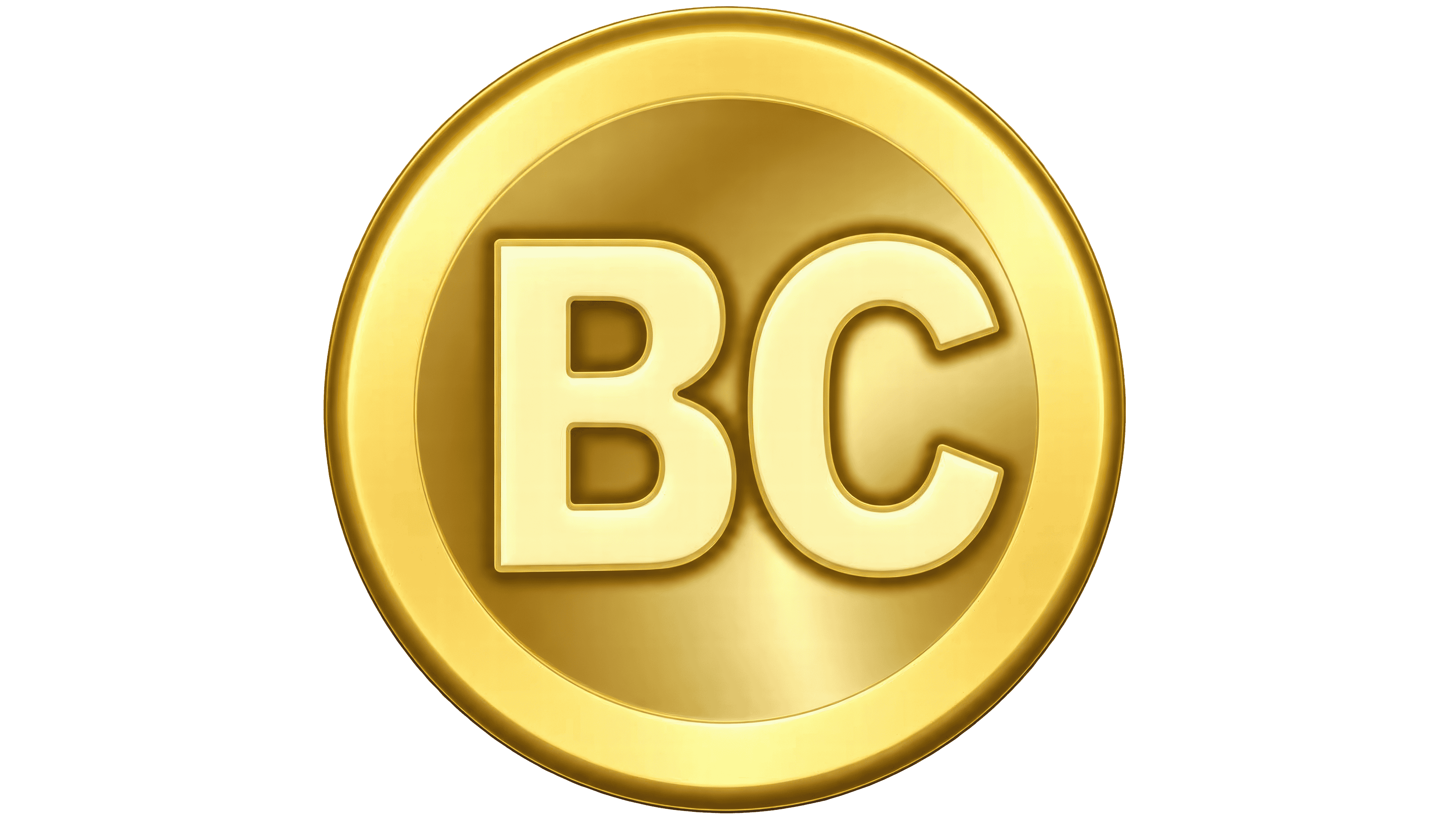
The first Bitcoin logo depicted the digital currency as a gold coin. Satoshi Nakamoto created it for the software released in January 2009. The name referred to an open network for electronic payments between users. The project was introduced on October 31, 2008, when Nakamoto sent a message to the metzdowd.com cryptography mailing list with a link to a nine-page paper on peer-to-peer transactions.
The name Bitcoin combines “bit,” a unit of digital information, with “coin.” It connects computer technology with a familiar term for money. In English, capitalization distinguishes two uses. “Bitcoin” refers to the network and protocol, while lowercase “bitcoin” refers to the monetary unit. The early emblem shortened the name to “BC.” The two capital letters corresponded to the two parts of the spelling “BitCoin.”
A rim surrounded the gold-colored circle, while highlights and shadows gave it a three-dimensional appearance. The letters in the center appeared embossed, as if stamped onto an actual coin. The logo was used in the early software client, so its design was shaped by the requirements of a small on-screen icon.
Imitating a physical object is an example of skeuomorphism. This design approach reproduces real-world features in digital interfaces. The term comes from the Greek words “skeuos,” meaning “tool,” and “morphê,” meaning “form.” This approach was popular when Bitcoin emerged. Two years before the cryptocurrency’s first logo appeared, Apple released the iPhone, whose user interface relied heavily on the same principle.
2010

By early 2010, BitcoinTalk members were discussing replacing the abbreviation “BC” with a symbol resembling familiar currency signs. Suggestions included the ampersand “&,” adding a “T” to the existing initials, and using “BTC” as the currency code. On February 5, NewLibertyStandard proposed pairing the abbreviation “BTC” with the Thai baht symbol “฿.” Nakamoto developed a different design. The image published on February 24 featured a “B” with two vertical strokes instead of one.
The gold-colored coin remained the logo’s foundation, with the new symbol replacing “BC” at the center. The paired lines extended above and below the letter but were concealed behind its body. Bitcoin now had a distinct currency symbol in place of an abbreviated name. The coin depicted represented one bitcoin, or 100 million satoshis.
Discussion continued after the design was published. Some users criticized the new version and suggested revisions. A member named Sabunir recommended increasing the tonal contrast between the “B” and the coin’s surface. On February 26, Nakamoto reported that he had lightened the letter and darkened the background, using the color of the previous “BC” lettering for the symbol.
For the small 16 × 16-pixel icon, Nakamoto felt that preserving the coin’s outline and a few embossed details was sufficient. In larger versions, the shadow affected the image’s proportions. It extended farther to the right than downward, resulting in dimensions of 32 × 31 and 48 × 47 pixels. He released the images into the public domain. He asked anyone creating derivative works to distribute them under the same terms.
2010 – today

By November 2010, BitcoinTalk members had identified a common goal. The Bitcoin symbol needed to work across different sizes, proportions, and media so that its variants could be used interchangeably. A user known as bitboy introduced a design. In his first post on November 1, he published a set of images that included a white “B” with two strokes inside an orange circle. He undertook the work on his own initiative.
Bitboy retained Nakamoto’s currency symbol and rotated the serif letter approximately 14 degrees clockwise. The rim and embossed metallic appearance were removed. He explained that the flat design made details easier to distinguish at smaller sizes. The orange background used the color #F7931A. Forum members responded positively, and the orange-and-white emblem became widely used to represent Bitcoin.
The set included a version with the name “bitcoin” beside the circle, rendered in lowercase italic sans-serif lettering. Bitboy identified the typeface as Ubuntu, developed by Dalton Maag with funding from Canonical for the Ubuntu project. It was used for the wordmark, while the serif “B” inside the emblem was a separate design. He prepared versions for light and dark backgrounds, made the images available as free downloads, and later marked the published set as public domain.
Familiar payment brands served as design references. When someone compared an image in the set to Mastercard, bitboy acknowledged Mastercard’s and Visa’s influence while noting his reservations about both companies. He explained that borrowing from their visual identities drew on people’s trust in payment services and their familiarity with how those services were presented.
Debate over the currency’s symbol continued after bitboy’s design gained acceptance. The people behind bitcoinsymbol.org advocated a symbol comparable to those for the dollar, euro, or yen. They spent years campaigning to replace the logo. In April 2014, they proposed “Ƀ,” a letter with a horizontal stroke that was already encoded in Unicode as U+0243 and used in Latin-based alphabets.
The “₿” symbol later received its own code point. It was added to Unicode 10.0, released on June 20, 2017, as U+20BF under the name “BITCOIN SIGN.” This made it possible to include the symbol in text when the font supports it. The standard defined a currency symbol whose appearance varies by typeface. The orange circle and tilted orientation remained features of the logo.
Font and Colors
As the project gained popularity and success, it needed a symbol. It needed to represent something unlike any competing virtual system. Then, Satoshi Nakamoto presented the first version of the logo to the world. In February 2010, he posted the design on the BitcoinTalk forum and suggested that one bitcoin equals 100 million satoshis. Forum visitors then shared their opinions.
As a result, the discussion participants reached a consensus: the emblem must meet certain criteria to prevent fraudsters from copying it. At first, the BTC emblem consisted of three elements: a rectangle, a small circle, and a curved line. Later, Nakamoto tweaked the official symbol by adding two vertical strokes – a dash at the top and bottom. Bitboy created the current version.
The numerical designation for the “B” block is eight (8). The top and bottom lines of the capital letter should match the dollar sign. But if you look closely, you will notice the icon’s stroke is incomplete and different from the dollar stroke. As a result, the graphic looks as if the letter “B” is superimposed on the “$” and overlaps it. This technique has a special meaning: it is time to replace the old currency with a new one, bitcoins.

The inscription “bitcoin” is slanted and lowercase. The font is smooth and sans-serif. The “i” characters are the same height as “t,” with half of the horizontal stroke cut off. The tops of “b” and “t” are cut at an angle to the left, and the pointed ends are cut to the right. Early attempts to incorporate the distinctive BTC mark into the Unicode system failed. However, in late 2015, Bitcoin was officially registered and received its symbol.
The cryptocurrency’s palette consists of several colors. The inscription can be white or gray; the virtual unit of account is white; the coin is orange; and the background is black or white. The yellow-orange color scheme feels natural because it evokes gold’s sheen.
FAQ
What is the symbol of Bitcoin?
In Bitcoin’s early years, its symbol was BC, an abbreviation formed from two bases: bit (a unit of digital information) and coin (money). Later, the symbol became a single letter B with two short strokes at the top and bottom, similar to the vertical line in a dollar sign ($). On exchanges, this cryptocurrency trades under the ticker BTC. It also has a variant called XBT.
Who owns the Bitcoin logo?
The Bitcoin logo belongs only to the payment system of the same name. Its actual owner is considered Satoshi Nakamoto, the cryptocurrency’s creator. However, since he designed the logo for everyone, it has no real owner. It is also “decentralized” and is used both for the website and to denote the currency.
Who designed the Bitcoin logo?
Two people designed the Bitcoin logo. Satoshi Nakamoto (the creator of this cryptocurrency) presented the first version he designed in 2008. Later, Bitcoin enthusiasts finalized it and made it the standard used today.
Why is the Bitcoin logo orange?
A member of a crypto-enthusiast forum invented the modern Bitcoin logo after Satoshi Nakamoto, the creator of this digital currency, asked for advice. The stranger, who went by the nickname Bitboy, was inspired by the MasterCard logo and used an orange circle as a model. This palette is considered a marketing palette. In hex, it is #F6911D; in Pantone, it is 1495 C.