


GoodPop’s frozen desserts have a new look, with a larger wordmark on a turquoise panel. The brand announced the update on February 24, 2026, and presented it at Expo West in March. Its in-house creative team focused on the moment shoppers encounter the brand in the freezer aisle. In just a few seconds, the packaging needs to convey the pleasure of a treat and help shoppers spot GoodPop among other desserts.
The logo’s story began with a sketch Daniel Goetz made as a student at the University of Texas at Austin. He founded GoodPop in 2009 and began making frozen fruit pops. He wanted to recreate familiar treats with natural ingredients and less sugar, without artificial additives. The brand eventually expanded into national U.S. retailers, including Whole Foods, Sprouts, Walmart, Kroger, and Costco. Its lineup grew to more than 20 flavors. Goetz sees the update as reflecting the company’s growth and continuing its original vision.
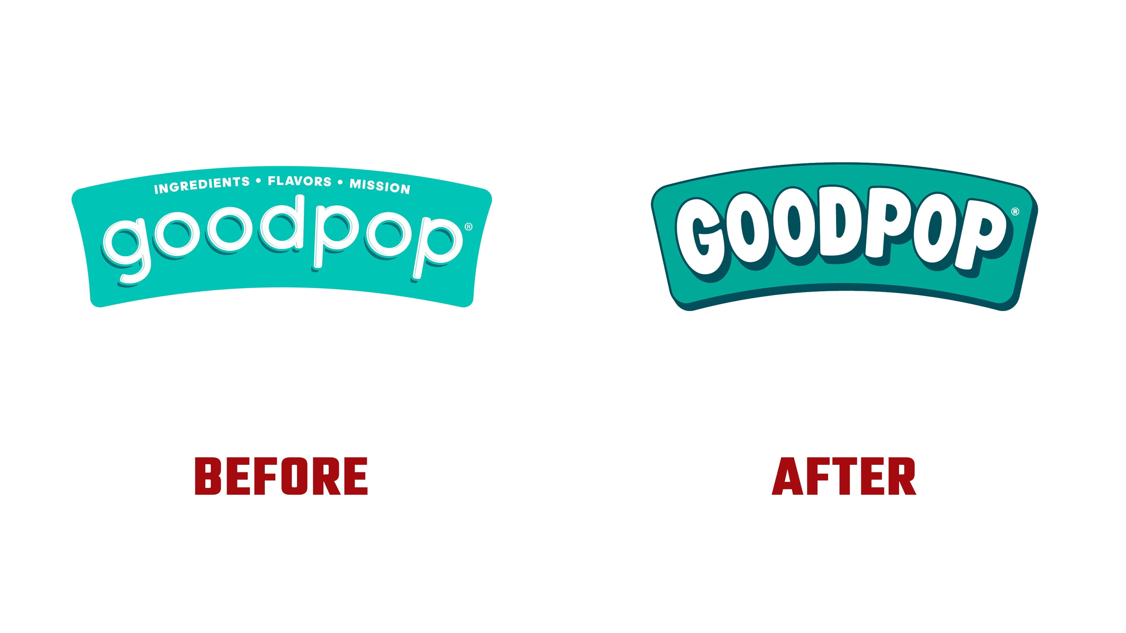
The shared turquoise panel originated in an earlier packaging project. GoodPop began working with Interact Brands in 2020, and the new boxes reached stores in early 2021. An expanding assortment and distribution through major retailers created a need to unify the product lines. Before the agency became involved, the logo’s color varied by flavor, and the name occupied only a small portion of the box. Interact introduced a turquoise panel with a gently curved wordmark while retaining the packaging’s white background.
The previous “goodpop” wordmark used thin, rounded lowercase letters. A single-story “g,” a tall “d,” and the descending stems of the “p” letters created height variations around the nearly circular “o” letters. Thin turquoise outlines and an offset shadow accompanied the white strokes. Above the name, the line “INGREDIENTS • FLAVORS • MISSION” referenced the company’s ingredients, flavors, and mission. The larger name replaces it in the 2026 version.
“GOODPOP” now appears in heavy uppercase letters that fill more of the panel. The rounded terminals remain, and the lower edge of the lettering follows the panel’s curve. Narrow vertical openings replace the circular counters inside the “O” letters. The white areas of the “G,” “D,” and “P” are larger. The letters vary slightly in their slant, while a dark shadow beneath the word adds depth. A thick outline and lower shadow separate the panel from the background.
The designers hid smiles in the curves of the “G” and “P.” They reference the enjoyment of a frozen pop and memories of favorite childhood treats. The arched panel maintains a connection to the previous logo. Turquoise remains the brand color, shifted one shade darker on the Pantone scale.
The update is intended to appeal to shoppers across generations. The large lettering and saturated colors aim to communicate the desserts’ flavor and ingredient quality. The recipes remain unchanged. On the boxes, the turquoise logo is paired with colors assigned to individual flavors. Short ingredient messages highlight natural ingredients and the absence of artificial colors and flavors. The B Corp mark identifies the company’s certification. Preliminary design testing showed a 10% increase in purchase intent.
The brand connects “Good” with the quality of its desserts, its business practices, and its contributions to the community. It supports charitable organizations through the Pledge Good Foundation. The tagline “Have a GOOD One!” works both as a wish for a good day and an invitation to enjoy a treat.