Visiting the chain stores is a joy, the Walmart logo promises. Here you can find a complete list of necessary things for the house. The emblem shows clear logistics, a well-thought-out assortment, and the correct location of goods inside the supermarket.
Walmart: Brand overview
| Founded: | July 2, 1962 |
| Founder: | Sam Walton |
| Headquarters: | Bentonville, Arkansas, U.S. |
| Website: | walmart.com |
Meaning and History
In 1945, businessman Sam Walton, a former employee of JC Penney, acquired a Ben Franklin store from Butler Brothers and set up his low-cost point of sale. His strategy was to compensate for the low price with a fast turnover. Despite the failures that accompanied the store’s work for the first time, the owner did not give up, although the rent and purchase of premises for branches took an incredibly large amount of money. A similar situation was with the suppliers of goods, as he suffered losses due to the small difference between the purchase price and the possible selling price.
Despite this, the outlet brought in an income of 105 thousand dollars in the first year of operation. Profits increased in the following years. But then the store’s lease expired, and the owner of the commercial business was forced to open it elsewhere. The result was the legendary Walton’s Five and Dime store in Bentonville, which is now the eponymous museum and tells the brand’s story.
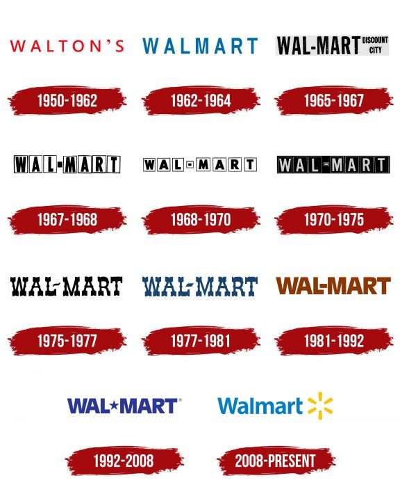
In 1962, the chain’s founder opened his first store in Rogers, calling it Walmart Discount City. Sam Walton got the idea for the corporate design from Ann & Hope. Having settled in a new location, the trading company began developing and expanding, increasing profits in five years to $ 9 million. In 1968, the company opened its first offices outside of Arkansas. In 1969, she officially registered as Wal-Mart, Inc. The next year, the store changed its name to Wal-Mart Stores. He also actively updated signs (logos), of which he has about ten.
1950 – 1962
The first store opened in a rented building was named Walton’s Five and Dime, the first part of which became his emblem. The sign featured the word “Walton’s” in simple block letters, sans serif. The chopped marks were thin and widely spaced in the title.
1962 – 1964
After the lease of the previous premises ended, Walton was forced to open a new store called Walmart. Signs featured the word in various styles and fonts, but the most common version was the blue-letter version from the Sans Serif category. These are simple grotesque signs of an elongated shape located on a white background.
1965 – 1967
For its round shape with an elongated rectangle, the emblem of those years was nicknamed “medallion” among the people. It was informative and served as an advertisement rather than a trademark. There was a lot of textual information on it. In the middle, on a horizontal rectangle, it said: “Wal-Mart” (in upper case) and “Discount City” (in lower case). In addition, there were a couple of other words: “Everything for less” and “Satisfaction guaranteed,” placed in opposite parts. The circle and the rectangle crossing it were edged with two stripes – white and black.
1967 – 1968
The store introduced custom branding that same year, as the previous one was a repeat spied on by Ann & Hope. It was primitive and consisted of a name, each letter of which was in a separate rectangle. True, there was more white in this version, while in the previous logo, it was the other way around. All characters in the word “Wal-Mart” except for the hyphen were placed in vertical geometric shapes. Its designers have made it black and wide.
1968 – 1970
The logo designers have kept the previous version, just tweaking it. They replaced the high letters with low ones, accordingly turning the rectangles into squares. The hyphen also got a separate frame.
1970 – 1975
The designers used the 1967-1968 emblem by changing the ratio of black and white. Light letters on a dark background, surrounded by rectangular frames, looked impressive and catchy.
1975 – 1977
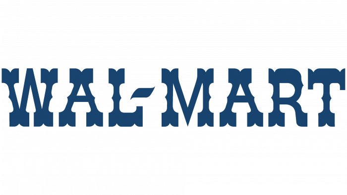
The retail chain has radically changed the logo, choosing a western-style font. Each letter had wide serifs that resembled curly rectangles. And on the legs, there were spike-like protrusions. They were tiny. The hyphen was placed diagonally in a wavy shape.
1977 – 1981
There were only three differences between the previous and the new logo:
- A clearer shape of curly serifs.
- Dark gray instead of black.
- The thickened hyphen.
1981 – 1992
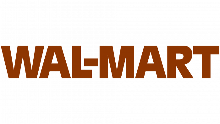
The Walmart logo is now brown. The designers also redesigned the typeface, using plain, sans-serif printable characters. There was still a hyphen between Wall and Mart, but it was next to the letters this time.
1992 – 2008
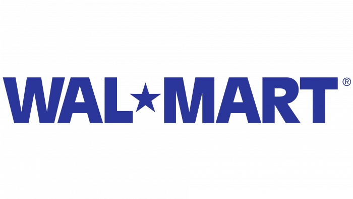
In 1992, the developers replaced the hyphen with a five-pointed star and used the brown space for blue. The inscription, as before, was in upper case. Moreover, this version of the trade network emblem is still found on branded trucks.
2008 – today
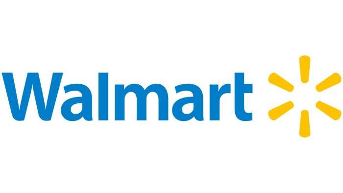
The yellow sparkle and blue color of the logo were approved in 2007 – along with the slogan. Even though the redesign took place a year earlier, the new attributes were officially approved only in 2008. The authors removed the separator from the store name and placed six circular dashes on the right side, behind the word “Walmart.” Now there is only one capital letter left in the name – “W.”
Walmart: Interesting Facts
Walmart, started by Sam Walton in 1962 in Rogers, Arkansas, has become the biggest retailer and private employer globally. It has a huge impact on business, economics, and society.
- Huge Reach: Walmart is the largest retailer worldwide, with thousands of stores in many countries. It offers everything from supercenters to neighborhood markets.
- Many Employees: It’s the world’s biggest private employer, with millions of employees helping run things smoothly, from managing supply chains to serving customers.
- Founding Idea: Sam Walton opened Walmart with a clear goal: to sell things cheaper than anywhere else. This idea of providing value still drives the company today.
- Supply Chain Smarts: Walmart is a leader in managing its supply chain, using tech and smart logistics to keep costs down and ensure product availability.
- Big Economic Influence: Walmart affects retail and global manufacturing and agriculture. Its decisions can change prices and how products are made and moved worldwide.
- Helping Communities: Through its foundation, Walmart supports disaster relief, fights hunger, and funds community projects, donating money and volunteer time.
- Worldwide Operations: Besides the U.S., Walmart operates businesses in the UK, Japan, and Mexico, among other countries, adapting to each market’s needs.
- Into Healthcare: Walmart now offers health services like vision and pharmacy, making healthcare more accessible and affordable.
- Tech Innovations: The company invests in tech to better shop, manage inventory, and create new ways to shop, including AI and autonomous delivery vehicles.
Walmart’s growth from a single shop to a global powerhouse shows its focus on customer value, operational efficiency, and innovation. It continues to shape the future of retail and corporate responsibility.
Font and Colors
The branding of the international trade network has undergone very significant changes. The only thing she retained was restraint. There are no bright colors and an abundance of details in it. On the sign, as well as on the logo, only the name was always present. At first, it was black and white, and then it became colorful. The fanciful symbols are replaced by the most simple and understandable letters.
This brand has used several types of typefaces in its logo. Moreover, she paid great attention to them because the logo served as an entrance sign. Early versions were dominated by a font reminiscent of Couplet CF Bold by Connary Fagen Type Design. Then another was introduced – with individually designed symbols in the Old English style. The modern logo uses the Myriad Pro-Bold typeface by Carol Twombly and Robert Slimbach for Adobe Systems. It’s a simple, bold sans serif with the W, a, and t slightly tweaked.
The brand range now consists of blue (lettering) and yellow (sun-shaped icon). Previously, it was black and white and red, dark gray, purple, and brown.
Walmart color codes
| Golden Poppy | Hex color: | #ffc300 |
|---|---|---|
| RGB: | 255 195 0 | |
| CMYK: | 0 24 100 0 | |
| Pantone: | PMS 7549 C |
| 007eca | Hex color: | #007eca |
|---|---|---|
| RGB: | 0 126 202 | |
| CMYK: | 100 38 0 21 | |
| Pantone: | PMS 3005 C |

