


![]() ASDA Logo PNG
ASDA Logo PNG
The ASDA logo communicates naturalness, safety, and a wide selection of products in the chain of stores. The emblem is fresh, like young greenery, which, without having time to wither, will fall on the buyer’s table. The sign demonstrates daily assortment updates and proximity to the home.
ASDA traces its roots to the 1920s, when Yorkshire farmers formed Hindell’s Dairies to supply milk and dairy products. In 1949, it merged with Asquith’s to create Associated Dairies & Farm Stores, establishing a base for expansion.
In 1965, the company entered retail with the acquisition of the Queens supermarket chain. The name ASDA combined “Asquith” and “Dairies”, and the first store opened in Castleford the same year.
Growth accelerated in the late 1960s and 1970s. In 1966, ASDA acquired GEM stores, extending beyond northern England. In 1978, it bought Allied Carpets to diversify, but the move diverted attention from its food retail business. The 1980s brought financial pressure and a decline in market share. In 1985, Allied Carpets was sold, and the company returned to its core grocery business. In 1989, ASDA expanded south by acquiring 61 Gateway supermarkets.
Recovery came in the 1990s with an “Everyday Low Prices” model influenced by Walmart. The strategy repositioned the chain around price competitiveness. In 1999, Walmart acquired ASDA for £6.7 billion and integrated its operations. During the 2000s, the company expanded into non-food categories, including the George clothing line.
By 2003, ASDA had overtaken Sainsbury’s to become the UK’s second-largest supermarket, after Tesco. In the 2010s, competition from discount retailers pushed investment in quality and online services. A proposed merger with Sainsbury’s in 2018 was blocked in 2019. In 2020, Walmart sold a controlling stake to the Issa brothers and TDR Capital.
Meaning and History
![]()
Supermarkets have developed historically, as their name suggests, after two entrepreneurs associated with the trade. They were farmers who initially dealt with livestock and dairy products. These are the families of Asquith and Dairies. They entered the business in different ways. Brothers Peter and Fred Asquith had several butcher shops, and their first store was opened in the former building of the city’s cinema.
The company then expanded by acquiring rival firms and merging with Associated Dairies and Farm Stores Ltd., from which the name ASDA is derived. These are the first two letters of each last name: Asquith + Dairies. This version was later taken as the basis for the logo. The text format has taken root. After all, it is best suited to a retail chain because it requires a clear, readable sign.
What is ASDA?
ASDA is the name of the British supermarket chain headquartered in Leeds. She sells a variety of retail products, including clothing and food. Today, these stores form the country’s second-largest chain.
1965 – 1968
![]()
In 1965, the specialized company GEM bought ASDA Stores Ltd. and renamed it ASDA Queens, which is reflected in the logo. It has an elongated “Q” with a large crown, each ray symbolizing a point of sale from the center. On the right, “ASDA” is written in small print, and “Queens” in large print. The logo format is black characters on a white background.
1968 – 1970
![]()
The trading platform’s management rebranded in the late 60s of the last century. The result is a shortened name and a new logo. This is a laconic inscription – “ASDA.” The authors did not add anything to it; it contains only one word, written according to the canons of grammar, with the first letter capitalized and the rest lowercase.
1970 – 1981
![]()
The emblem was set against a rectangular background, with a graphic element consisting of a drop-shaped point and a wave. The developers also added the word “SUPERSTORES” because stores have moved to supermarket status. Unlike the title block, the new one is in a thin font.
1981 – 1985
![]()
The designers have reworked and modernized the old logo. It is orange and looks like a horizontally elongated diamond-shaped rectangle. The blue icon with a white background is on the left. The word “ASDA” is on the right below “SUPERSTORES.” The letters in both inscriptions are much thinner than they were before.
1985 – 1994
![]()
In 1985, the era of wide, tightly connected signs began. Gaps “A” are yellow (at the first letter) and red (at the last character). Everything else is mint color.
1994 – 2002
![]()
The management eliminated the old version and approved a new one without multi-colored gaps. The developers also changed the mint green to light olive. This version was used on television and was intended for advertising.
1999 – 2002
![]()
There was another mint-green parallel painted, alongside the previous emblem, with deep shadows and a 3D effect.
2002 – 2008
![]()
The logo’s corrections from that period mainly concerned the shadows, which were removed.
2008 – 2015
![]()
The designers added a bright green hue to the lettering.
2015 – 2017
![]()
This logo reflects a new phase in ASDA’s development following its integration with Walmart, its parent company. The primary element of the logo, the brand name rendered in bold, rich green, remains unchanged, preserving continuity and recognizability.
A significant new feature of the logo is the orange symbol positioned above the letter “A.” This element, composed of short rays converging in a circle, resembles sunbeams or a flash of light. It symbolizes brightness, energy, and innovation while also highlighting the connection with Walmart, whose logo features a similar design. Including this symbol in ASDA’s emblem underscores the brand’s strengthened market position and commitment to meeting the high standards set by its parent company.
2017 – 2024
![]()
After the “spark” logo was canceled, the trading network administration returned to the 2015 version. He is the one who is used now.
2024 – today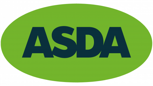
The ASDA logo blends modern trends with the heritage built over years of successful operation. The logo’s centerpiece is the brand name, displayed in bold, large type against an oval-shaped green background. This oval shape symbolizes unity and accessibility, reflecting the company’s focus on reaching a broad audience and its commitment to being close to every customer.
The dominant green color in the design is traditionally associated with nature, freshness, and sustainability, aligning perfectly with ASDA’s mission to provide fresh, high-quality products at affordable prices. The green background conveys vitality and dynamism, helping the company stand out from competitors while evoking positive emotions in customers.
The font used in the logo emphasizes the brand’s simplicity and accessibility. It is bold, solid, and easy to read, conveying a sense of reliability and confidence. The font is free of unnecessary details, supporting the company’s goal of clarity and straightforward communication with its customers.
Font and Colors
The transformation of the ASDA logo occurred frequently but not on a large scale. This is due to constant changes in the trading network and the forced rebranding. Visually, the picture changed from maximum to minimum:
Along the way, graphic elements disappeared.
- The thickness of letters decreased.
- The number of small details decreased.
This modernization resulted in a simple, laconic, and understandable emblem in bright green. It informs, looks good on labels and advertisements, and is an excellent sign.
The ASDA logo features a geometric sans-serif typeface reminiscent of the Futura ExtraBold. Designer Paul Renner created the font. The identity’s color scheme has almost always been associated with green, except for the first four versions: black, brown, and two white. At various times, the emblem was also made in olive, mint, light green, and dark green. She is now painted in Lemon Lime # 78BE21.
FAQ
Has Asda changed its logo?
The company has changed its logo, adding dark green to its brand identity. This new look comes from extensive customer research. The company listened to customers to understand what they love about the brand and how it needs to regain relevance and individuality in the market.
The updated logo reflects these insights and helps the brand stand out more. The dark green gives the logo a fresh, modern appearance while preserving its recognizable elements.
What is Asda famous for?
Asda Stores Ltd. is a British supermarket chain known for offering a wide range of products at very affordable prices. They sell food, clothing, toys, and general merchandise, making it a popular choice for budget-conscious shoppers in the UK.
In 1999, Asda became a subsidiary of Walmart, the world’s largest retailer. This acquisition helped the company expand its operations and strengthen its position in the retail market.
What does the Asda logo represent?
The logo shows the store’s name in capital letters, tinted light green. This design gives the brand a fresh, modern look, aligning with its focus on affordable, high-quality products. The name “ASDA” is derived from the words “ASquith” and “DAiries,” reflecting the company’s roots.
The logo was last updated in 2017 to stay relevant and appealing in the retail market. Its simple and clear design makes it easily recognizable and helps build strong brand loyalty.
Does Asda do delivery?
Due to its extensive logistics network, the company offers delivery services across the UK, reaching cities and rural areas. This allows us to deliver goods to even the most remote locations. Customers can place their orders through apps and websites, which account for around 30% of all purchases.
Shoppers can choose from a wide range of products, including groceries, clothing, and general merchandise, and have them delivered directly to their homes. The online ordering system is easy to use, allowing customers to browse, select, and purchase items from their homes.
In addition to standard delivery, the company offers next-day delivery and click-and-collect services, providing flexibility to meet different customer needs.
Who founded Asda?
The brand was founded in 1949 by the Asquith family. It started as a butcher shop business but transformed significantly in 1965 when it merged with Associated Dairies in Yorkshire. This merger laid the foundation for the company’s transformation into a supermarket chain. It is one of the largest supermarket chains in the UK, known for its wide range of products and affordable prices.
Is Asda a brand?
Yes, it is a registered trademark representing a chain of stores across the UK, headquartered in Leeds. It is well-known for offering a wide range of products, from groceries to clothing. The company operates several brands to meet different customer needs:
- Extra Special: Premium quality products at competitive prices, focusing on gourmet and high-end items.
- Smart Price: Budget range, providing essential items at the lowest prices.
- Farm Stores: Fresh produce and other farm-sourced goods, emphasizing quality and value.
- Little Angels: Products for babies and young children, such as diapers, baby food, and clothing.
- George: Affordable fashion, offering a wide selection of clothing and accessories for men, women, and children.
The variety of brands enables it to serve a wide range of customers, reinforcing its reputation as a versatile and customer-focused retailer.