


![]() Lidl Logo PNG
Lidl Logo PNG
The Lidl logo aligns with the corporate style used across all Lidl supermarkets. The bright logo embodies drive, positivity, and optimism because the brand aims to appear welcoming to attract customers. This is the foundation of its marketing.
LIDL is a German grocery company engaged in wholesale and discount retailing of food and household goods. Today, it owns an extensive network of supermarkets (over 10,000) across Europe and the USA, all designed in a uniform corporate style with blue, yellow, and red.
The company was founded in 1930 by Josef Schwarz, the owner of a small grocery store in Berlin, and his friend, economics professor Ludwig Lidl, who proposed the idea. Initially, the company was called “Lidl & Schwarz,” but it retained only the concise, resonant word LIDL, changing its spelling to uppercase. Schwarz led the business and, in just 10 years, positioned the wholesale food warehouses as leaders in Germany and Austria. During the war, LIDL was one of the suppliers of provisions for the army.
After Germany’s defeat, the company was liquidated, as all its assets were destroyed. However, Josef Schwarz decided to rebuild it from scratch, and within ten years, LIDL re-entered the top three among wholesale food agents.
Since 1977, the company has been divided into two segments: the economic segment and the food segment. It has also begun to engage in “price wars,” offering customers consistently lower prices than competitors. Despite economy-class prices, all goods in the LIDL network are of the highest quality.
Meaning and History
![]()
What is Lidl?
It is an international retail chain headquartered in Germany. Founded in 1973, it started as a small food store. Now, it’s one of the world’s largest discount retail chains, represented in over 30 countries. It offers a variety of affordable goods, including electronics, kitchenware, clothing, snacks, beverages, and more.
1862 – 1930
![]()
1930 – 1944
![]()
1973 – today
![]()
The foundation is a blue square, symbolizing stability, quality, and reliability. Inside is a yellow circle in a red ring, symbolizing the company’s loyalty and friendliness. In the center is the brand name LIDL, rendered in large blue-and-red letters. The lowercase letter ‘i is angled, visually making it even larger than the rest. The logo is bright and memorable, allowing the brand to be identified at first glance. Experts assert that the LIDL emblem inspires trust and a desire to shop with them.
Font and Colors
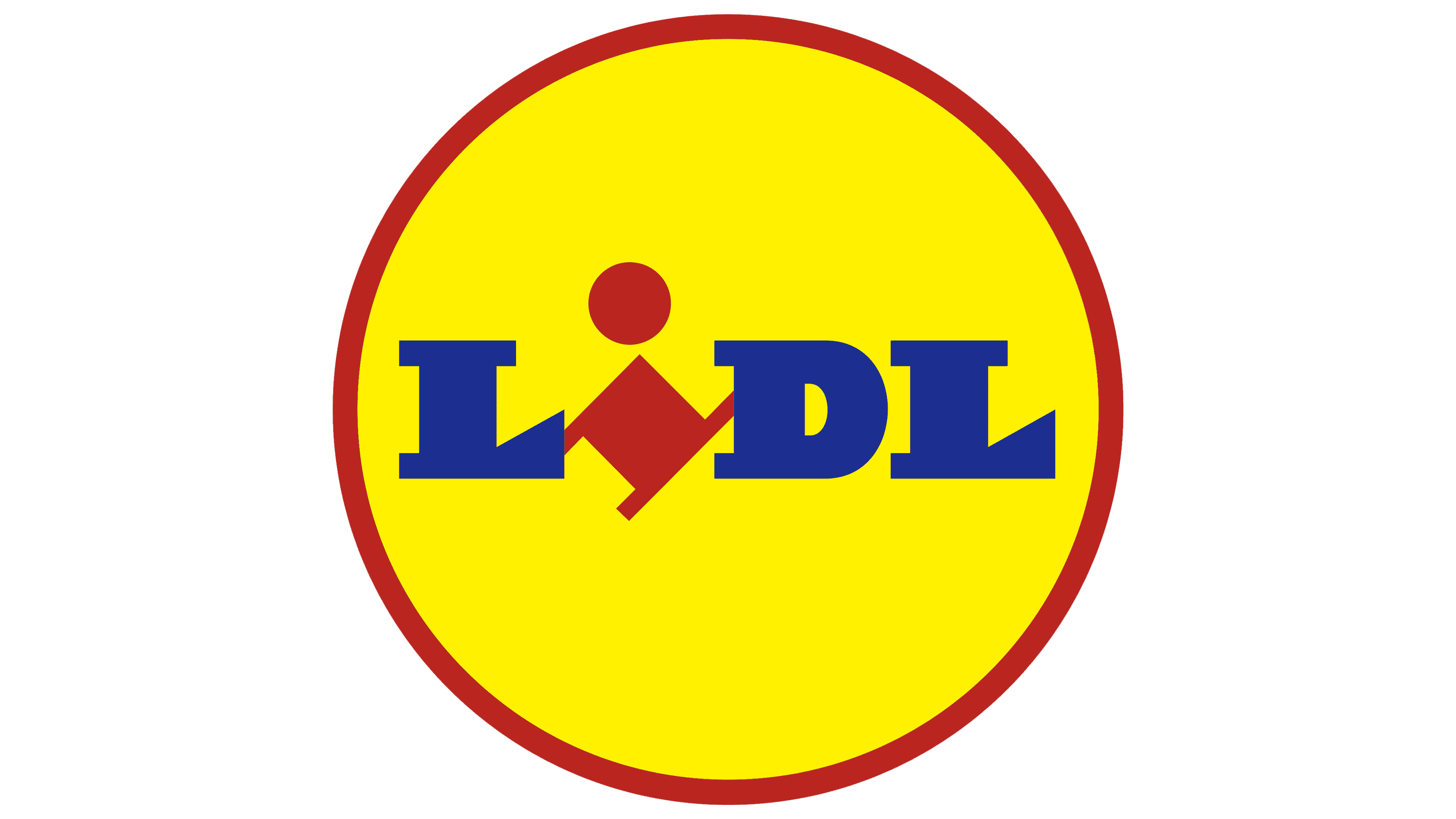
Since its inception, the logo of the well-known retail chain has reflected an optimistic style, openness, and friendliness, central to the name, which is an inscription of three uppercase and one lowercase letter. Additionally, the developers highlighted the letter “i” in red, while the other characters are blue. Visually, this symbol resembles a playful little man with a round dot for a face. To emphasize this similarity, the letter is rotated. Then follows a yellow circle outlined in red. All elements are within a blue square.
The letters in the logo are not written but drawn, so it’s pointless to talk about a typographic font. Each character in the word is individual. They resemble serif fonts, but it’s impossible to identify an exact match. The “L” has a significantly raised and truncated leg end, the “D” is very wide with an almost imperceptible inner gap, and the “i” is lowercase.
The life-affirming, joyful color of the logo is created by combining red (#EE1C25), yellow (#FFF200), and blue (#015AA2).