The emblem informs about pleasant, pleasing prices in the network stores. The Best Buy logo is a prototype of major acquisitions. He says that on the shelves, there is only reliable equipment that will serve for a long time. Therefore, customers will be satisfied with the purchase.
Best Buy: Brand overview
| Founded: | August 22, 1966 |
| Founder: | Richard M. Schulze, James Wheeler |
| Headquarters: | Richfield, Minnesota, U.S. |
| Website: | bestbuy.com |
Meaning and History
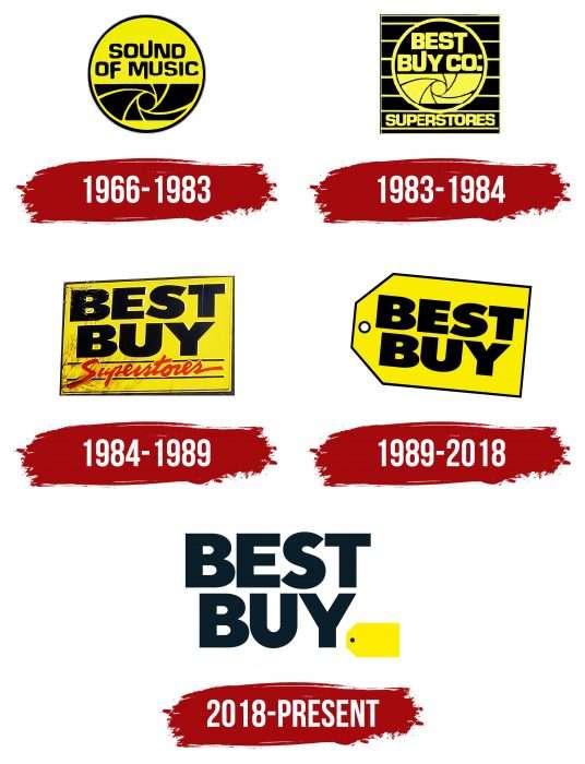
The retail giant is not only famous for its goods and stores – it is famous for its yellow and black logo, which has taken different forms over the years. At first, it was round, and then it became rectangular, like a signboard. Recently, Best Buy has been using its most popular symbol, the tag image.
What is Best Buy?
It is an American home appliance and electronics chain. Its eponymous company is the largest industry retailer in the US and Canadian markets. It appeared in 1966 and was originally called Sound of Music.
1966 – 1983
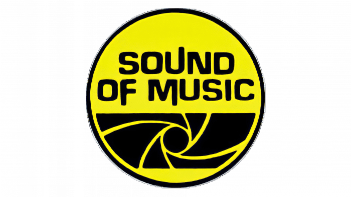
When the retailer first entered the market, it was called Sound of Music and was selling stereos. Its first emblem was in line with the chosen concept: a yellow and black circle, stylized as a speaker. In the upper half was the phrase “SOUND OF MUSIC” with asymmetrically elongated strokes for “U,” “F,” and “M.”
1983 – 1984
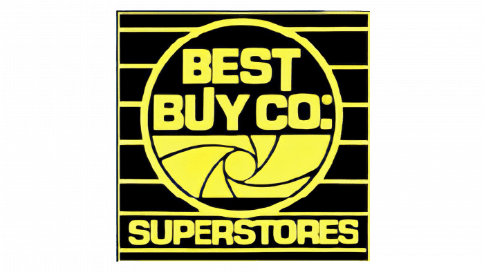
After expanding the range, the company was renamed Best Buy Co. Superstores. The rebranding was reflected in its logo: the designers replaced the old lettering and placed the circle inside a black square with yellow horizontal stripes. Simultaneously, the name was divided: the first three words were in a circle, and the last one – at the bottom of the square.
1984 – 1989
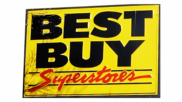
In 1984, the retailer changed its name to Best Buy Superstores and immediately updated the logo to match the new image. The yellow rectangle was taken as a basis. Above was the black word “BEST BUY,” and below, between the two thin lines, the red word “Superstores.” It was written in an oblique script that mimics calligraphic handwriting.
1989 – 2018
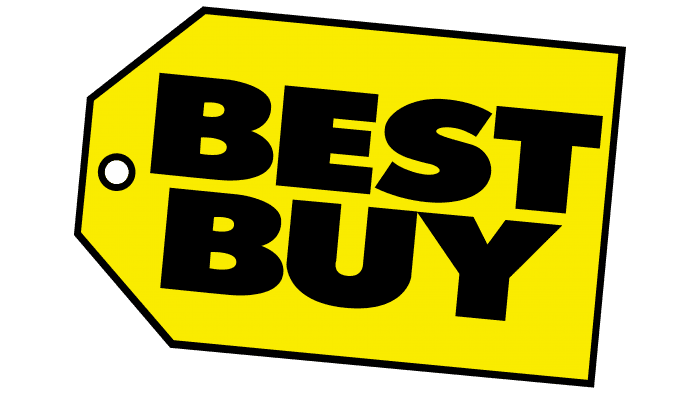
When the name was shortened to Best Buy, the company gained its iconic symbol, a yellow label with two cut corners, and a small circular hole. The new logo became part of a change in concept: the company relied on fashionable design and quality service.
2018 – today
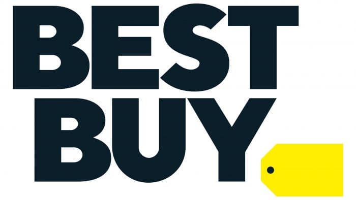
In 2018, the current logo was developed for the stores’ chain, with a large black lettering “BEST BUY” taking center stage. The tag is reduced and shifted to the lower right corner. The fact that she was left speaks of a reluctance to abandon the iconic symbol. But the change in size indicates the desire to modernize the identity.
Best Buy: Interesting Facts
Best Buy, established 1966 as Sound of Music, has become a major consumer electronics retailer.
- Start as Sound of Music: Founded by Richard Schulze, it originally sold high-fidelity stereos.
- Becoming Best Buy: In 1983, it rebranded to Best Buy Co., Inc., expanding its focus beyond audio to a wide range of consumer electronics.
- Warehouse-Style Retail: Best Buy was among the first to sell electronics in a warehouse format in the mid-1980s, offering a large selection at low prices without the traditional sales pressure.
- Geek Squad Acquisition: In 2002, Best Buy acquired Geek Squad, adding tech support and repair services.
- Customer-Centric Model: The early 2000s saw a shift to a customer-centric approach, with stores organized to cater to different customer needs, enhancing the shopping experience.
- Renew Blue Initiative: Launched in 2012, this strategy aimed to revitalize the company by focusing on customer service, operational efficiency, and online competition, significantly contributing to its resurgence.
- Mobile Stores: Best Buy once operated mobile-specific stores in malls, and though closed, mobile products and services are still a major part of its inventory.
- Sustainability: The retailer is dedicated to environmental efforts, including recycling electronic products and responsible sourcing, and has earned recognition for its sustainability initiatives.
- Health Tech Expansion: Best Buy is increasingly focused on health and wellness tech. It now sells products like fitness wearables and has acquired GreatCall, a provider of health services for the elderly.
- E-commerce and Omnichannel Retail: Adapting to digital shopping trends, Best Buy offers a robust online shopping experience with options like in-store pickup and same-day delivery, keeping it competitive in a changing market.
From its beginnings as an audio store to becoming a consumer electronics powerhouse, Best Buy has navigated market changes by innovating and focusing on customer needs and sustainability.
Font and Colors
The company, which has been in the consumer electronics retail business for many years, is world-famous for its yellow tag. This sign appeared in 1989 and first contained an inscription, but after another redesign, the words “BEST BUY” moved outside the label. The redesigned logo is designed to be easier to read. It is used on signage, branded bags, uniforms, and promotional materials.
In 2018, not only the graphic element was changed, but also the font of the inscription. The bold black letters are from Futura Bold. This typeface is characterized by the absence of serifs and flowing lines with pronounced angles.
The color scheme was the same as in 1966 when the company was called Sound of Music. Best Buy has preserved its iconic mix of black and yellow – a legacy that ties it back to its past. This palette is supposed to be more visible to customers and make it easier to identify the brand. It is also very symbolic: black is associated with elegance and quality, while yellow means optimism and joy.
FAQ
Why does Best Buy have a yellow logo?
Best Buy’s yellow logo has historical significance for the brand. 1966 the company opened its first store, Sound of Music, selling stereo systems. The initial logo featured a yellow and black loudspeaker. This bold color palette helped the brand stand out in a competitive market, making it recognizable.
The yellow color was eye-catching and conveyed energy and excitement, fitting for a store selling audio equipment. The yellow logo became a familiar customer symbol as the business grew into a chain.
When the company rebranded to Best Buy, it kept the yellow color in its logo. This choice maintained a visual connection to its origins and reinforced its identity. The yellow logo continues to represent the brand’s commitment to offering various electronics and appliances, focusing on customer service and satisfaction.
What brands are owned by Best Buy?
Best Buy owns several private-label brands that offer a variety of products, from cellphone cases to smart TVs. These brands are Insignia, Rocketfish, Platinum, Modal, and Dynex. These products are available only at Best Buy stores, providing customers with exclusive options.
Insignia offers a wide range of electronics, including smart TVs, home appliances, and audio equipment. This brand aims to provide high-quality products at affordable prices.
Rocketfish specializes in electronics accessories like HDMI cables, speaker mounts, and other connectivity solutions. This brand enhances the performance and convenience of electronic devices.
Platinum is a premium accessory brand offering high-end cases, chargers, and other tech accessories designed for superior quality and durability.
Modal provides stylish and functional accessories for mobile devices, including phone cases, tablet stands, and other personal tech gear. This brand focuses on design and practicality.
Dynex offers various electronics and accessories, including TVs, computer peripherals, and other essential tech products. This brand is known for reliable and budget-friendly options.
The brand has been making products under these private labels for 15 years. These brands help Best Buy provide great value and exclusive products, enhancing the overall shopping experience for customers.
What does the Best Buy logo mean?
The current logo represents a price tag, showing the brand’s focus on offering great deals and value. The logo is shaped like a rectangle with the top corners cut off, looking like a traditional retail tag.
This design highlights the brand’s identity as a retailer that provides competitive product prices. The tag shape connects to the last letter in “Best Buy,” reinforcing the idea of a price tag with each purchase. The small round slot on the tag adds to this retail tag look. The simple design makes the logo stand out and easy to recognize.
Why did Best Buy change their logo?
The company changed its logo to reflect the evolving world and stay current with modern design trends. Whit Alexander noted that the new logo represents a pure heritage. It is modern, easy to read, and distinctive while still connected to the brand’s history.
The updated design aims to create a stronger visual identity that resonates with today’s consumers. Its simplified and clean look makes the logo versatile and adaptable to various media and formats, ensuring it remains effective across digital and physical platforms.
Updating the logo was part of the brand’s effort to stay relevant in a rapidly changing market. This balance helps maintain customer trust and recognition, ensuring the brand stands out in the competitive retail landscape.
Did Best Buy change their logo?
Yes, the company changed its logo in 2018. The designers removed the large yellow price tag background and turned it into a smaller tag attached to the “Y” in “Best Buy.”
This update aimed to modernize the brand’s look while keeping a link to its history. The new logo is simpler and cleaner, making it easier to read and more adaptable across different platforms. The redesign shows the brand’s commitment to staying current and appealing to today’s consumers while honoring its roots.
What is Best Buy’s tagline?
The company updated its tagline as part of its rebranding. The old slogan, “Expert service. Unbeatable price,” was changed to “Let’s talk about what’s possible.”
This new tagline shows the brand’s focus on engaging with customers and exploring new possibilities in technology and services. It highlights the brand’s commitment to helping customers find innovative solutions and make informed decisions about their tech needs. The brand aims to create a more interactive and customer-focused experience by adopting this tagline. This change helps the company stay relevant and connected with its customers in a fast-evolving market.
