Keeping energy high all day, seven days a week, openness to customers, and freshness of all products are the main themes of the 7-Eleven logo. The emblem conveys its message through colors filled with vitality.
7 Eleven: Brand overview
The convenience store operator 7-Eleven is part of the Japanese group of companies Seven & I Holdings, headquartered in Dallas. It owns more than 60,000 outlets worldwide, mostly in Asia and North America. Each mini-mart sells food and beverages around the clock.
The modern chain of stores was laid in 1927 when several ice merchants merged to form the Southland Ice Company. Their business was indirectly related to food because they used ice blocks instead of electric refrigerators. The company turned one glacier into a freezer to offer eggs, milk, and other perishables to local residents around the clock. The business turned out to be profitable, and the managers decided to increase the number of outlets. This is how an entire retail chain – Tote’m Stores – came into being.
Meaning and History
The retail chain Tote’m Stores got its name from the totem poles of Indians, which stood in front of the entrances to the stores. The same pole was depicted on the logo, which gave it a personalized identity. During the financial crisis, the company went bankrupt. Nevertheless, it returned to the market and even succeeded in the liquor trade when prohibition was lifted in the United States.
After World War II, the company renamed all Tote’m stores 7-Eleven. The new name indicated the extended opening hours: the stores were open seven days a week, from seven in the morning to eleven in the evening. They then had a logo to reflect the new name. In 1963, retail outlets began to switch to 24-hour operation. It started with a store located near the University of Texas. It stayed open at night so that students could buy something when they returned home from soccer contests. It proved so profitable that the rest of the chain stores followed suit. The change in graphics had no effect on its name and logo.
In 1999, Southland Corporation, which owns the convenience stores and franchise rights, changed its old name to 7-Eleven, Inc. The company continued to grow and opened its 25,000th store in 2003. The company is now known for its impressive assortment and corporate logo, which has been changed several times. Despite all the redesigns, it has almost always featured the red-orange number “7” on a green background.
What is 7-Eleven?
7 Eleven is an American company that operates a chain of stores in the United States and abroad. The name of the company reflects the mode of operation of its outlets: from 7 am to 11 pm. The history of the brand began in 1927 with a mini-market selling ice cream, bread, milk, and eggs. The modern 7-Eleven assortment is much broader: it offers a variety of drinks, ready-to-eat food, baked goods, salads, fresh fruit, and even financial services.
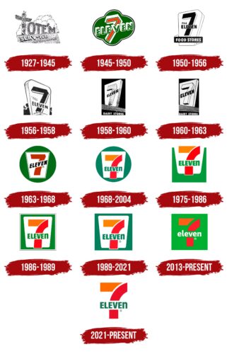
1927 – 1945
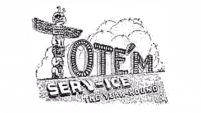
Around 1927, the Southland Ice Company began using its icehouses to store beverages and food for retail. This is how the first Tote’m stores came into existence. Over time, the retail chain had a logo consisting of several inscriptions. In the center was a large word, “Tote’M,” on a background of white clouds. Each letter looked like a ritual sculpture, but the first letter, “T,” with the figures of an eagle and a man, stood out the most. The wings of the bird spread out to the sides, forming a horizontal line “T.”
Both the name and the visual symbolism of the brand were connected with a real totem pole, which stood in front of the entrance to one of the stores. It was a souvenir brought back from Alaska in 1928. The owners of the company realized that such a marketing tool would increase the number of customers, so they were not lazy to install totems near each outlet.
The lower half of the logo was occupied by additional inscriptions: “SERV-ICE” and “YEARS.” The designers made the letters volumetric, expanding the dark contours below and to the left. The text was arranged diagonally; the far characters were smaller than the near ones, which made the lines seem to go further away.
1945 – 1950
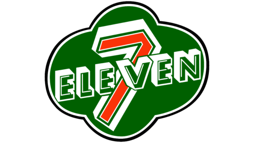
In 1946, the Southland Ice Company had several City Ice and Tote’m outlets. The owners decided to combine them under the common name 7-Eleven, which indicated the rare opening hours for grocery stores – 7:00 to 23:00. To emphasize its main competitive advantage, the retailer included the word “7-Eleven” in its new logo.
The brand name looked like a shining sign in the shape of a four-leaf clover, a powerful good luck charm. It was turned to the left and appeared three-dimensional due to the wide white frame with silver shadows. The central part was green. Inside was a red number “7” crossed with the white and green word “ELEVEN.”
1950 – 1956
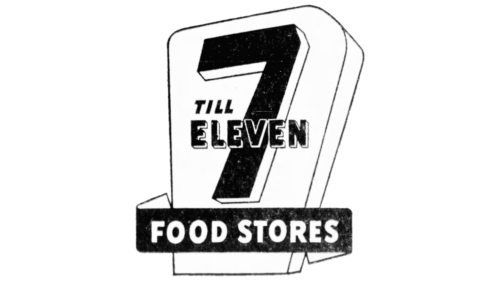
The owner of the 7-Eleven grocery store chain did not like the seven in the logo: it diverged as if to the sides. In addition, its white border was visually turned in the opposite direction and did not coincide with the border of neighboring letters. Therefore, a decision was made to redesign the visual identity. The result was a distinct “7” with a leftward turn. The volume effect was created due to the light contour with a black border. On top of the “seven” was the company name, made in the same style as the main element. The background was a volumetric trapezoid resembling a billboard. It was surrounded by a ribbon with the phrase “FOOD STORES.”
1956 – 1958
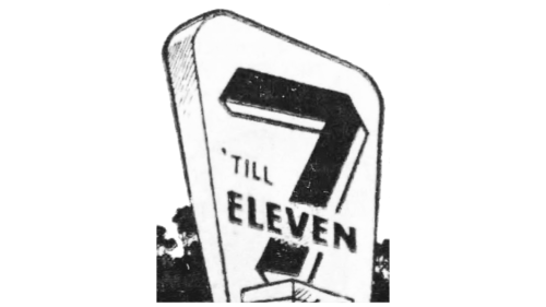
The experiment with the logo continued and resulted in a new sign placed at the entrance to 7-Eleven stores. However, the result did not last long and was subsequently replaced. The emblem was a trapezoid with the number seven in the middle. Designers returned it to its former appearance, further trimming the upper right corner. The “seven” was placed on a pedestal, and the black film was removed.
1958 – 1960
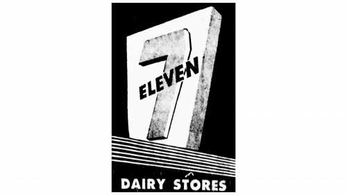
After modernization, the 7-Eleven emblem was rotated to the left. The shadow under the horizontal element of the figure was colored black. The designers regrouped the name of the store chain and placed it diagonally, as in the 1945-1950 version. In addition, the text became black, and the “7” sign became gray. Gone were the rounded corners of the massive trapezoid – thin, straight lines appeared. The plinth was replaced by solid horizontal stripes, which began on the left part of the rectangle and ended on the right. The phrase “DAIRY STORES” was printed below them in wide white sans-serif letters.
1960 – 1963
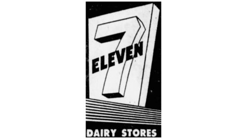
The content of the trapezoid was adjusted so it was lighter and clearer. The designers added volume to the seven so that it would not look flat as in the previous logo. For this purpose, the contours on the right side were widened, and the foot at the bottom was painted black.
1963 – 1968
A two-dimensional version of the emblem with a round base appeared. Seven acquired in it clear broad lines, and the inscription “ELEVEN” became black and slanted. In this case, the word was located on a white background, crossing the red number in the middle. The name of the store chain was placed inside a white inverted trapezoid with a frame of thin lines. This, in turn, was placed in a green circle. Under the letter “E” was the registered trademark.
1968 – 2004
The designers divided the “seven” into two blocks: orange and red. In addition, they repainted the circle and the inscription in turquoise color, removed thin lines on the edges of the trapezoid, and rounded its corners. At the same time, the word “ELEVEN” was aligned horizontally and received a new font. The logo designer insisted that the last letter “n” should be lowercase because, in this case, the image looked harmonious. By reducing the trapezoid, the lower edge of the number “7” slightly protruded beyond its limits.
1975 – 1986
Gradually expanding, the company updated its corporate style. As a result, the shape of the logo changed: it became square, and the white trapezoid moved upwards and even went beyond the frame. The developers again used green color instead of turquoise, which gave the image a traditional look.
1986 – 1989
In 1986, 7-Eleven got a trademark that is still relevant today. Its base is a turquoise rectangle. The other elements are the same as on the 1969 round emblem: a white trapezoid and an orange-red seven with the turquoise word “ELEVEN.”
1989 – 2021
There were no graphic changes to the emblem during this period, except for the colors. The brighter colors became more muted.
2013 – today
A different version of the logo is used for stores in Ohio and Chicago: a light green square with a white lowercase letter “eleven” in the lower half. The two-color numeral “7” remains, but it now sits directly within the square, without the white base in the form of an inverted
2021 – today
Designers have abandoned any background and geometric figures, so the numeral “7” is in white space without any contours. This emphasizes the limitless possibilities of the franchise and the vastness of the assortment that the retail chain offers to its customers. The logo is laconic and clear: two blocks (red and orange) form a clear seven, through which the turquoise inscription passes. The lowercase letter “n,” which appeared at the end of the word “Eleven” in 1968, has retained its relevance.
7 Eleven: Interesting Facts
7-Eleven is the biggest convenience store chain, starting in 1927 in Dallas, Texas. It began with an ice company employee selling basic groceries from an ice dock. This idea quickly took off, setting the stage for the convenience store concept.
- How It Started: The 7-Eleven idea came from selling milk, eggs, and bread at an ice company, making life easier for people who didn’t want to go far for essentials.
- The Name: In 1946, the store got its name “7-Eleven” to show it was open from 7 a.m. to 11 p.m., which was a big deal because it offered longer shopping hours.
- Going 24/7: After a 7-Eleven in Austin, Texas, stayed open all night for an event in 1963 and saw great success, the stores started opening 24/7.
- Growing Worldwide: The first 7-Eleven outside the U.S. opened in Canada in the late ’60s. There are over 70,000 stores in 17 countries, a huge number in Japan.
- Innovations: 7-Eleven introduced several firsts, like takeaway coffee and self-serve soda, and even created the Slurpee® in the 1960s.
- ATMs Inside: In the early ’80s, it was one of the first to have ATMs in-store, making it easier for customers to get cash.
- Its Products: Over time, 7-Eleven started offering its brand of items, from snacks to personal care products.
- New Ownership: In 1991, Ito-Yokado from Japan bought 7-Eleven, and now it’s under Seven & i Holdings Co., spreading its wings even further.
- Digital Moves: 7-Eleven has kept up with tech, offering mobile apps for ordering and delivery, digital payments, and a rewards program for deals and freebies.
- A Cultural Staple: It’s a store and a part of pop culture, known for its logo and Slurpees®.
From starting as an ice dock to becoming a global convenience store leader, 7-Eleven’s journey is a tale of constant innovation and catering to customers’ needs.
Font and Colors
The most noticeable element of 7-Eleven’s corporate identity is the lowercase letter “n,” which is as large as the capital letters “E,” “L,” and “V.” This makes the company’s logo one of the most recognizable in the world. Rumor has it that the wife of the brand’s founder suggested omitting the “n” to make the lettering more elegant. Whether this is actually the case is not known. The retailer’s management has neither confirmed nor denied this unusual theory.
The font of the word “ELEVEN” is as close as possible to Humanist 521 Extra Bold Condensed – geometric sans-serif with contrasting thick strokes. At the same time, as already mentioned, in the main version of the logo, the letter “n” is lowercase, although it is the same size as “ELEVE.”
The color scheme is quite stable – only the shades change. The base is always green or turquoise, and the number consists of two blocks: orange and red. Depending on the emblem variant, the inscription may be emerald or white.
7 Eleven Logo Color Codes:
- Orange: Hex Code: #F4811F; RGB: (244, 129, 31); CMYK: (0, 60, 100, 0); Pantone: PMS 165
- Green: Hex Code: #008163; RGB: (0, 129, 99); CMYK: (100, 0, 70, 30); Pantone: PMS 341
- Red: Hex Code: #EE2526; RGB: (238, 37, 38); CMYK: (0, 100, 100, 0); Pantone: PMS 485
FAQ
What is the significance of the 7-Eleven logo?
The logo depicts a bright red number “7” intersecting with the word “Eleven” on a background of a green four-leaf clover. Although there is no official confirmation, there is a visual similarity to (Tote’m’s company totem pole). The clover in the background symbolizes prosperity and good luck. The clover in the background symbolizes prosperity and good luck.
Why is the letter N in the 7-Eleven logo lowercase?
In the current 7-Eleven logo, the letter “n” is lowercase to give a more approachable and informal brand identity. The decision was influenced by the first wife of John P. Thompson Sr., the company’s president in the 1960s. She felt that the capitalized version looked too imposing, which led to the distinctive lowercase “n” we see today.
Why is “7 11” orange, green, and red in color?
Although the exact reason for the choice of red, green, and orange remains unknown, Southland President Joe Thompson, who was involved in the logo design, wanted the colors to be prominent on exterior signage. This need for visibility probably influenced the choice of bright, eye-catching hues.
What does “7 to eleven” mean?
The name 7-Eleven was adopted in 1946 to emphasize the stores’ unusually extended hours of operation for the time – 7 a.m. to 11 p.m. By the late 1950s, the company began expanding beyond Texas and opening stores on the East Coast.
What font is used in the 7 11 logo?
The Right Grotesk font was chosen for the 7-Eleven brand after it was redesigned by Deutsch LA. According to a presentation on Behance, the brand is a familiar element of everyday life: Americans have a 7-Eleven store about every 10 miles.
