Simplicity and style characterize the Sephora logo. The company provides customers with freedom of choice and the opportunity to create their own special and unique image with the help of brand products. The emblem is a tribute to impeccability and fashion with a capital letter.
Sephora: Brand overview
| Founded: | 1970 |
| Founder: | Dominique Mandonnaud |
| Headquarters: | Neuilly-sur-Seine, France |
| Website: | sephora.com |
Meaning and History
Although the cosmetics company Sephora was launched in the 1970s, it reached its maximum fame in the 90s after Dominique Mandonnaud bought it and attached it to his perfume chain under the same name. This happened in 1993. This is how the largest brand was born, focused on selling a wide range of products for the beauty industry.
It has become popular due to the presence of a huge range of goods and in connection with the introduction of an innovative self-service system. It radically differed from the usual trading models, offering to test funds before buying directly in stores. During the 1990s, the Sephora network expanded rapidly. It was then that the flagship boutique appeared on the Champs Élysées in Paris. In 1997, Mandonnaud and business partners sold the company to the cosmetics giant LVMH, which continued its development. He increased the number of cosmetic products and attracted many specialty brands.
The new owner focused on the promising markets of Middle Eastern, establishing 44 points of sale in the UAE and KSA. The brand entered the United States in 1998, opening its first store in New York. It has been present in Canada since 2004 and in Australia since 2014. In 2007, Sephora introduced e-commerce and launched its own online store. But the company does not stop there: it still continues to expand partnerships with exclusive cosmetic brands. Its regional offices are scattered worldwide, so the minimalist logo is well known not only in the world’s major cities.
Exclusivity should be subtle and concise – such as to attract obscurity and refined taste. Both the first and the second owners of the cosmetic brand are sure of this. Therefore, his sign of visual identity is distinguished by an unusual sophistication, unfamiliar in the fashion industry. After all, it is concise to the limit, beyond which the world of divine beauty begins. Moreover, “sephos” is translated precisely from ancient Greek as “beauty.”
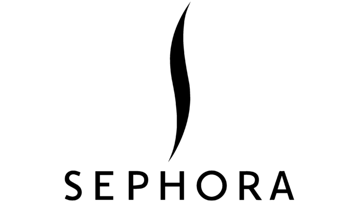
The logo embodies the values and aesthetics of the cosmetic brand, although, at first glance, there is no sign of a feminine ideal in it. But this is only a cursory examination. If you penetrate into the depths of his philosophy, then many meanings are revealed. They are reflected in the graphic symbol – the language of the wriggling flame, which is located above the company name.
Firstly, he personifies the fire that burns inside every woman. Secondly, it conveys the brand’s name, as it has the shape of a softly curved “S.” Thirdly, it symbolizes a woman with graceful body curves. Fourth, it depicts a strand of perfectly groomed hair. Fifthly, it offers a narrow loophole into the world of pure and bright beauty. In general, the symbolic character of the sign is boundless and high, as well as its memorability.
The wavy and slightly extended line is located vertically. It is located exactly in the middle of the horizontal Sephora lettering, characterized by simplicity, elegance, and wide spacing of letters. The signs are even, smooth, grotesque: they represent the standard of printed fonts, where there is nothing superfluous. Thanks to this, the graphic and text elements form the elusive sophistication of the logo.
Sephora: Interesting Facts
Sephora has changed how we buy cosmetics, skincare, and fragrances, making it a big name in the beauty world.
- French Beginnings: Founded in 1970 by Dominique Mandonnaud in France, Sephora was among the first to let customers try products before buying. This idea is now common in beauty stores.
- Name’s Meaning: “Sephora” merges “Sephos” (Greek for “beauty”) and Zipporah (Moses’ beautiful wife from the Book of Exodus), reflecting the brand’s focus on beauty.
- Worldwide Growth: Owned by LVMH since 1997, Sephora has grown to about 2,600 stores in 34 countries, showing its vast global reach.
- Unique Shopping Experience: Sephora’s stores are set up so that customers can freely try products with help from informed staff, making shopping there unique.
- Sephora Inside JCPenney: Since 2006, Sephora has opened shops inside JCPenney, widening its reach, especially where standalone stores aren’t possible.
- Beauty Insider Program: This loyalty program rewards customers with exclusive benefits and has built a community of beauty lovers.
- Digital Innovations: Sephora leads tech by offering tools like the “Virtual Artist” app, which lets people try makeup virtually.
- Sephora Accelerate Program: This program mentors female beauty entrepreneurs, showing Sephora’s support for diversity and innovation in the industry.
- Sephora Collection: The brand also sells affordable, high-quality beauty products catering to various customer needs.
- Eco and Social Efforts: Sephora is working on becoming more sustainable and inclusive, aiming to reduce its environmental impact and increase diversity.
Sephora’s mix of innovation, customer focus, and dedication to beauty and diversity has made it a leader in retail. It continues to shape the beauty industry’s future.
Font and Colors
The cosmetics brand commissioned a custom font package from Mucca Design to ensure its products and identity reflect personal style in all areas. Sephora Sans is a versatile typeface that is used in the emblem, labels, and documents. Sephora Serif Text is a variant with excellent legibility at small logo sizes. Sephora Serif Display is characterized by high contrast.
The color scheme, on the contrary, is meager and consists of a classic combination of white and black. But when paired with custom fonts, it takes on sophisticated elegance.
Sephora color codes
| Black | Hex color: | #000000 |
|---|---|---|
| RGB: | 0 0 0 | |
| CMYK: | 0 0 0 100 | |
| Pantone: | PMS Process Black C |
