The modern logo of InterSport is stylish, reflecting this important characteristic of all its products. Its direction, characteristic dynamism, and balance are symbolized by a sign curved in the shape of a ramp, at the top of which rests a red ball.
InterSport: Brand overview
| Founded: | 1968 |
| Headquarters: | Bern, Switzerland |
| Website: | intersport.com |
Meaning and History
The first InterSport lottery logo appeared in 1971 and was immediately presented in a thousand stores. The international corporation developed it for marketing purposes. It wanted the franchising network to have a unique corporate style, distinguishing it from competitors.
In 1979, the logo was redesigned. The new version reflected an improved brand image. The overall concept changed, but the color scheme remained the same: blue + red on an absolutely white background. In 2009, minor changes were made to the logo, only affecting the typography.
What is InterSport?
Intersport is an international chain of stores selling goods for various sports, including swimming, running, and football. It was founded in France in 1968 and gradually expanded, opening retail outlets in more than 60 countries worldwide. The product range includes accessories, footwear, and clothing specially designed for physically active people. The company sponsors numerous sporting events, including large-scale ones such as the Olympic Games, Tour de France, and FIFA World Cup.
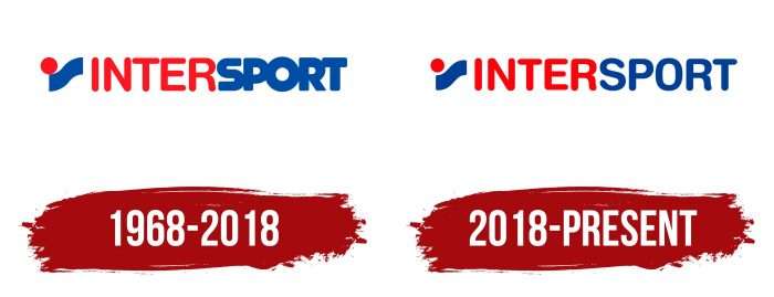
1968 – 2018
Initially, the logo was a harmonious combination of text and graphics. They were balanced in color and style. On the left was a miniature icon that included two elements – the so-called ramp (short curved stripe) and a ball. They convey movement and the concept of being on the edge; one can either soar upwards or fall. On the right was the word “INTERSPORT,” divided by color into two segments: red “INTER” and blue “SPORT.” The second segment is highlighted with wide letters.
2018 – today
The central part of the Intersport label is a curved rectangle with a circle. The rectangular shape is like a steep ramp. A small ball has stopped at its edge – it is either rolling down or trying to climb to the top.
The image has frozen dynamics. Also, balance is important because the circle balances on the very edge and does not fall. This idea corresponds to the concept of the retail conglomerate specializing in sporting goods.
The second part of the logo is the inscription “InterSport.” The brand name is in two colors: red (“Inter”) and blue (“Sport”). The font is sans-serif with rounded corners. Until 2018, the letters were bold and merged in the second half of the word. This is not the case in the latest version of the logo – everything looks harmonious and corresponds to the idea of balance.
InterSport: Interesting Facts
Intersport is a big store that sells lots of sports for people who like to play sports, whether just for fun or seriously. It started in 1968, and now it’s pretty big worldwide.
- How It Started: Ten different country groups got together to make Intersport. They thought that if they bought stuff together, they could get it cheaper and sell it to people who came to their stores.
- All Over the Place: Intersport has more than 5,500 stores in over 40 countries, making it one of the biggest sports stores.
- All Kinds of Sports: They have gear for many sports, like soccer, basketball, running, skiing, and even outdoor stuff. So, pretty much anyone can find something they need.
- Their Own Stuff: In addition to selling big-name brand sports gear, Intersport also makes good stuff that costs less.
- Helping the Community: Intersport likes to support local sports, such as sponsoring events and teams, to get people moving and having fun together.
- Shopping Online: They’ve also made it easy to shop online so people can buy stuff even if they can’t get to the store.
- Cool Store Experiences: Some places have cool tech, like virtual reality, so you can see what the sports gear is like, or they help you find the perfect fit for your sports clothes and equipment.
- Advice from Experts: The people working at Intersport know their stuff because many also play sports. They can give you great advice on what to buy.
- Sport for Everyone: Intersport believes that sports are good for everyone, no matter how old or good you are at sports. They think everyone should be able to play and have fun.
Intersport is about helping people enjoy sports more by making it easier to get good sports gear, offering advice, or supporting local sports. They keep up with what sports lovers need and want, which is why so many people like shopping there.
Font and Colors
The inscription in the emblem is executed in a grotesque font in uppercase. The words have no serifs – these are simple, smooth symbols, which were first wide and now have become as narrow. All external ends of the letters are rounded.
A combination of red and blue colors on a white background dominates the logo. No other official palette exists. Moreover, the colors are striking, vivid, and saturated.
InterSport color codes
| Cobalt Blue | Hex color: | #003e98 |
|---|---|---|
| RGB: | 0 62 152 | |
| CMYK: | 100 59 0 40 | |
| Pantone: | PMS 661 C |
| Red | Hex color: | #ff010a |
|---|---|---|
| RGB: | 255 1 10 | |
| CMYK: | 0 100 96 0 | |
| Pantone: | PMS 1655 C |


