Working for the good of society is shown by the Walgreens logo. Concern for the convenience of customers, the sale of prescription drugs and a full range of medicines for all occasions are encrypted in the smooth swirls of the emblem.
Walgreens: Brand overview
| Founded: | 1901 |
| Founder: | Charles Rudolph Walgreen |
| Headquarters: | Deerfield, Illinois, United States |
| Website: | walgreens.com |
Meaning and history
The Walgreens logo has always looked like a handwritten word, and the emblem has recently featured an elegant “W” (aka “Flying W”). This symbolism has repeatedly become the cause of controversy because the pharmacy company was constantly in conflict with someone. She once sued the Wegmans supermarkets because she saw an obvious similarity with the Walgreens brand in their “W.” Ultimately, the Wegmans ditched their logo. However, its origins date back to the 1930s.
After that, the retailer noticed that the emblem of the famous Washington Nationals baseball team also had a lot in common with the “Flying W.” To avoid paying the fine and to continue to use the logo inspired by the 1960s Washington Senators logo, the sports club had to agree to several requirements. Under the compromise, Walgreens did not pursue a copyright infringement lawsuit. The Washington Nationals provided the pharmacy with their baseball players, who had to train, become pharmacists, and sell drugs in stores near the metro. In addition, the team has committed to promoting Walgreens for five years.
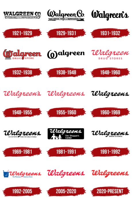
Because of all these events, the trade network logos have become truly famous. There were six in total, not counting the different versions of the “Flying W” badge.
1901 – 1921
The beginning of the Walgreens pharmacy chain was laid in 1901, when the American Charles Rudolph Walgreen Sr., formerly a pharmacist, opened a small grocery store in Chicago. The brand name, which served as the basis for all signs and logos, is derived from the name of a businessman.
1921 – 1929
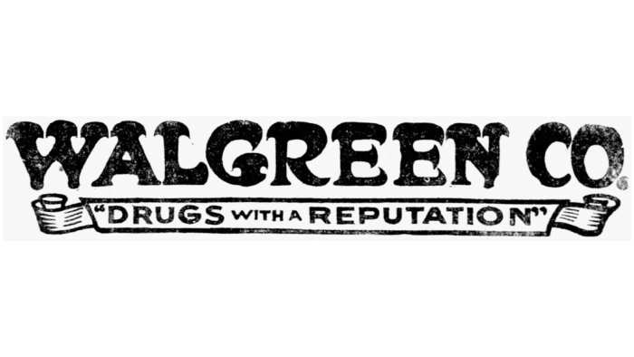
In the 1920s, the company became famous for selling whiskey as a medicine, bypassing prohibition. To draw attention to herself, she used a logo with the slogan “DRUGS WITH A REPUTATION.” All three words were capital letters, but “WITH” and “A” were shrunk and slightly raised above the line. The phrase was enclosed in double quotes and was inside a white scroll. The upper part was occupied by the then name of the pharmacy chain: Walgreen Co. The designers embellished the ends of the glyphs with wide, curved serifs and made the strokes unevenly thick.
1929 – 1931
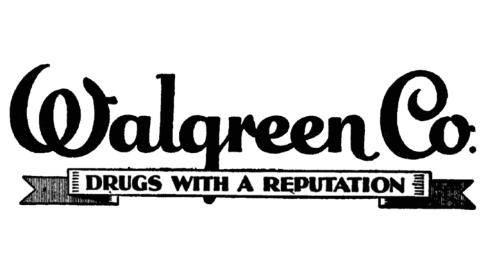
Until the 1930s, the layout of the text varied. For the phrase “Walgreen Co.” a cursive script began to be used, in which all letters were interconnected, except the first “W.” She not only stood alone but also resembled a similar glyph from the emblem of Walt Disney Pictures. The “W” in the shape of a pretzel was not the only non-standard element – other letters also looked unusual. For example, the “C” twisted into a spiral, the “l” had a serif at the top, and the right side of the “n” extended down the line.
The scroll with the company’s name took on a clear geometric shape and became more angular, turning into a ribbon with bifurcated triangular ends. The quotation marks disappeared, and the slogan was written in a contrasting bold sans-serif.
1931 – 1932
In 1931, the inscription “Walgreen Co.” on the logo was changed to “Walgreens” with an apostrophe after the “n.” The font remained handwritten, but the shape of the letters changed: they stretched out vertically. The slogan ribbon has been removed.
1932 – 1938
One of the oldest logos featured a red ‘Walgreen’ lettering, which the designers used a stylized handwritten typeface. All letters except “W” were linked. A thin black line ran along the edges. In the background, the artists depicted a gray mortar made of several parallel horizontal lines of different lengths. This element symbolized the pharmacy mortar – a tool for grinding pharmaceuticals and preparing powders.
At the bottom was the red DRUG STORE, split in two by a loop of the lowercase g from the above Walgreen. The second inscription has been converted to upper case. It used a typeface with contrasting stroke weight and short serifs.
1938 – 1948
The logo of this period was similar to the one used before 1932 because it also contained the black “Walgreens” lettering. But the letters were more accurate and squat, as in the 1932-1938 version. The only difference was the lack of a serif at the top of the “l.” Designers lowered the first “W” down, finally separating it from the rest of the letters.
1948 – 1960
After the redesign, the word “Walgreen” appeared at the top, written in italic cursive. There was no link between the letters “g” and “r” because at the end of the “g,” there was a loop but a hook. The second line was occupied by the phrase “DRUG STORES.” A bold sans serif was used, and all glyphs were capitalized. The same red color united both parts of the inscription.
1948 – 1955
In 1948, a version of the logo appeared that contained the word “Walgreen’s” in red. The company name was written in elegant italic type.
1955 – 1960
The designers removed the apostrophe. Since there was no space between the letters “n” and “s” before, nothing has changed in the structure of the inscription.
1960 – 1969
Throughout the 1960s, the company name was black. The designers kept the classic typeface to keep the brand recognizable.
1969 – 1981
The developers of the logo added a slogan that was supposed to express the new concept of the pharmacy chain. It was at the bottom and was reduced compared to the top row. The protruding stroke of the “g” from the word “Walgreens” divided the long phrase into two parts: on the left – “THE NATION’S,” on the right – “NAME FOR DRUG STORES.” All letters were black, capital, and bold. Italic was used for “NAME.”
1981 – 1991
The new company logo was in the shape of a rectangle with rounded edges. The geometric figure has been painted black, and the elements inside it have been painted light gray. The negative space effect was created in the lower-left corner of the figurines of three people of different heights and builds. It was understood that this is a family – a child and his parents. So the designers wanted to show the versatility of the stores, which have everything you need for both children and adults.
Above, as always, was the name of the trading network. Its font hasn’t changed. But the place of “DRUG STORES” was taken by a completely different inscription – “The Shopper’s Center,” divided into two lines.
1991 – 1992
After a small modernization, the chain of stores acquired a completely black logo. The letters on the first line now have a slight slant to the right, with lowercase “s” added at the end. The typeface is slimmer and more elegant. The phrase “DRUG STORES” has been reduced and moved to the right. The mortar that used to be in the background is gone.
1992 – 2005
In the first half of the 1990s, the word “Walgreens” turned red again. The background rectangle and the human figures are gone. The phrase “The Shopper’s Center” has been replaced by a new text: “The Pharmacy America Trusts.” The developers of the logo made the slogan blue and divided it in half, placing a lowercase “g” on both sides of the protruding part of the slogan.
A blue mortar appeared to the left of the inscriptions, this time with a pestle in it. Inside the bowl, the artists depicted many small dots, which symbolized the crushed powder. The fact that the contents of the mortar were flying upwards indicated an ongoing process of work.
2005 – 2020
After the redesign, the letters were slightly elongated so that there was not a lot of white space left on the outside signs. The slogan and the pharmacy mortar are no longer used. However, newly opened shops sometimes have a red pestle and mortar emblem with a large white “W.” Under the bowl, as a rule, there is the name of the trade network.
In addition, a completely different logo, known as the Corner W, may be displayed above the entrances. It looks like a callout consisting of a scarlet rectangle, a burgundy triangle, and a white handwritten “W.” This option was proposed in 2012.
2020 – today
In 2020, the shade of the lettering had become darker than in previous logos. But the concept hasn’t changed: the company is still identified by the red word “Walgreens” in cursive with a strong right-angle.
Walgreens: Interesting Facts
Walgreens is a major drugstore chain in the U.S. with a long history and a big role in health care and retail.
- Beginnings: Charles R. Walgreen Sr. started the first Walgreens in Chicago in 1901. It quickly grew because it focused on doing things consistently and offering quality products.
- Malted Milkshake: In the 1920s, Walgreens popularized the malted milkshake. This tasty treat made Walgreens a go-to spot, helping the chain grow.
- Drive-thru Pharmacy: Walgreens led the way in the 1990s by starting the first drive-thru pharmacy. This made it super easy for people to get their prescriptions without getting out of their car.
- Growing Bigger: Walgreens grew by buying other drugstore chains, such as Duane Reade and Drugstore.com. In 2014, it joined Alliance Boots, reaching more customers worldwide.
- Digital Health: Walgreens has also been ahead in digital health. You can refill prescriptions online, use telehealth services, and use a mobile app for various health services. This makes getting pharmacy help more convenient.
- Vaccinations: Walgreens is important for public health because it gives flu shots and other vaccines. They make it easy to get vaccinated without needing an appointment.
- Environment and Sustainability: Walgreens strives to be eco-friendly by using less energy, cutting carbon emissions, and safely disposing of unused medications.
- Specialty Pharmacy: Walgreens has specialty pharmacies for people with serious health conditions like cancer or HIV, which provide extra care and support.
- Healthcare Clinics: Some Walgreens stores have clinics where you can get basic health care. They’re run by nurse practitioners and physician assistants who can treat minor issues, do health screenings, and give shots.
- COVID-19 Efforts: Walgreens provided COVID-19 tests and vaccines during the pandemic. They set up drive-thru testing and helped with the vaccine rollout.
Walgreens has grown from a single store to a global leader in health, known for its commitment to making health services accessible and helping communities.
Font and Colors
The most prominent part of Walgreens’ identity is the capital “W.” It is presented in the form of a symbol used both as part of a word and separately – on a mortar or inside a rectangle. Because of this mark, the company openly clashed with the Wegmans supermarkets and the Washington Nationals basketball team because they had very similar emblems. Having won the right to use the stylized “W single-handedly,” Walgreens has made the letter synonymous with high-level service and quality merchandise.
When designing the Walgreens logo, the designers did not use any typefaces. They came up with the inscription, imitating handwritten text with smooth lines and a slight tilt to the right. The letters do not have serifs, but they have graceful curves at the ends. Later, a font called Freebrush was created based on this wordmark.
The main color of the Walgreens symbol is red. The company executives chose him on a leftover basis. They did not want to use green (which would be logical) so that consumers would not think that the logo belonged to an environmental organization. Marketers have also given up on purple. They associated it with the album Purple Rain, recorded by a musician who died from drugs. And they considered brown unfortunate because the worst team in the NFL was called the Cleveland Browns. As a result, it was decided to make the main color bright red. Its only drawback was that it reminded of Christmas when combined with green (as part of the word WalGREENs).
Walgreens color codes
| Pigment Red | Hex color: | #ef2729 |
|---|---|---|
| RGB: | 239 39 41 | |
| CMYK: | 0 84 83 6 | |
| Pantone: | PMS Bright Red C |
