The company knows its target audience well, and all the products presented in the stores definitely fall into the shopping cart. The Target logo demonstrates the energy and focuses on the success that sets the brand apart.
Target: Brand overview
| Founded: | January 5, 1962 |
| Founder: | Douglas Dayton & John Geisse |
| Headquarters: | Minneapolis, Minnesota, U.S. |
| Website: | target.com |
Meaning and History
In 1960, Dayton Company executives wanted to open several discount stores to add variety to the family department store chain. But before that, they decided to create a new brand from scratch and think over all the nuances, right down to the logo.
Then-Marketing Director Stewart K. Widdess developed the concept. His team had a choice of two hundred names. The most advantageous variant seemed to them “Target” – a word that symbolized the store’s desire to hit the bull’ s-eye and guess what society needs. It also formed the basis of the famous red and white logo.
What is Target?
It is the sixth-largest retailer in the United States. He operates a chain of retail stores for two brands – Target and SuperTarget. The company was founded in 1902. Its headquarters are located in Minneapolis, Minnesota.
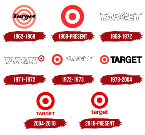
1962 – 1968
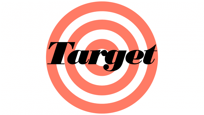
On May 1, 1962, the Target store was officially opened. A sign greeted buyers with six concentric circles. Their colors alternated: three circles, including the central one, were white, and three more (one after another) were red. In the middle was the horizontal “Target” lettering in black italics.
It was the first brand logo created by the design team led by Stewart K. Widdess. To tie the brand name to the name, they used the inside of the target, the Bullseye, as the centerpiece.
1968 – today
In the late 1960s, Target stores began to appear across the country. Simultaneously with the expansion, the company changed its logo, simplifying it to a red circle surrounded by two rings: white and red. The inscription has disappeared, so the symbol has become more universal. It is remembered that it was used in an advertising poster that was specially designed for the opening of Shop at Target in 1969: the famous target looked like a dangling earring.
1968 – 1972
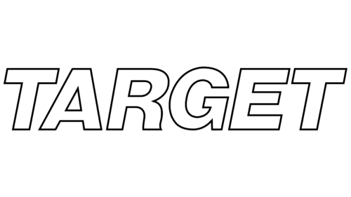
In 1968, Target had a logo that consisted of only one word. It was the name of the company, written in large white letters with thin black strokes. For the design, a font similar to ParaType’s Pragmatica Shadow Italic was used, only without thickened outlines. Absolutely all glyphs were capitalized. Such a minimalistic version of the emblem existed until the early 1970s.
1971 – 1972
In the first half of the 1970s, a rondel was added to the inscription, consisting of three concentric circles with alternating red and white colors. In fact, the designers combined Target’s iconic symbol with a previously created wordmark. The design of geometric figures in the form of a target was located in the upper right corner and partially covered the vertical stroke of the last “T.”
1972 – 1973
Over time, the white-red rondel was moved to the other side – to the left of the inscription. By moving the round symbol, the designers enlarged it, and the word “TARGET” was almost halved. That is, it turned out that the graphic element came to the fore and became more important than the company’s name. To make it better visible, the authors of the emblem focused on bright red.
1973 – 2004
In 1973, designers tried to highlight the inscription using font and color. To do this, they enlarged the letters, aligned them, and made them completely black. Despite the elimination of italics, the general shape of the glyphs remained the same:
- The “G” still resembled a swirling arrow.
- The “R” had an elegant ridge at the bottom.
- The middle stroke of the “E” was shorter than the others.
- A similar typeface is Foundation Sans Bold by FontSite Inc.
2004 – 2018
With the advent of the new millennium, Target decided on bold experiments. She presented a logo in which the rondel was record-breaking enlarged and moved up, while the inscription, on the contrary, became very small and ended up at the bottom. In this version, the letters were repainted in the same shade of red used for the rings.
2018 – today
In 2018, another radical change took place in the company’s identity. As part of the redesign, all letters in the word “target” were converted to lowercase. But the font type hasn’t changed: it’s still a bold geometric grotesque. The concentric circles on top represent the target. That is, it is, in fact, a graphic reflection of the brand name.
Target: Interesting Facts
Target Corporation is more than just a big retailer in the U.S.; it’s a key part of American culture and economy. Since opening in 1962 in Minneapolis, Minnesota, Target has become famous for its red and white logo, community support, and trendy products.
- First Store and Logo: The first Target opened in Roseville, Minnesota, in 1962. The bullseye logo was designed to represent savings and is so iconic that it’s recognizable.
- Designer Collaborations: Target is known for partnering with famous designers to offer stylish, affordable fashion. Starting with Michael Graves in 1999, these partnerships have included Missoni, Lilly Pulitzer, and Alexander McQueen, creating highly sought-after collections.
- Target REDcard: This card gives a 5% discount, free online shipping, and longer return times. It also supports schools, with Target donating 1% of REDcard earnings to local education.
- Sustainability Goals: Target aims to use 100% renewable electricity by 2030 and is working on reducing emissions, using sustainable packaging, and practicing ethical sourcing.
- Community and Philanthropy: Target gives back through donations to education, safety, and environmental projects. It has committed to donating 5% of its profits since 1946.
- Innovative Stores: Target has created smaller, urban-focused stores like CityTarget and TargetExpress, offering a product selection that meets local needs.
- “Tarzhay” Nickname: This playful nickname reflects Target’s upscale yet affordable shopping experience, highlighting its unique market position.
- Target Circle Program: Started in 2019, this loyalty program rewards shopping, offers deals, and involves customers in Target’s community support efforts.
- Tech Investments: Target invests in technology to improve online and in-store shopping. It has a strong e-commerce platform, contactless payment, and personalized experiences through AI.
- COVID-19 Response: Target introduced safety measures, special shopping hours for at-risk groups, and contactless pickup during the pandemic. They also supported employees with bonuses and extended health benefits.
Target stands out for its style, value, and commitment to community, innovation, and sustainability, making it a beloved brand among American shoppers.
Font and Colors
More than 96% of American consumers associate the iconic red and white target with Target, a survey found. This was achieved thanks to a high-profile advertising campaign carried out by the brand owners. In 1999 a real Bullseye appeared – a bull terrier named Arielle. Marketers decided to decorate the dog’s left eye with three concentric circles that looked exactly like the retailer’s emblem.
Customers have always loved the clean design and minimalism of the logo. Perfect symmetry makes it harmonious: all sides match in shape, color, and size. The red and white rondel evokes only positive associations because it symbolizes the target – the embodiment of determination and success.
The word “Target” has been written since 1968 in a font similar to Helvetica Neue from the Bold subfamily. It belongs to the German concern Heidelberger Druckmaschinen AG and is distributed only on a paid basis.
The color scheme also rarely changed, except for the occasional use of black lettering. Now all the elements are red and white. Moreover, there are two versions of Bullseye, which differ in the alternation of colors. An emblem with two white circles is relevant when the background is red. She often appears on the signs of Target shopping centers.
Red (shade # CC0000) and white balance each other out. The first color symbolizes energy and passion, while the second symbolizes elegance and style. Their classic contrast is designed to grab buyers’ attention.
FAQ
What font is the Target logo?
The logo uses a thickened version of the Helvetica Bold font. This gives the logo a clean, modern look that fits well with the brand’s image. Helvetica Bold is clear and simple, making it great for brand recognition.
The logo features the company name in this bold typeface, along with the iconic target symbol. This symbol has two rings of equal weight, creating a balanced and recognizable design. The simplicity and boldness make the logo easy to identify and remember.
Using Helvetica Bold conveys reliability and trust. The straightforward design reflects the brand’s commitment to a clear and consistent shopping experience. The thickened font ensures the logo stands out, even from a distance, making it effective for in-store signs and advertising.
What is the symbol for the target?
The symbol is a red bullseye logo. The brand has used this iconic design for decades. It features a simple red circle with a smaller red dot in the center, resembling a target’s bullseye.
The red bullseye logo symbolizes quality, affordability, and a great shopping experience for customers across the US. Its straightforward design makes it easy to recognize and remember, setting the brand apart from other retailers. The logo’s simplicity conveys clarity and trust, while the bold red stands out and grabs attention.
What is Target’s brand mark?
Target’s brand mark is its red and white bullseye logo. This logo is a powerful marketing and advertising symbol, instantly recognizable from a distance. When people see the red and white bullseye, they immediately think of Target. This strong brand recognition comes from Target’s marketing across various channels.
The bullseye logo has a simple design with a red circle and a smaller red dot in the center, surrounded by white space.
The brand uses the bullseye logo, store signage, and packaging in its advertising campaigns. The logo’s presence in marketing materials helps create a cohesive and recognizable brand image.
What is the meaning behind the Target logo?
The Target logo is a target, reflecting the name of the stores and conveying their concept of hitting the mark. This design serves as a powerful marketing tool that attracts customers.
The logo features a red circle with a smaller red dot in the center. This simple, bold design stands out, making it easy to recognize and effectively drawing attention. The target imagery suggests precision and accuracy, implying that the store offers exactly what customers need.
The red color of the logo is vibrant and eye-catching, attracting customers. Red is associated with energy and excitement, encouraging shoppers to visit the store.
What was Target’s original logo?
Target’s original logo featured a classic target symbol with the store’s name in bold italics. The red logo attracted attention and emphasized “hitting the target.”
The design had concentric circles with the name “Target” prominently displayed. The bold italics gave the logo a dynamic and energetic feel, aligning with the brand’s goal of standing out.
Red was chosen as the primary color because it is eye-catching and associated with energy and excitement, attracting customers. This color choice helped establish the brand’s identity, making the logo memorable and recognizable.
Did Target change its logo?
Yes, the company has changed its logo over the years. In 1968, the company simplified its original multi-piece target design, leaving only a circle and one ring. This made the logo cleaner and more modern.
In 2004, the brand made the bullseye the main logo element, increasing its size and placing the company’s name below it.
The logo’s simpler design and focus on the bullseye made it more effective in conveying the brand’s message and values. The red color remained constant, ensuring continuity and maintaining the logo’s strong visual impact.
