The company’s department stores have a stellar position in the US market. Here is the widest assortment, the best goods, and many outlets. Macy’s logo represents leadership and shows that the brand is known and popular.
Macy’s: Brand overview
| Founded: | October 28, 1858 |
| Founder: | Rowland Hussey Macy |
| Headquarters: | New York City, U.S. |
| Website: | macys.com |
Meaning and History
When hundreds of retail outlets throughout the United States turned into Macy’s, a large-scale rebranding process took place as part of the Project Star project. It was called that because the star became a new element of the identity of all the renamed stores. It began to be used in advertising and signage, and before that, it was present in almost all old Macy’s logos, where it replaced the apostrophe before the “S.”
There are legends about where it came from. According to the most common version, Rowland Hussey Macy got a tattoo with a red five-pointed star on a whaling expedition. This story is considered the most likely. There are also rumors that he worked as a navigator, and the star helped him find his way during heavy fog. But skeptics argue that Rowland was too young: he was 15 years old and could not have held such a responsible position. In any case, it is known that he had a tattoo and that it influenced the identity of the department store chain.
The Macy’s logo replaced the regional symbols of the stores included in the chain’s structure. This did not appeal to their regular customers, but the star meant that it all starts with a clean slate. However, no one noticed it while it was used as part of a word instead of an apostrophe. Only later, when the star was made red and brought to the beginning of the inscription, they began to give it a special meaning.
Now it is associated with holidays and old traditions that the company introduced. As far as we know, Macy’s has been organizing the Thanksgiving Day Parade for almost a century and sponsoring the Miracle on 34th Street fireworks for half a century, so Americans are very familiar with its flagship store Macy’s Herald Square, and know who owns the red star symbol. In addition, the retail chain actively uses its logo for advertising purposes, linking it with sales.
What is Macy’s?
Macy’s is a company that owns several hundred department stores across the United States. It offers many products, including home goods, furniture, jewelry, cosmetics, clothing, appliances, and more. Macy’s stores are associated with holidays because the retail chain hosts grand shows and sales during these times. The brand is owned by the namesake conglomerate, formerly called Federated Department Stores.
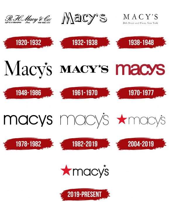
1920 – 1932
In 1858, the first RH Macy & Co. department store was opened. With a rooster on the sign. Four years later, he received another emblem – a red star. And logos with inscriptions began to be used much later. One of the earliest versions that have come down to our times dates back to 1920. As far as we know, it contained a beautifully handwritten text “R. H. Macy & Co. Inc.” – a sample of old calligraphy. Below is the address of the outlet: “34TH ST. & BROADWAY “(left) and” NEW YORK CITY “(right). The company moved there in 1902 after being bought by the Straus brothers. Now this place is listed in the National Register of Historic Places and recognized as a landmark.
1932 – 1938
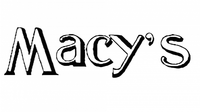
Over time, the design changed: the only element of the logo was the white word “MACY’S.” It seemed three-dimensional because of the gray outlines of varying thickness. The developers used a stylized antique font, with the first “M” being larger than the rest of the letters and extending beyond the line.
1938 – 1948
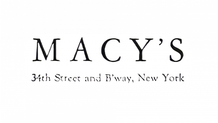
The creators of the new version of the logo made the inscription black and transferred it to the upper case. Typography was based on thin characters with long serifs. The address of the main store reappeared below: 34th Street and B’way, New York City.
1948 – 1986
In the middle of the 20th century, designers removed the address to emphasize the name of the department store chain. The word “Macy’s” was as black as before. The four letters after the “M” have become lowercase, and the apostrophe has become a small five-pointed star above the “y.”
1961 – 1970
Over time, the line thickness has changed slightly. Until 1970, the company used a logo that contained bold flattened lettering. All letters were capital and serif.
1970 – 1977
The 1970 emblem had nothing to do with the previous ones, except for the brand name. The font was round and grotesque, there was no apostrophe in the word, and the letters were repainted in dark red and converted to lower case.
1978 – 1982
To make the inscription easier to read, the designers have reduced the thickness of the strokes and returned to black. Small spacing appeared between characters, which were not present in the previous version.
1982 – 2019
In the early 1980s, the lines have become even thinner, but the font has not changed much. A subtle five-pointed asterisk has been added in the upper right corner of the “y.”
2004 – 2019
In the 21st century, the Macy’s chain of stores decided to decorate the logo with its iconic symbol – a red star. The new item was to the left of the word.
2019 – today
The 2019 redesign was aimed at making the lettering symmetrical. The designers changed the font and adjusted the position of the lines so that the large star now matches the stylized apostrophe in height. In addition, its two diagonals (from the top to the legs) run parallel to the strokes of the letter “y.” The purpose of this alignment is to create the illusion that all characters are the same size. This is not the case: there is a significant difference between them, especially noticeable in the “s.”
Macy’s: Interesting Facts
Macy’s is a famous store with a long history and a big impact on American culture.
- Start: Macy’s began in 1858 in New York City, started by Rowland Hussey Macy. It started small, selling dry goods. The red star logo comes from Macy’s tattoo from his younger days on a whaling ship.
- Biggest Store: The main Macy’s store in New York City’s Herald Square is the biggest in the world. Built in 1902 and expanded over time, it spans a city block with over a million square feet of space.
- Thanksgiving Parade: Macy’s has been known for its big Thanksgiving Day Parade in New York since 1924. It features balloons, floats, bands, and performers, ending with Santa Claus. It’s a huge event that kicks off the holiday season.
- Retail Innovations: Macy’s introduced window displays and the concept of Santa Claus in stores. They’ve also held big themed exhibitions.
- Historic Moments: The Herald Square store has been the site of many big events, like a black-tie gala in 1938 and a rooftop garden during World War II.
- Cultural Icon: Macy’s appears in many movies, TV shows, and books. It’s featured in “Miracle on 34th Street,” a movie about a Macy’s Santa Claus who claims he’s the real thing.
- Growth: Macy’s went from one store in New York to a nationwide chain, buying up local stores.
- Fireworks: Macy’s has held a big Fourth of July fireworks show in New York City since 1976, one of the country’s largest.
- Architecture: The Herald Square store is a landmark and is on the National Register of Historic Places.
- Shopping Experience: Macy’s aims to make shopping exciting with slogans like “The Magic of Macy’s.”
Macy’s combines innovation and tradition, making it a special place that has been part of American retail for generations.
Font and Colors
For Rowland Hussey Macy, the red star was a powerful talisman. But due to the Soviet regime, it acquired a new meaning, so the company could not use it on the logo without evoking extraneous associations. She also could not get rid of her iconic symbol completely, so after the Second World War, the apostrophe in the word “Macy’s” turned into a small black asterisk. When communism fell and was forgotten, the retail chain happily placed a large red star on the emblem. It has become the main hallmark of hundreds of brand stores around the world.
The logo’s typeface matches Avant Garde Gothic Extra Light, a round sans serif designed by Tom Carnase and Herb Lubalin. But in the latest version, the designers changed the shape of some of the lines to make the letters appear symmetrical and coincide with the diagonals of the star.
Red (# Е11A2B) has become Macy’s main color relatively recently. It is combined with black, making the image bright and visible on any light background.
Macy’s color codes
| Spanish Red | Hex color: | #e11a2b |
|---|---|---|
| RGB: | 225 26 43 | |
| CMYK: | 0 88 81 12 | |
| Pantone: | PMS Bright Red C |
| Black | Hex color: | #000000 |
|---|---|---|
| RGB: | 0 0 0 | |
| CMYK: | 0 0 0 100 | |
| Pantone: | PMS Process Black C |

