The Lowe’s logo represents a practical, comfortable home full of love and coziness. According to the logo, the user will find everything necessary for professional renovation and interior design inside the store. With the help of retail goods, you can build housing from scratch.
Lowe’s: Brand overview
Lowe’s is an American retail chain. Its full name is Lowe’s Companies, Inc. She specializes in building materials, home appliances, and all things home, second only to rival brand The Home Depot. The firm has extensive sales networks in the United States and Canada and operates from Mooresville, North Carolina. The company’s founder is Lucius Smith Lowe, who named it after himself. The time of foundation is March 1921.
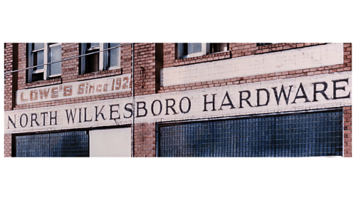
The first store appeared in North Wilkesboro, North Carolina, and was called North Wilkesboro Hardware. After the first owner’s death, the outlet passed to his daughter, Jim Lowe Ruth Buchan, but she immediately sold the inheritance to her brother, Jim Lowe. He took the share of Carl Buchan, the sister’s husband.
His brother-in-law contributed to the flourishing of the commercial enterprise since the events took place in 1943, during the Second World War. After graduation, Buchan foresaw a sharp rise in building materials and equipment demand, so he changed the store’s specialization. Until then, he sold dry goods, groceries, snuff, and horseshoe nails.
The business took off, so 1949 the owners acquired a second store in Sparta, the same state. As a result, the emblem, which served mainly as a sign, became known outside the hometown. In 1952, Carl Buchan became the sole owner of construction outlets. He incorporated the company as Lowe’s North Wilkesboro Hardware. His partner Jim Lowe spun off and created his grocery retail chain, Lowes Foods.
By early 1955, the building materials firm had rapidly expanded to include several neighboring cities, for which it needed a catchy personal identity badge to identify its six stores. After the sudden death of Buchan, his team renamed the company, bringing it to the international market under the current name, Lowe’s Companies Inc. The first retail outlet outside the country appeared in Hamilton (Ontario, Canada).
Meaning and History
The visual identity of Lowe’s stores was originally associated with their founder, Lucius Smith Lowe, whose business was later continued by descendants. His surname served as the name, and it, in turn, became the basis for the logo. But before, such an inscription appeared above the entrance of the sign. The logo remained textual for a long time until it was combined with the silhouette of the building where the first outlet was located.
What is Lowe’s?
This is a trading company from the United States, which owns a chain of stores of the same name that sells repair and household goods. It appeared in 1946 and served about 14 million customers weekly. Its head office is located in Mooresville.
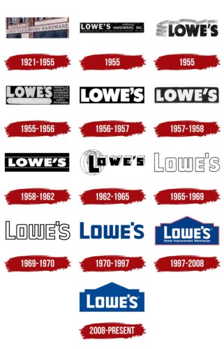
1921 – 1955
The emblem contained a single-line horizontal inscription printed in upper case. Bold signs testified to the network’s desire to become a replacement against competitors’ backgrounds, stand out, and show the assortment’s breadth. The glyphs were sans-serif.
January – June 1955
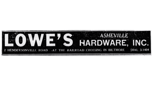
The logo was completely informational because, in this way, it was possible to convey all important information to customers quickly and intelligibly. And also – to make the brand memorable so that it is easily recognized among other stores. Detailed data was located on a horizontally elongated rectangle, and the inscription was made in geometric glyphs with a wide breakdown. The font was used simply – even chopped and capitalized. The black and white palette made the symbol as distinct as possible.
June – November 1955
After a series of transformations, Lowe’s stores have a radically different emblem. It consisted of a large title and a ribbon with various inscriptions. Moreover, the designers worked on the letters significantly, adding originality. For example, “E” received diagonal cuts at the ends. The same one appeared on the bottom fragment, “L.” The glyphs were very bold.
1955 – 1956
The boldness of the letters in the names of the network stores remained, but the location of the inscriptions was changed. The designers have regrouped them by collecting the words “Lowe’s” at the end and placing them on each other. In addition, the name was underlined by a wide line with oval ends.
1956 – 1957
After the modernization, Lowe’s logo was even larger: it consisted only of the name, which increased by half. Therefore, it occupied the entire space of the black rectangle. The bevels at the ends of the letters were removed, and they became even and smooth.
1957 – 1958
The only change was in the apostrophe. It was straightened and placed diagonally, making it look like a parallelogram.
1958 – 1962
Two long stripes were added to the emblem, which crossed the rectangle horizontally. They served as borders for the name, as they were located at the top and bottom of the word “Lowe’s.” The emblem’s designers slightly reduced its height, so it seemed flattened.
1962 – 1965
The developers translated the letters into a 3D format to make the logo original. As a result, they became voluminous. The geometric shape made them unusual, so all the glyphs looked like shapes. The front part was painted black, the rest – white. Moreover, the letter “L” was much larger than the others, although they all remained capital. On the left, the background for the inscription was the globe, which emphasized the global reach of the chain of stores. The continents were shown in grey.
1965 – 1969
Unlike the previous sign, this one had strict forms since it consisted only of contour letters. Each glyph in the title was outlined with a black line to form a border. At the same time, the designers rounded the corners of the signs and made the “w” look like an inverted “m.” The apostrophe was straight, vertical, and shaped like a rectangle.
1969 – 1970
In this version of the logo, the inscription was composed of letters with a bold border, which made the light part look smaller and the glyphs thinner. The rectangular apostrophe was slightly cut off and looked like a square.
1970 – 1997
In this version, the designers have converted all letters to upper case, but at the same time, left the “L” larger than the rest. They also rounded the outer corners of the “O” and “W,” so the signs contrast with the “E” and “L,” which do not have such rounds – they are geometrically strict, even, and, conversely, angular. “S” is written in a different font and separated from the word’s main body by a square that replaces an apostrophe. In addition, the developers changed the logo’s color – instead of scarlet, they used dark blue. This word sign was taken as the basis for subsequent emblems and is still used today.
1997 – 2008
The retail chain management decided to update the logo and focus it narrowly, reflecting the type of activity, assortment, and basic focus. To do this, the designers took the existing text, changed its color, and placed it in a blue geometric shape, the outlines of which resemble a house. Below, under the brand’s name, they made an inscription in small print – “Home Improvement Warehouse.” Around the entire perimeter of the emblem, a double edging was drawn in the form of red and gray lines.
2008 – today
The developers tweaked the existing logo to simplify and balance the house’s image. They removed the red-gray outline and text, lowered the word mark, and lightened the blue by a few tones.
Lowe’s: Interesting Facts
Lowe’s, a big name in home improvement stores in the US, Canada, and Mexico, started back in 1921 in North Carolina. It’s the second-biggest hardware chain worldwide.
- The Beginning: Lucius Smith Lowe started it as a small hardware store. After he passed away in 1940, the store passed through a few family hands and eventually expanded under the leadership of Jim Lowe and Carl Buchan.
- Focus Shift: Originally, Lowe’s sold a bit of everything, from hardware to groceries. After World War II, they decided to stick to hardware, appliances, and building materials, aiming at the growing number of people building homes.
- Growing Bigger: In the 1950s, Lowe’s started opening stores outside North Carolina. They cut out the middleman and dealt directly with manufacturers, which meant lower prices and fast growth. Now, they have over 2,000 stores.
- Going Public: Lowe’s shares hit the stock market in 1961, and this move helped them grow even faster, modernizing and opening more stores.
- Innovative Store Design: Lowe’s was one of the first to use the big-box store design, making shopping for a wide range of home improvement products easier.
- Helping the Community: Lowe’s charitable foundation helps with education and community projects, investing millions to make a difference.
- Embracing Online Shopping: Lowe’s has stepped up its online game, making it easy for customers to buy and pick up in-store. They also use technology like augmented reality to help with home improvement planning.
- Valuing Diversity: Lowe’s works hard to be an inclusive workplace, and its diversity and inclusion efforts have won praise.
- Eco-Friendly: Lowe’s prioritizes sustainability and takes steps to lower its environmental impact through energy-efficient stores and recycling programs.
- Helping in Disasters: When disasters strike, Lowe’s is there to help, donating money and supplies to help communities recover.
Lowe’s has become a leader in the home improvement world through innovation, community involvement, and staying focused on what customers need, all while adapting to new technologies and trends.
Font and Colors
The long-term uneven commercial network development did not allow the brand to establish itself completely. Therefore, the official identity was adopted after the opening of the stores. The owners wanted something simple yet catchy that carried a ton of information. This is how the outline of the house appeared. The verbal part was used in parallel with it, which came into use almost thirty years earlier.
In the early years, the emblem was executed in a font reminiscent of HWT Unit Gothic 716 with some modifications. Then came the second option – Design System- in all Lowe’s logos. Its main highlight is the rounded “S” from another typeface.
The corporate color is stable and consists of several shades of blue: # 004791 (now) and # 1c3f86 (formerly). The color scheme also includes neutral white, dark gray, and red in two spectra (crimson # c40b43 and scarlet # fd1100).
FAQ
What is Lowe’s symbol?
Lowe’s is a popular American home goods retailer. Its shares are traded on the New York Stock Exchange (NYSE) under the “LOW.” This symbol helps investors and financial markets trade and track the company’s shares.
Stocks designated “LOW” are included in several major stock indices, indicating their importance in the market. A company’s financial health, earnings reports, and plans can influence the share price, attracting individual and institutional investors. Investors use financial news websites, stock market apps, and investment analysis platforms to stay updated on stock performance.
What font does Lowe’s use?
Lowe’s, a major American home improvement retailer, uses two main fonts: Helvetica and DIN. These fonts are chosen for clarity and readability, giving the brand a consistent and professional look.
Helvetica is a widely used sans-serif typeface known for its clean and modern appearance. It conveys a sense of reliability and professionalism. This font is versatile and suitable for various uses, such as signage and digital platforms.
DIN, which stands for Deutsches Institut für Normung, is another sans-serif typeface the brand uses. DIN is known for its straightforward and highly legible design, which was originally developed for engineering and technical applications. Using DIN helps ensure clarity and consistency when presenting information.
Using Helvetica and DIN helps the brand maintain a cohesive visual identity that supports its image and improves customer communication. These fonts contribute to the overall look and effectiveness of the company’s marketing efforts.
Did Lowe’s change their logo?
In 2008, the company redesigned its logo to clarify its brand direction. The logo depicts a silhouette of the main store building with the brand name inside.
The change made the logo simpler and more recognizable. The silhouette of the building helps customers associate the logo with the brand’s stores. The clear and bold title within the silhouette makes it easy to read and recognize. This redesign aligns with the brand’s mission to offer quality home improvement products and services.
What color is Lowe’s?
The logo is blue, a shade chosen to inspire trust, stability, and reliability, which are important brand values. The blue color reflects Lowe’s commitment to providing reliable products and services for home improvement.
Previously, the logo used red and gray borders, but the current design focuses only on blue. This change helps keep the look clean and simple. The blue color highlights the brand and makes it easily recognizable.
What was Lowe’s old slogan?
The brand has had several different slogans over the years. The first, “Never Stop Improving,” started in 2011. This slogan showed the brand’s desire to help customers improve their homes and lives.
In 2019, the slogan changed to “Do the right thing for less. Start at Lowe’s.” The focus was on the value and quality that customers could find in the brand’s stores.
In 2021, the brand introduced a new slogan: “A home for every possibility.” This reflects the wide range of home improvement solutions the brand offers, showing that whatever projects customers have in mind, the company can help make them a reality.
Why is the Lowe’s logo blue?
The logo is blue because it matches the color of the US flag. The brand chose this shade to evoke patriotism and connect with American consumers. The blue color symbolizes trust, stability, and reliability, which are key values of the brand.
To emphasize this connection, the designers removed the gray stripe that was once part of the logo. This change made the logo simpler and more blue-centric. Choosing a blue color helps make the brand easily recognizable and trustworthy to customers.
