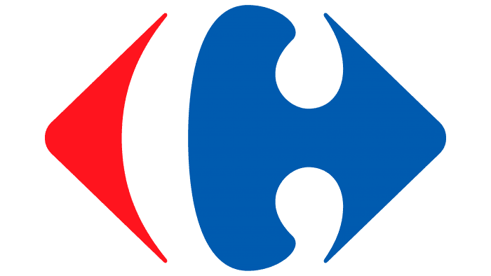
The message of the Carrefour logo is simple and clear: in whatever direction the buyer goes, he will definitely meet the store of the chain. The emblem promises: inside; you can choose both exclusive products and a large list of everyday items at affordable prices.
Carrefour: Brand overview
| Founded: | 1 January 1958 |
| Founder: | Marcel Fournier, Denis Defforey, Jacques Defforey |
| Headquarters: | Massy, Essonne, France |
| Website: | carrefour.com |
Meaning and History
The trading company was founded in 1957, and immediately the first shop was opened in the town of Annecy. In 1963, in the suburbs of Paris, Sainte-Genevieve-des-Bois, the first hypermarket in Europe called Carrefour was opened.
Today, Carrefour owns almost 16 thousand stores, super- and hypermarkets in France, Spain, Russia, and Kazakhstan; chains exist in Argentina, Brazil, Asia, and North Africa. It employs more than 400 thousand people.
After merging with the Promodès chain of stores in 2000, Carrefour became the largest retailer in Europe. In 2009, she left the Russian market, selling her assets to X5 Retail Group.
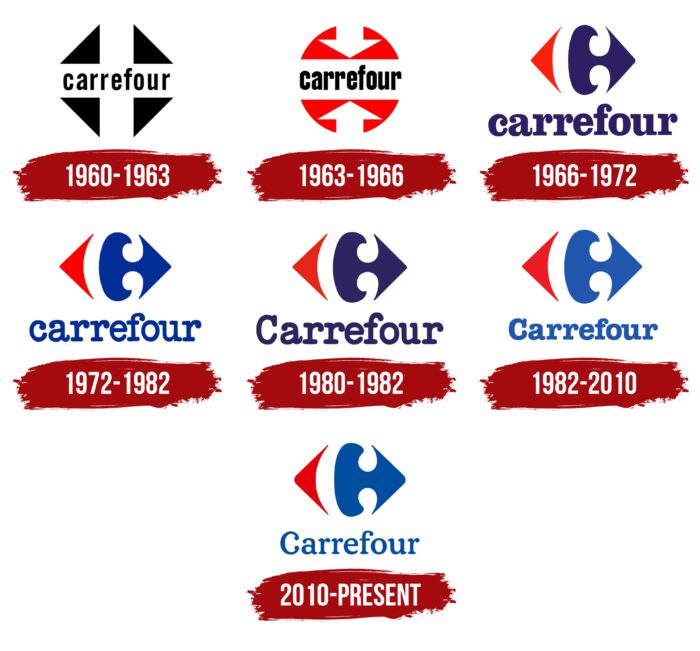
Throughout its history, the logo has changed several times, and today it has reached complete perfection.
What is Carrefour?
Carrefour is a French chain of hypermarkets, supermarkets, and discount stores. It was established in 1958 and has since expanded to more than 30 countries worldwide. Its retail outlets operate in Africa, Asia, Europe, the Middle East, and South America. The company offers a variety of products under both its own and third-party brands, including food, clothing, electronics, household appliances, and much more.
1960 – 1963
The first emblem was a schematic representation of an intersection with a white cross made of wide stripes against a black rhombus background. The name of the company is written on the horizontal line in black lowercase letters.
1963 – 1966
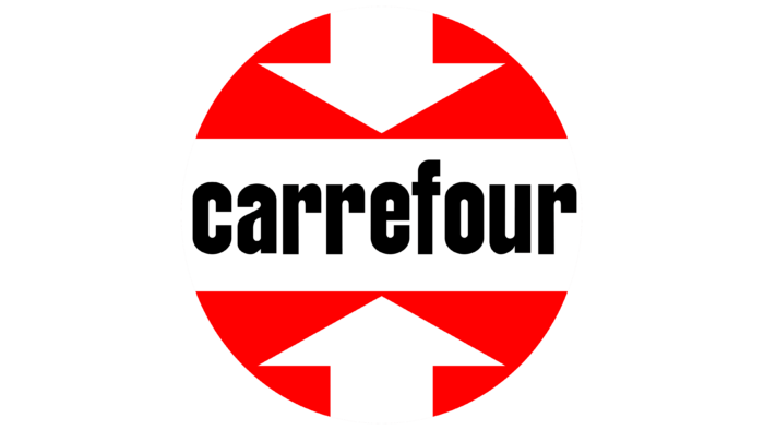
At the beginning of 1963, the logo’s image changed dramatically: it became round, red. The name of the company, as before, is written in a wide horizontal white stripe. Two large white arrows have replaced the vertical stripe
1966 – 1972
Again, a complete logo update is associated with the new “Positive is Back” campaign. This time, it was performed in France’s colors – white, red, and blue. On a white background, the company’s name is written in blue letters, and above it again, there are two arrows – red and blue, looking in different directions. The letter “C,” symbolizing the company itself, seemed to be glued to the blue part. The two arrows mean a crossroads and the company’s values - an attractive price-performance ratio for people.
1972 – 1982
The logo remained the same in image and design. The proportions were changed – the brand name was reduced, and the badge was made much larger, thus informing that quality and affordable prices are the most important thing for the company.
1980 – 1982
Changes in the Carrefour logo mainly affected the color: the badge in the form of multidirectional arrows remained. The designers replaced the blue with purple and trimmed the shape of the letters, making them smoother and more rounded. They also reduced the gap at the top of the ‘r,’ rounded the curve at the ‘f,’ used a capital ‘c’ instead of a lowercase ‘c,’ and shortened the serifs a bit.
1982 – 2010
The company continued to increase the proportions of its brand name for better brand identification. The color scheme remains the same. But the inscription, which was attached to the emblem, received a new font. The serifs on the letters are now rounded. The entire inscription is in bold type.
2010 – today
Again, a slight improvement was made to the logo – now, the name and icon are balanced in proportions. As it was said in the presentation release, the chain has significantly increased the price range, and now there are products in both the economy and elite class.
Carrefour: Interesting Facts
Carrefour, a big company from France, is known worldwide for its huge stores that sell everything from groceries to electronics.
- French Roots: Carrefour was founded in 1958 in Annecy, France, by the Fournier, Badin, and Defforey families. Its name means “crossroads” in French because it brings different types of products together in one place.
- First Hypermarket: In 1963, near Paris, Carrefour opened the first hypermarket in Europe. This was a big deal because it combined a supermarket and a department store, making shopping cheaper and easier.
- Worldwide Presence: Carrefour didn’t just stay in France; it opened thousands of stores worldwide, including Europe, Asia, South America, and Africa.
- Innovative Shopping: Carrefour was one of the first to let customers serve themselves, changing how we shop. It gave customers more freedom to choose what they wanted to buy.
- Using Blockchain for Trust: Carrefour uses new technology like blockchain to let customers know exactly where their food comes from. Customers can see the product’s journey details by scanning a QR code.
- Own Brands: Carrefour also sells its own brand of products, which are often cheaper than other brands. These range from everyday items to more luxurious goods.
- Helping Out: Carrefour is involved in various projects to help communities, fight hunger, and support education, showing its dedication to doing good.
- Going Digital: Carrefour is keeping up with technology by selling products online through its website and app. This makes shopping easier and more convenient.
- Understanding Local Tastes: As Carrefour grew, it adapted its stores and products to fit the local culture wherever it went. This has helped it succeed in many different countries.
Carrefour’s growth from just one store in France to a huge international company shows its creativity, focus on customers, and ability to adapt to new shopping trends.
Font and Colors
The current logo echoes the emblem of 1966. This was done on purpose because, after several years of experimenting with identity, the brand decided to return the previous symbolism that set the current logo series’s start. The only thing that Wolff Olins (its developer) did was to remove the edges at the ends of the protruding elements and reduce the color intensity of the sign to light blue.
The text part has also changed: thin characters are now used instead of bold characters. But their style has been preserved: the letters are still retro with enlarged dots at the ends. This is one of the interpretations of serifs. The main typeface is close to the commercial American Typewriter. Of the free fonts, it most closely resembles the Erica Type Bold Font.
The corporate palette has not changed since 1966. It consists of red (a triangle pointing to the left) and blue (curly elements with an arrow pointing to the right). The rest in between is white, forming a negative space with the original shapes – two short commas above and below.
Carrefour color codes
| USAFA Blue | Hex color: | #004ea0 |
|---|---|---|
| RGB: | 0 78 160 | |
| CMYK: | 100 51 0 37 | |
| Pantone: | PMS 2945 C |
| Venetian Red | Hex color: | #e3000c |
|---|---|---|
| RGB: | 227 0 12 | |
| CMYK: | 0 100 95 11 | |
| Pantone: | PMS Bright Red C |
