From the emblem blows home and bright emotions. Auchan logo embodies novelty, hot offers, variety of flavors. Causes a feeling of care and protection of the interests of the buyer. Everything that the client needs will be delivered quickly, as if on the wings of a bird.
Auchan: Brand overview
| Founded: | 1961 |
| Founder: | Gérard Mulliez |
| Headquarters: | Croix, Lille Métropole, France |
| Website: | auchan-retail.com |
Meaning and History
After meeting with the retail chain owners, Carrefour and Leclerc, second-generation businessman Gerard Mulliez decided to become a large merchant and set up his store with a similar operating scheme. After some thought and preparation, he opened it in the Phildar building – at his father’s former factory in the Hauts-Champs area of Roubaix. Its total area was 600 square meters. However, later (in the 1980s) the commercial outlet had to be closed due to high competition.
In the summer of 1967, Auchan got its first hypermarket. It was located in the city of Roncq and covered an area of 3500 square meters. And the first shopping center was founded in Englos in the metropolis of Lille.
The company gradually expanded, expanding throughout France and even Europe. Today, her stores are located in many countries around the world. Among them – Portugal, China, Hungary, Spain, Poland, Tajikistan, Italy, UAE, Russia, Ukraine, Luxembourg, Romania.
The exception is the United States, where the Auchan chain has failed to compete. In early 2003, she announced the closure of two stores due to lack of profit. On January 6, both points were closed at once, and after 15 years, the French company curtailed all trading activities in the United States, focusing on the countries of Europe and Asia.
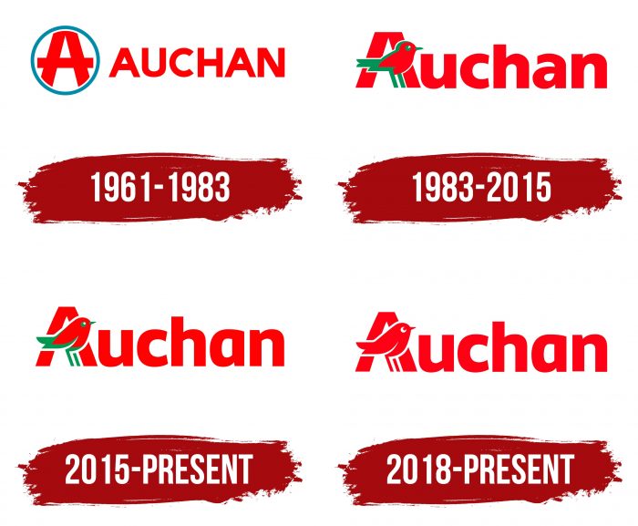
The name Auchan, which later became the basis for the corporate logo, did not appear immediately. The first store was named Ochan. But because of the Japanese sound, it was changed to the current version. The founder wanted to use “A” instead of “O” because it is the first letter in the alphabet, and it starts the list in any directory. During the entire existence of the holding, it had four emblems.
What is Auchan?
Auchan is a large French retailer with a presence in more than ten countries under different names, such as RT-Mart in China and Alcampo in Spain. Its stores sell household goods, food products, clothing, electronics, cosmetics, etc. Customers can also access travel and banking services. The company was founded in 1961 and is a holding company that includes several divisions: Oney, Auchan Retail International, and Ceetrus.
1961 – 1983
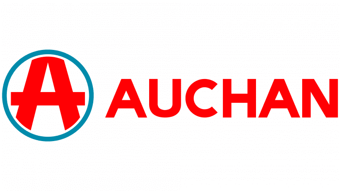
The debut logo featured a large “A” in a circle. It was outlined so that the top of the letter and the bar’s protruding ends were cut off. This is a hint that the store surpasses all expectations and is much larger than any framework. The edges of the icon are blue; the letter is red, the background is white. On the right is the full name of the retail chain, in an uppercase font. The word is designed in a grotesque style – it is smooth, smooth, and therefore easy to read.
1983 – 2015
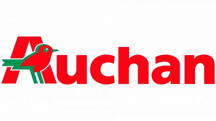
During this period, a radically different emblem appeared. It depicts a red-green bird with a long tail that replaces the center bar “A.” The rest of the letters are lowercase, printed, bold, in the classic spelling. The feathered one is a robin. Its task is to show the store’s closeness to customers and its love for them.
2015 – today
In 2015, the artists changed the style of painting the robin: they made it more cute, beautiful and welcoming. She still stands in front of “A,” replacing the crossbar, but her body has become elongated, with smooth transitions of lines. The eyes, beak, legs, and tail of the bird are green, the rest of the plumage is red, like the inscription. The letters are tall and bold, and the lowercase “a” got a different spelling altogether. It is round, with a leg and no top cap.
2018 – today
Now another version of the emblem is in use, which appeared in 2018. Then Auchan changed its slogan and, at the same time, decided to transform the identity a little. This is how the red and white version appeared – an exact copy of the previous version.
Auchan: Interesting Facts
Auchan, a major retail chain from France, is known for offering various products at low prices. Since its start in 1961 by Gérard Mulliez, Auchan has grown into an international network.
- Family Ownership: The Mulliez family, one of France’s richest, owns Auchan. This lets Auchan stick to its core values and long-term goals without worrying about stock market pressures.
- Different Store Types: Auchan leads the creation of various store types, including big and small stores and online shopping, to meet different customer needs. This approach helps Auchan stay flexible and responsive to trends and preferences.
- Worldwide Operations: Auchan is in 17 countries across Europe, Asia, and Africa, showing it can adjust to different markets by offering local and international products.
- Sharing Profits with Employees: Auchan shares profits with its employees, creating a sense of belonging and aligning their interests with the company’s success.
- Auchan Drive: This innovative service lets customers order and pick up groceries without leaving their car, blending online convenience with physical store benefits.
- Supporting Young People: Auchan runs the Auchan for Youth program, supporting cultural, educational, and social projects for the youth, showing its commitment to giving back.
- Private Labels: Auchan offers its brands various products, providing high-quality options at lower prices than national brands.
- Supply Chain Innovations: The company is praised for making its supply chain efficient and sustainable, including reducing food waste and tracking product sources.
- Strategic Market Focus: Auchan has left some countries, like Italy and Vietnam, to focus on places where it leads or sees big growth chances.
Auchan’s growth from a single store in France to a global retailer shows its dedication to innovation, sustainability, and meeting customer needs, all while staying true to its founding principles.
Font and Colors
The evolution of this trading network’s logo developed simultaneously with its expansion but always remained in the same style: the icon on the left, the inscription on the right. The name is in lowercase letters, except the debut emblem, where all characters are uppercase. In 1983, a mascot appeared – a robin, which is a symbol of good nature and closeness to a person. On two emblems, the bird is red-green; on one, it is completely red. Since 2015, she has received soft features to make the retail network attractive in potential customers’ eyes.
The retailer chose the Frutiger Pro 75 typeface for its logo. This is a serrated version of the rounded, flowing fonts. It meets the criteria of practicality, readability, and friendliness. Its author is designer Adrian Frutiger. The corporate palette consists of a combination of three colors. In particular, the emblem contains red (# e1001a), green (# 00915b) and white (# ffffff).
Auchan color codes
| Neon Red | Hex color: | #ff0013 |
|---|---|---|
| RGB: | 255 0 19 | |
| CMYK: | 0 100 93 0 | |
| Pantone: | PMS 172 C |
