The Costco logo promises a huge selection of goods in the company’s halls and the ability to buy them in large quantities. At the same time, the emblem makes an allowance for the need for permanent membership in the club, which gives the right to enjoy the privileges of the network.
Costco: Brand overview
Entrepreneur Sol Price founded Price Club in San Diego, California, in 1976, starting Costco’s history. Initially focused on serving small businesses, the first store operated from a former airfield hangar. However, it quickly became evident that the wholesale model could benefit regular consumers.
In 1983, James Sinegal and Jeffrey Brotman, who had worked with Sol Price, opened the first Costco store in Seattle, Washington. Sinegal applied the business principles he had learned at Price Club, offering products to members at wholesale prices.
The company experienced rapid growth during its early years. By 1984, six locations had been opened, generating $165 million in sales. In less than three years, the retailer became the first to surpass $1 billion in sales.
In 1993, Price Club and Costco merged to form PriceCostco. The combined company operated 206 locations and generated nearly $16 billion in sales, significantly expanding its market presence and geographic reach.
In 1997, PriceCostco was renamed Costco Wholesale Corporation after Sol Price left the business in 1994 to start a new venture. The retailer then embarked on aggressive international expansion.
The first international store opened in Canada in 1995. Its success led to additional locations in the UK, Japan, Korea, Taiwan, and other countries in the following years.
The 2000s were marked by both growth and innovation. The company introduced its Kirkland Signature brand, offering high-quality products at competitive prices. The name honored Kirkland, Washington, where headquarters were located.
In 2005, annual revenues exceeded $50 billion. The retailer expanded its offerings by introducing services such as pharmacy, travel, optical, and auto sales through membership programs.
The 2010s saw a focus on online growth. In 2016, the website was enhanced, and online shopping options were expanded. Partnerships with other companies enabled the introduction of fresh grocery delivery services.
Between 2017 and 2023, the company continued its global expansion, opening stores in various countries. Investments in e-commerce helped it meet changing consumer demands. By 2023, Kirkland Signature featured over 350 products, ranging from food to clothing and electronics. These products were known for their quality and competitive pricing compared to national brands.
The retailer maintained a minimal markup policy, with most items capped at 14% and Kirkland Signature products at 15%. This approach fostered strong customer loyalty and long-term relationships.
By 2023, it had become one of the largest retailers worldwide. The company adhered to providing high-quality products at affordable prices, offering a curated selection, and operating on a membership model. Its history demonstrates a consistent ability to balance steady growth with innovation in the retail industry.
Meaning and History
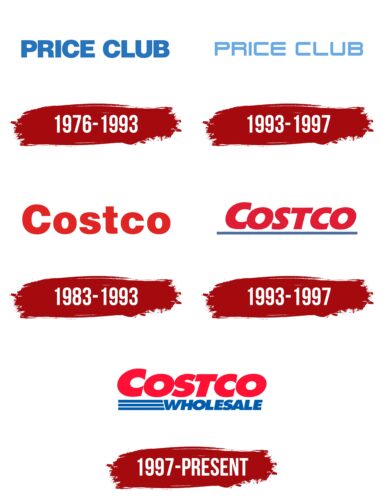
The iconic red and blue Costco Wholesale Corporation logo took on its current look at the turn of the millennium. Before that, it had been refined several times, although the general concept remained the same: horizontal inscription with minimal decor.
What is Costco?
This is a chain of stores operating under a unique business model. It serves only registered members, offering them substantial discounts. Each outlet functions as a warehouse where shoppers with membership cards can purchase goods. Customers must renew their membership annually and remain part of the club to use the services. The assortment includes various products: cosmetics, furniture, household appliances, clothing, and groceries. It is one of the largest retailers in the world, with locations in the United States, Canada, Mexico, Australia, South Korea, Japan, and other countries. In addition to retail, the company offers additional services such as insurance and travel arrangements.
1976 – 1993
The logo of Price Club, a warehouse chain that became the predecessor of modern Costco, stood out for its simplicity and minimalism. It consisted of “PRICE CLUB” in bold, uppercase blue letters on a white background. This aligned with the brand’s essence, which focused on offering wholesale-priced goods without unnecessary embellishments or pomp.
The font used straight lines and clean shapes, emphasizing the company’s reliability and professionalism. The thick letters made the text noticeable and readable from a distance. The color scheme was limited to blue and white, conveying a sense of cleanliness, transparency, and trust.
The name reflected the brand’s concept: a club for shoppers united by the desire to purchase reasonably priced goods. The logo was perfectly suited to its time, when the focus was on functionality and savings, and its simplicity underscored the company’s core principle—no extra costs, just real benefits for customers.
1993 – 1997
The updated Price Club logo symbolized a new chapter in the company’s history, coinciding with its merger with Costco. The emblem featured the text “PRICE CLUB” in uppercase block letters. The light blue color added freshness and visual lightness, while the letterforms, with clean, straight lines and rounded corners, gave the design a sense of modernity and technical sophistication.
The text had distinct rectangular spacing between the letters, creating a sense of structure and precision. The letters appeared even and neat, maintaining the brand’s characteristic simplicity. This approach resembled the font of a neon sign, easily associated with urban environments and consumer activity.
The font, possibly inspired by Yoyo’s NiseJSRF Regular, reflected the company’s focus on modernity and accessibility. The light blue color emphasized reliability, calmness, and trust, perfectly aligning with the needs of customers seeking advantageous and transparent shopping conditions.
The uppercase format of all the letters highlighted the significance of the name. This decision helped make the emblem more prominent and professional. The design appeared balanced, with letters aligned and evenly spaced.
This logo symbolized the company’s transitional period while preserving the spirit of the Price Club brand, which was rooted in practicality and customer focus.
1983 – 1993
This Costco logo was the first official representation of the new brand. It featured the company name in bright red, primarily set against a white background. The red color added energy to the visual identity, symbolizing confidence and capturing attention. The text was rendered in a large, bold sans-serif font, making it highly legible and suitable for the retail industry.
The font stood out for its massiveness and proportionality, creating a sense of stability and reliability. The red color distinguished the brand from competitors, emphasizing accessibility and dynamism.
The name “Costco,” a contraction of “Cost Company,” reflected the brand’s essence. The logo, centered around this word, highlighted the customer-oriented approach, offering savings and practicality.
The design’s simplicity and clarity allowed the emblem to be easily reproduced on various surfaces, from warehouse signage to product packaging. This helped solidify the brand’s recognition in the market and laid the foundation for the company’s future growth.
1993 – 1997
After the 1993 merger, Costco, like Price Club, received an updated logo that symbolized the transitional period for both brands. It was a hybrid emblem, reflecting individuality and a new stage in the company’s development.
The main “Costco” inscription was rendered in light red, which is softer and less aggressive than the previous version. The italicized font added dynamism and a sense of motion, creating an impression of lightness and speed.
A horizontal blue stripe was added below the main text, emphasizing the brand’s stability and reliability. The blue color was a contrasting element symbolizing trust and professionalism.
The logo’s elements were arranged to balance one another visually. The italicized font imparted a sense of movement, while the blue line below created a feeling of a solid foundation.
The updated logo bridges the company’s old image and new goals following the merger.
1997 – today
In 1997, PriceCostco, formed in 1993, officially became Costco Wholesale Corporation and introduced a new logo that firmly established its updated image. This version retained the visual features of previous emblems but became more distinctive and focused on global wholesale trade.
The main element of the visual mark is the word “COSTCO,” rendered in rich red. This color emphasizes activity, energy, and confidence. The font remains bold, with slight slants and smooth curves. The thickness of the letters enhances the sense of reliability, while the slightly rounded shapes give a friendly tone.
The second part is the word “WHOLESALE,” placed below. It is written in blue, symbolizing stability and professionalism in corporate branding.
Three horizontal lines to the left of the word “WHOLESALE ” reinforce the composition’s symmetry. These lines visually support the text, giving the emblem a finished appearance. They evoke associations with transportation flows, warehouse shelves, and systematization.
The logo’s composition is balanced. The contrast between red and blue underscores the company’s business approach while conveying a sense of simplicity and accessibility. The red “COSTCO” dominates the upper part, while the blue “WHOLESALE” provides clarity and structure. The lines on the left act as a unifying accent for the visual elements.
This design has remained unchanged to this day, becoming globally recognizable.
Costco: Interesting Facts
Costco Wholesale Corporation stands out in the warehouse club world thanks to its approach of selling in bulk and requiring a membership to shop.
- Start and Expansion: Founded in 1983 by James Sinegal and Jeffrey Brotman in Seattle, Washington, Costco has grown into the world’s second-largest retailer and the biggest membership warehouse club in the U.S.
- Membership-Only: The company’s model requires shoppers to have a membership. This approach has helped build a loyal customer base and keep prices low due to the high sales volume and quick inventory turnover.
- Kirkland Signature Brand: Since its launch in 1995, the Kirkland Signature brand has become known for quality and value, even outperforming some national brands.
- Affordable Hot Dog and Soda: The famous $1.50 hot dog and soda combo, unchanged in price since 1985, shows the retailer’s dedication to giving members great deals.
- Gas Sales: Many locations offer gas at lower prices than competitors, attracting non-members and boosting membership sign-ups.
- Worldwide Growth: The company isn’t just in the U.S.; it has warehouses in countries like Canada, Mexico, the UK, Japan, South Korea, and Australia, driving international expansion.
- Select Product Range: About 4,000 items are stocked, focusing on products that can be sold in high volume, simplifying shopping and lowering costs.
- Good Pay and Benefits: The organization pays its employees well and offers good benefits. It enjoys low staff turnover and high job satisfaction rates.
- Eco-Friendly Practices: Committed to sustainability, it uses solar power at some warehouses and promotes sustainable seafood, among other green initiatives.
- Seasonal Surprises: The “treasure hunt” shopping experience allows members to find unique and high-value items that often change, drawing them back to see what’s new, especially during the holiday season.
Font and Colors
Costco has a concept trademark: it contains the name of the chain of stores and the corporate colors with which it is associated. Three parallel stripes make the text dynamic.
The logo creators used the commercial Futura Extra Bold Oblique font. They lengthened the letters and positioned them at a slight angle, tilted to the right. Another highlight of Costco is its eye-catching palette, which includes just two colors: red (# E31837) and blue (# 005DAA).